
https://www.fruute.com/
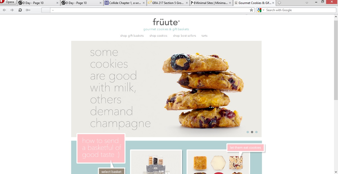
I think the deisgner of this website did a great job of utilizing white space in order to make the viewer pay attention to the main content in the center of the page. They utilized great images of their deserts to be sure to show great details in the foods. Because of the use of the white background, the designer was able to use pops of pastel colors without being overwhelming or annoying (as most pastels can be, in my opinion). I feel that the use of simple fonts allows our attention to once again be able to drift to the photos of the deserts and makes us more inclined to click on them.