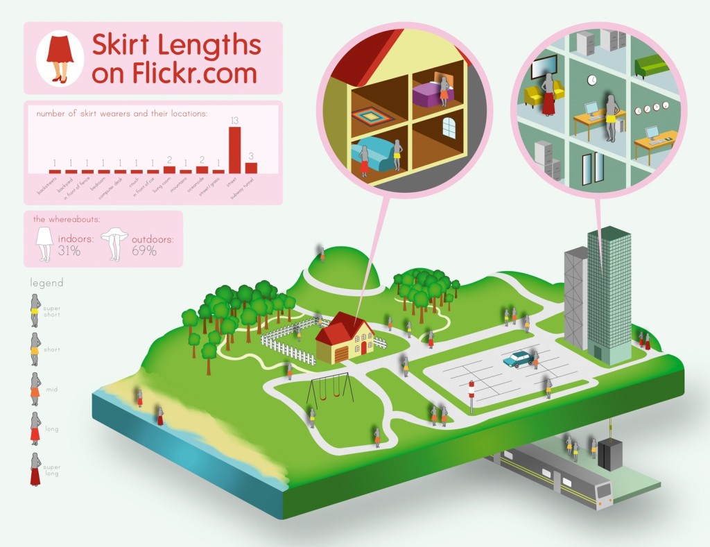
This is an infographic created using Adobe Illustrator. I found this infograph from a Adobe Illustrator tutorial website. This is definitely a very high-level difficulty work that requires lot of knowledge about the program to make it. However, if I were to guess what the designer have done to create this project, The first thing I can think of is setting up the three-dimension grid, based on the three dimensional rectangular platform. Also, one would have used the pen tool to create figures like houses, trees, train station, and the beach scene.
Monthly Archives: September 2013
Illustrator Techniques: Save Water, Save Life Illustration
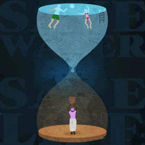 This illustration effectively identifies the disparity in water distribution throughout the world in one clever image. Yet how is it so effective?
In Adobe Illustrator and illustrating in general, perspective is key. Through applying multiple shades of color throughout the image and placing the words behind the illustration, there exists a sort of depth that wouldn’t exist otherwise. It is also important to note the figures within the hour glass and even the hour glass are simplified. There is very little detail in the shapes, but the shapes are recognizable. Most if not all of the shapes involved in the illustration can be created through utilizing the pen tool. There are other tools such as the gradient tool that can also provide shadow or a sense of light progression which can be seen in the faint aura behind the drop of water.
The most effective illustrations are not complicated yet discuss an intricate, complex idea. A simple hourglass is transformed into a potent metaphor of the water crisis that the world is facing.
Illustrator Inception
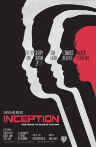
This poster is a simple design that is really effective for the movie Inception. The visual uses the pen tool, the direct select arrow, and the color bucket in the creation of these figures. If I were to produce a similar illustration, I would draw one of the figures with the pen tool, and then I would make duplicates of the figure. Next, I would use the direct select arrow on each duplicate to change the hairline a bit, and the paint bucket to change the color. This poster is simply designed yet it is clever and creative.
Save the Earth–Illustrator Tools
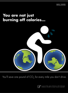
This poster is very realistic and it’s successful in getting the message across to the audience. It appears to be done in illustrator, filling in the bike tires with the earth-drawn pattern, and the use of the pen tool to create the figure on the bike. If I were to replicate this poster, I would likely use the pen tool, draw two ellipses (using shift to make a perfect circle) and then increase stroke sizes for the tire rims to show the black, finally filling in the circles with the earth pattern created.
Simplicity is like a Box of Chocolates
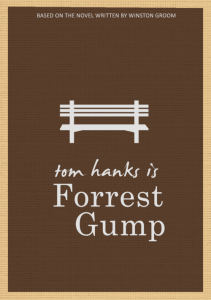
Another personal favorite (sorry guys for all of the movies). This is probably one of the simplest designs on Illustrator anyone will find. The park bench, where Forrest tells his story, is central to the movie itself, without being one of the scenes to capture his life story. The pen tool is obviously used to create the straight lines of the park bench, and none of the curves of the pen tool were used because it simply was not necessary. This poster is simple and straightforward and captures Forrest’s simple attitude towards life effortlessly. Go pen tool.
Blogging: Adobe Illustrator techniques
This week you need to select a piece of illustration likely made in Adobe Illustrator and comment on what sorts of Adobe Illustrator tools and techniques the designer may have used to create the artwork. If you are to produce a similar illustration, what are the major steps? The illustration piece can be from a poster, a magazine, a website, or even an Illustrator tutorial (like this one explaining how to use the Live Paint Bucket). Feel free to add Illustrator screenshots if needed.
The deadline is Friday September 27 11:59 PM.
The deadline for comments is Sunday at 11:59 PM.
Also, check this out:
Illustrator Mastery: 25 Techniques Every Designer Must Know
Michael Jordan
What I love about this poster isn’t just that it is of the best basketball player of all-time, but the typography tell us the story. First off, this font is perfect for this design because of its perfect mix between legibility and attention-grabbing attributes. By his right jaw you can easily see “Domination” and on his forehead you can easily see “MVP”. A photo of Michael Jordan looking fierce is great to see, but the typography adds another historical and inspirational boast to it.
typographic bomb
Vivaciously V
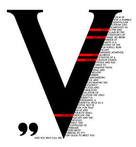
V for Vendetta is another cinematic favorite of mine, and this poster brilliantly utilizes the main character, V, and his famous speech in a visually appealing way. The large V takes up most of the space on the page, because V’s vibrant character is the main player in the movie. Because his speech uses words that start with V to emphasize the creativity of V’s character, this visual is stunning in its use of the starting V as the main V for all of the words in his speech. The red and black color scheme are his standard colors, for darkness and blood, but it allows for a pop of color against the dark black and white contrast. Also, the letter V is very balancing and captures the eye wonderfully.
