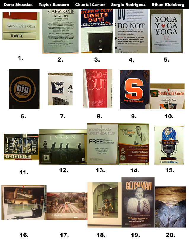
This has been not just a fun class but very rewarding in terms of what I’ve learnt. The most important thing I learnt is to think critically. Before taking the class and doing the projects, I hardly paid much attention to visuals — I saw them everyday but never thought of them CRITICALLY. The class has helped me foster such notion. Also, I enjoyed designing with Photoshop, Illustrator and InDesign. The process has made me a better observer, thinker and design practitioner.
Monthly Archives: December 2013
iPad project
What I Learned
I have learned so much in graphics class. Every time I look at a website, flyer, menu, etc., I notice the layout and design. I critically analyze the piece, and I take notice of the typefaces chosen and the gestalt principles applied. Before this class, I never considered how much work went into laying out the information we read. Now, not only do I have a new respect for every layout I see, I can also label the principles used and comment on the visual hierarchy. I also learned so much about the Adobe programs that we used. I worked with photoshop a little bit before, but InDesign and Illustrator were totally foreign to me. Now, I am able to work all three programs, and I believe it will give me an edge in the world of public relations. I truly appreciate all I have learned throughout graphics class this semester.
What I learned
Graphics 217 has taught me a wealth of information about the Adobe Suite that will take me very far in my career future in PR. I feel these tools are so important in the communication world today, because I may not be designing an advertisement in my field but I will be working with others who may and I now understand graphic terms and the ins-and-outs of the various software. I learned how to communicate in graphic terms (i.e. typography, colors, spacing and image) and this will be an invaluable tool for the future. I truly enjoyed every aspect of this course, my most favorite project being the iPad design because I loved the interactivity usage. Thanks for a great semester.
What I learned
This class taught me that the little legs on letters means that the font is a part of the serif family, and without legs means sans serifs (without serifs). I thought that was pretty cool. I also learned how to do cool things on InDesign, because I hated InDesign before this class. But now I know how to put a scrolling tray on a layout, or use hyperlinks properly. I also learned that jeopardy is intense and if you don’t pay attention in lecture or keep your notes, you won’t know the answers, like what typeface Volkswagen used to use. I created an awesome resume and learned what analogous colors are. Basically, the ins and outs of graphic design were taught very well in this class, and I am definitely more graphic savvy after this class. It’s been real. It’s been fun.
Knowledge Gained
This semester, I have learned a lot from this class. Overall, I have gained a greater awareness of graphic design and principles. This is something that I will be able to take with me in almost everything PR-related that I do. Additionally, I learned how to use Adobe Photoshop, Illustrator and InDesign. Knowing how to use these programs is something that will give me an edge, and allow me to perform graphic design tasks in my future career. Thank you for a great semester!
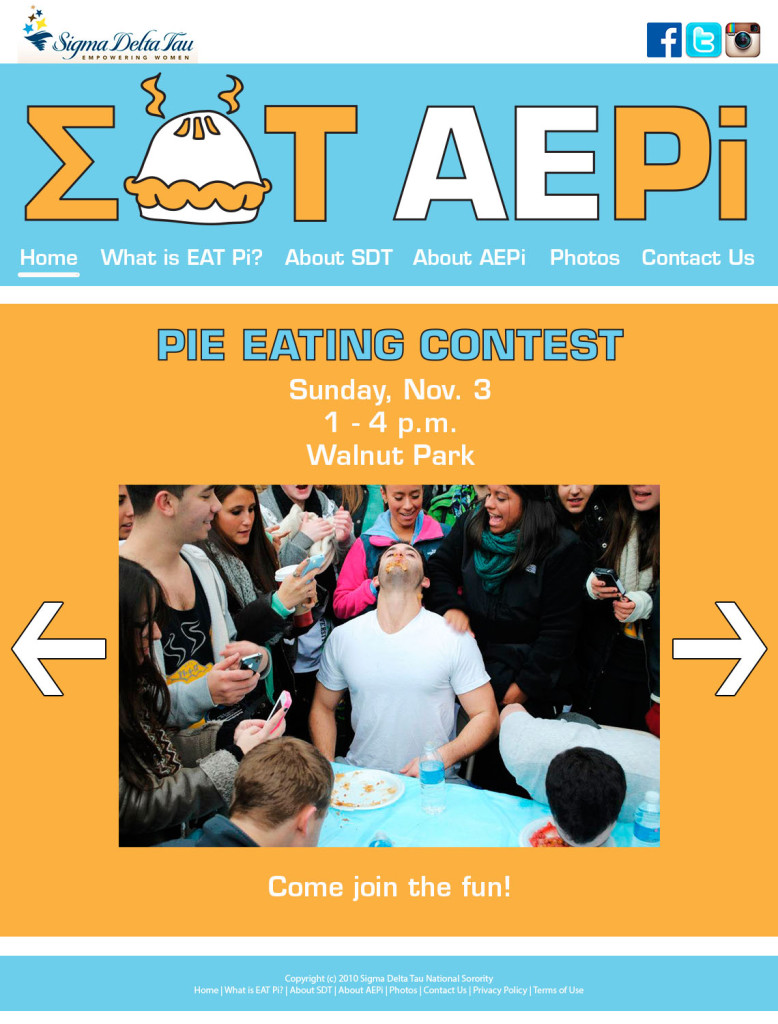
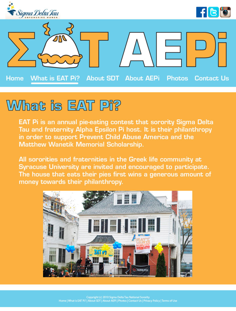
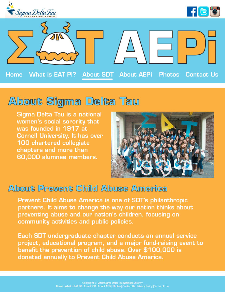
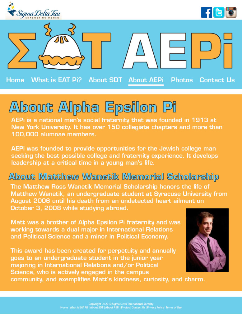
Website (Redo)
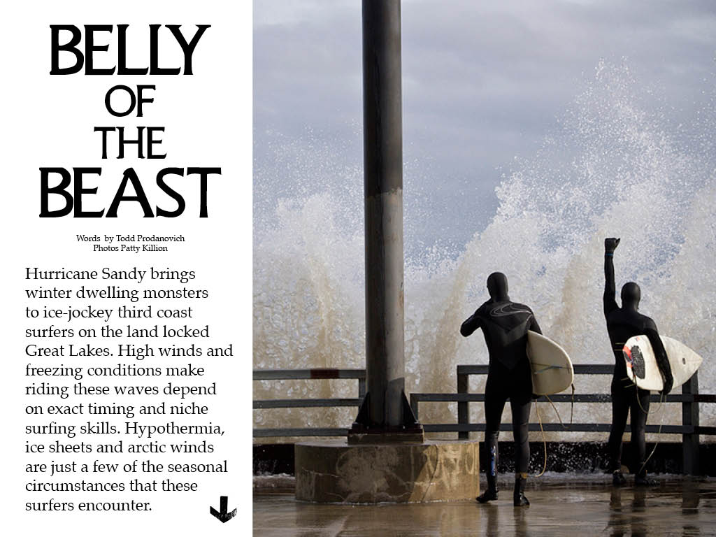
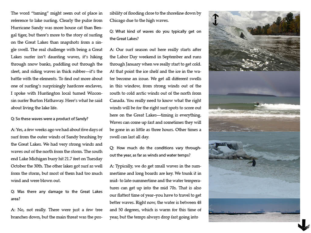
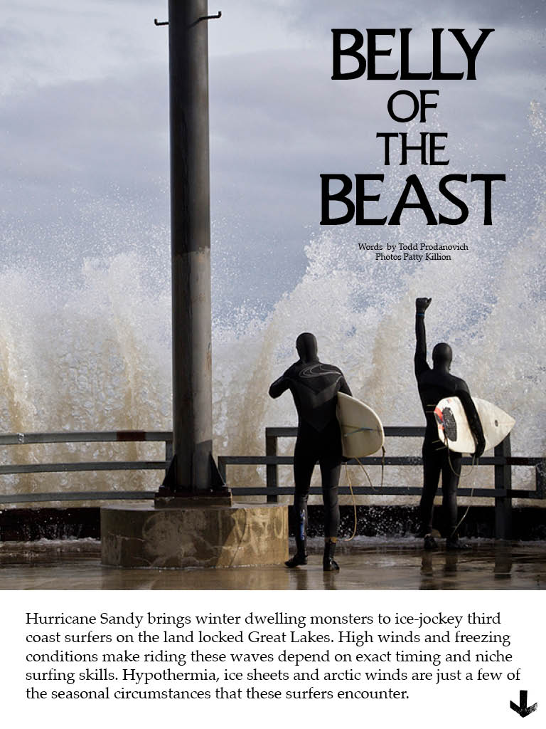
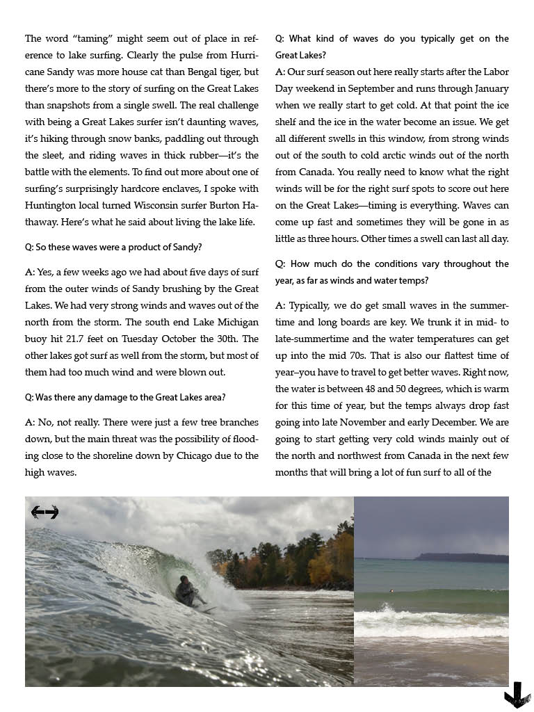
iPad Magazine (floating redo)
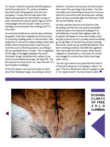
I learned a lot while creating this project, especially how to create interactivity. So cool! I now really appreciate all that magazines do to draw in an audience. There is a lot of work that must go into the story, the photography, and the design process… and then they must convert it to work in different formats. So much work!
Zalkind Tablet Layout





 I learned how vital it is for the visuals to match the written content. My opening page is probably the strongest of the three pages because of the connection. I also noticed how effective continuation throughout the pages in the form of text, colors, and content to pull the magazine into one cohesive unit.


