Author Archives: Yidi Zhang
The Whitney’s Website and Gestalt Principles
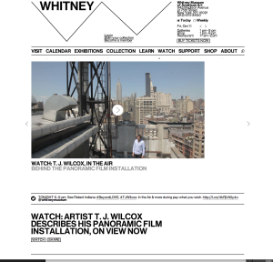
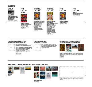
This website was newly published by the Whitney Museum of American Arts. I think it serves as a good example for other museums how to make pages readable and clear. It uses white color as a background and black color for most words, and the visuals are very colorful. Hence, it is such a great contrast that objects can easily stand out. We can see that it groups information well under the “EVENTS” column. Top is dates, middle is visuals and bottom is the name and other information. White space is between each event. Each group of information can be clearly consider as a unity and separate with each other. Regarding visual hierarchy, the website uses the same font but different colors, different sizes, bold or regular, and upper or lower cases. For example, it uses black color, bigger size and upper case for the dates in EVENT column, while uses smaller size and lower case for the events’ names. And it uses grey colors, for the least important information—the time.
Poster
Fashion PR Confidential
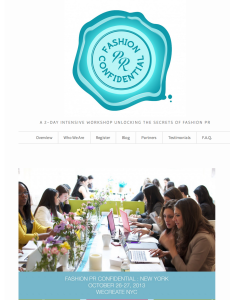
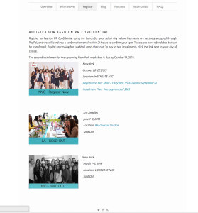
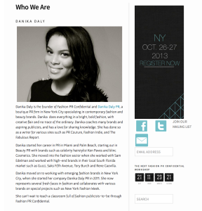
This is a website for promoting a 2-day crash course in Fashion PR in NYC. This is a event website that is similar to our projects, so it is valuable for us to study. I really like this website, because it look bright, simple and stylish. And it is very easy to navigate. Its logo, which is on the top of the home page, is very impressive and can catch people’s attention once they open this website. I think one of the reasons make this website so attractive is that it makes a good use of white color, which occupies most of the space. Also, the color of the logo and the theme color are almost the same. All in all, this website can be a very good example for promoting an event.
Interesting camera
This picture, which was designed by Illustrator, is interesting. The major tool for this picture should be pen tool, and texture effect. The first step may be to create the two hands and the camera. The shape of the hands and the camera are easy to be created by using pen, rectangle and ellipse tools. And then, we can use different colors to make the figures more detailed and clearer. The next step may be to add some wood grain texture to the camera, and another dots texture to the hands and the part of the camera. The last step should be to rotate the whole image.
Starbucks Typography Poster
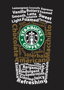
I really like this typography poster designed for Starbucks. It is a very smart design that the words are combined as a typical Starbucks’s coffee cup. The upper and lower words are white color, while the middle ones are brown color that implies the cup sleeve. The typeface of the words should be sans serif grotesque. Creatively, all the words are about coffee, like “Macchiato”, “Vanilla”, and “Foamed”. And the logo at the middle of the “cup” is bright and impressive, which gives people a clear idea that this is a Starbucks’s poster.
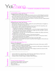
Yidi Zhang Resume
poster of movie Oblivion
I think the poster of Oblivion, a 2013 American movie based on a post-apocalyptic science fiction, is very shocking and attractive. We can clearly see the eroded Empire State Building and the adjacent buildings occupy most of space of the poster. And the white and huge fall, which cascades down between the buildings, overwhelmingly draw our eyeballs. As one reason makes the scene so impressive, the angle of the shot is from the ground to the building’s top, making us feel small and dread. The second reason is that the Empire State Building in Manhattan is very familiar to most of us, so it make us feel shock to imagine such a scene. In addition, the male figure and the “aircraft” not only show the huge comparison between the small figures to the grand and imposing buildings, but also reveal that they are not at the present time, but in the future. The words may be sans serif geometric typeface with a specially spilt design. These thin and white words give us a strong post-apocalyptic feeling, which are very appropriate to the background of this movie. Honestly, I watched this movie right after it screened because I was attracted by this poster. Although the movie was not as good as I imagined, its poster did gain its marketing goal and drew a great amount of people’s attention.
Subway and Flickr
I chose the Subway wordmark for its amazing design. All the letters are upper capital, and connect tightly. These letter may be used Helvetica, which is one of the world’s most widely used typefaces. White, yellow, and green serve as the symbolic color of Subway, and the white and yellow color combination of its wordmark reveals its object—to provide healthy and fresh food for people. The most creative things are “S” and “Y” with the little arrows, relating the meaning of subway.
Flickr is a website that people can upload and share their photograph. The wordmark of Flickr utilizes all lower capital that looks friendly. The blue and pink color combination looks bright and interesting, which can easily attract people’s attention. It uses pink color to make “r” stand out, which stands for “-er”.
I think the common point of Subway and Flickr is the utilization of color. Both of them are good at finding the best color combinations to demonstrate their brands.

