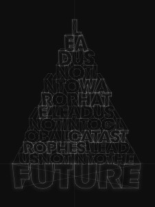
 I was drawn to this typography design because at first glance you see letters constructed into the shape of a pyramid. Looking closer, the letters form words into the phrase, “Lead us not into war or hate, lead us not into global catastrophes, lead us not into into the future.” The words get bigger as the sentence continues, ending with the word future as the largest in the pyramid. This ties in with the overall look of the type, the letters being formed by constructive lines, as if they could actually form a 3D object. Also, having the black background and clean cut white lines seems futuristic.
Author Archives: Emily Capobianco
Resume
Week 3 poster design
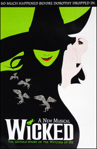 This is not just one of my favorite broadway shows, but one of my favorite posters. The aesthetic of Elphaba the bad witch and Glinda the good witch fitting together to create one image shows the idea of how these characters were once allies. The contrast in black and white counteracts this though and shows the good and bad characters, white being good and black being bad. Also, the big title and not much other text doesn’t overwhelm the viewer. The text font used for the title, being almost a gothic design, represents the eeriness of the play and mirrors the actual word “wicked.” There is not too much color so you are not overwhelmed, and the way the negative space reflects the green in Elphaba’s face is very cohesive. Overall, this simple but thought out poster truly reflects the aesthetics of the play.
Wordmark
 This wordmark is entertaining because it first captures your attention with the classic bright red color. The all capitals create a powerful look, but keeping it simple with the plain text. The O is a play on the word morningstar, meaning the sun, and it is rising from the bottom of the word line like the sun would rise in the morning. The alteration of the shape of the O also adds to the sun reference. While being simple it is a creative word mark.
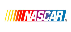 This iconic wordmark is very identifiable. First off, the slant of the letters gives you the feeling of motion, which represents the cars of Nascar. The overlay of the text on the colored stripes show the motion by a transition of color, and transitional color makes your eye move across it giving more motion to the wordmark. Also the different widths of the stripes help your eye start from the left and move right. In addition, the kerning between the letters varies, and connecting some of the letters gives more fluidity. This all gives speed to the wordmark.

