
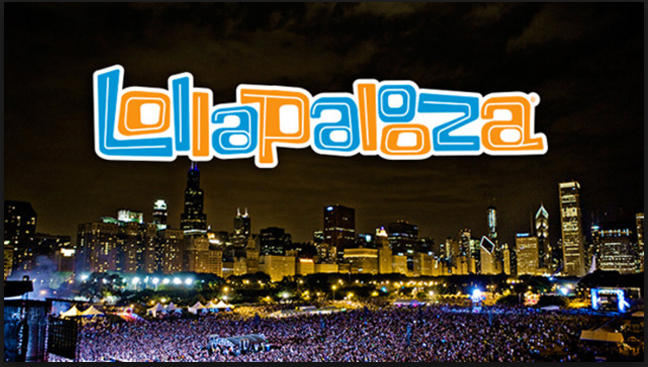
The Lollapalooza logo for the United States version of the popular music festival event is loud and fun. The clashing orange and blue colors make the letters pop and the stacked double “o” toward the end of the word force our eyes to take the extra split second to appreciate the artwork. The wordmark represents a good time, a party. Setting it in the visual center over the Chicago Skyline adds to this effect. Studying this poster close almost makes you want to nod your head as if you were in the festival. The warm whites and yellows of the skyline illuminates and contrasts the deep blue and purples of the crowd below drawing further emphasis to the wordmark on top. Everything about the poster screams crazy wonderful fun.

The typeface on the Jeep wordmark is simple but bold. It gives off a rugged and masculine impression to sell the idea that its cars are meant for tough outdoor use. Although this example of the wordmark is green, it is not uncommon to see different colors utilized, generally black or a darker blue. These deep and strong colors reinforce the outdoors aspect of the car and play to the manly, working class man.
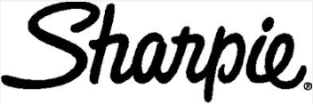
the Sharpie wordmark is designed to appear as if it was written by an actual sharpie. The letters appear to flow uniformly to right as the eye carries across the word. This also highlights the handwritten aspect. The “h” and the “r” appear to have been created by two separate marker strokes. The capital “S” and the lowercase “p” are the only letters that do not connect to the following letter. It is easy to see the way in which the “p” was written, a downward stroke retraced up to form the round section in a clockwise stroke.