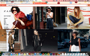
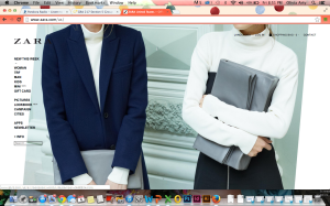
I have always been in awe of Zara’s website. It is so simple and modern. The minimalism in it makes it very easy to navigate through the website and it also intrigues me to keep looking the website. The website does an excellent job of showing Zara’s culture, and the style that the company is trying to portray. However, my one complaint is that the side bar get s a little lost.
Author Archives: Olivia Arty
Poster Critique
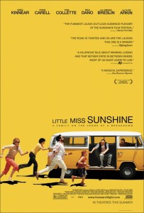
This is the movie poster for Little Miss Sunshine, and I’ve always found it to be really intriguing. First, the bold yellow background ties in perfectly with the movie title and is definitely eye-catching. The picture of the at the bottom of the poster also is very interesting and does a very effective job at catching people’s attention, and does a great job at portraying how the they’re a family “on the verge a breakdown”. I think my favorite part of this poster is the fact that the movie tittle isn’t all the same size. This really helps balance the action going on at the bottom left of the poster and the lack of weight on the bottom right. On this note, the poster designer did a phenomenal job understanding and incorporating the “Z” principle, because my eyes always follow that motion each time I look at the poster. I do find it awkward how heavy the poster is at the bottom, but I think that was intentional since the family in the movie is awkward and dysfunctional. All in all, I find this a very effective poster because not only is it appealing to the eye but it communicates very well, and makes you want to go see the movie.
Wordmarks
The Marc Jacobs logo has always been one of my favorites. It is so modern, clean and elegant. I find that it really represents the contemporary style of the brand. Furthermore, I find the loose curning to be very appealing to the eyes, and I also love how the type is all caps. This logo really embraces the concept that less is better.
This logo is also very similar to Marc Jacobs. I tend to like very modern and sleek designs. I love the play on the word generation and how it’s attached to BCBG, I find it very creative. In addition, the use of the small caps gives the word generation just enough attention without distracting the consumer from the original brand name.


