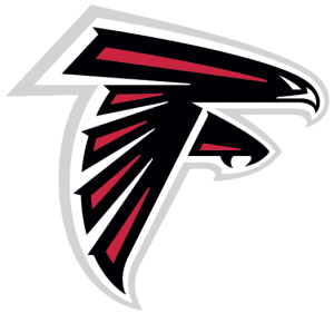
This fine piece of artwork was made with the pen tool. I’m also pretty sure the artist used multiple layers while making this. One separate layer for each color, and one for the shape of the white beak and eyes. It’s made with straight lines and bezier curves. It’s a straight forward layout, but it embodies the strength and power of the mighty Atlanta Falcon. If I were to recreate this, I wouldn’t. It’s already perfect.
Category Archives: week4post
Vivaciously V
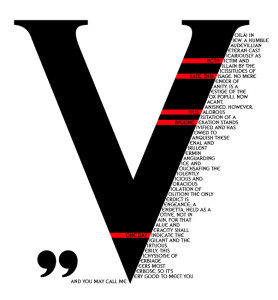
V for Vendetta is another cinematic favorite of mine, and this poster brilliantly utilizes the main character, V, and his famous speech in a visually appealing way. The large V takes up most of the space on the page, because V’s vibrant character is the main player in the movie. Because his speech uses words that start with V to emphasize the creativity of V’s character, this visual is stunning in its use of the starting V as the main V for all of the words in his speech. The red and black color scheme are his standard colors, for darkness and blood, but it allows for a pop of color against the dark black and white contrast. Also, the letter V is very balancing and captures the eye wonderfully.
Hamburger Ingredient Typography
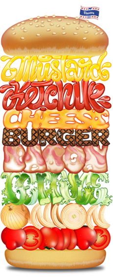
This hamburger design primarily relies on its typography. The sorts of typographic elements that make it stand out are the different typefaces that spell out the different components of the hamburger. The typeface of the each ingredient is the correct color, texture, and look of the actual ingredient itself. This allows the word to accurately resemble the ingredient that it’s representing. I think that this design is very effective.
Week 4 Blog: Typography
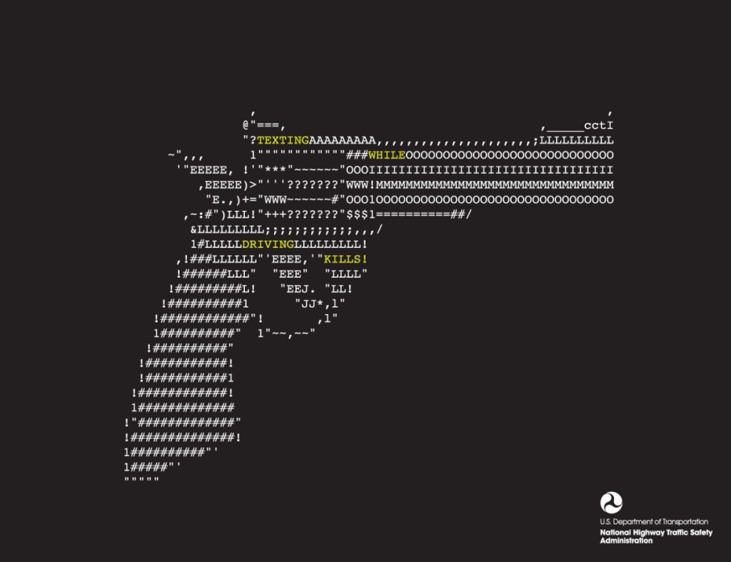
This design solely relies on typographic to create this image of a gun. The purpose of this graphic is for public service announcement, raising awareness for the danger of texting while driving. By creating a shape of a gun through face found in regular phone while texting, it allows viewers to create the realtionship between the gun (and its associated values such as violence) and texting in the car.
Starbucks Typography Poster
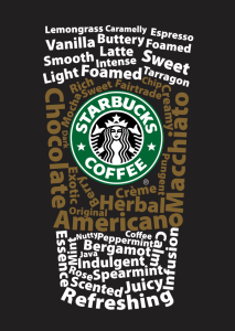
I really like this typography poster designed for Starbucks. It is a very smart design that the words are combined as a typical Starbucks’s coffee cup. The upper and lower words are white color, while the middle ones are brown color that implies the cup sleeve. The typeface of the words should be sans serif grotesque. Creatively, all the words are about coffee, like “Macchiato”, “Vanilla”, and “Foamed”. And the logo at the middle of the “cup” is bright and impressive, which gives people a clear idea that this is a Starbucks’s poster.
Bauhaus?
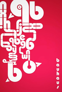
I’m not even sure what I’m looking at, but I love the way the letters are arranged. They create a maze like object and it leads you all around the image. I was drawn to this typography because of the use negative space. It’s heavy on one side, but I like the asymmetrical balance, it adds to the maze-like design. I think the color scheme is awful. I hate it. But other than the terrible colors I think this is a solid piece.
Apple Blog 4
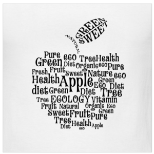
I really like the typography, arrangement and spacing on this t-shirt design. I like the way that the words make the shape of an apple. The word apple is the biggest in size and stands out the most, which makes sense because all the other words describe aspects of apples. The typography works really well on this design because the curly letters add to the element of the curved outside lines of the apple. Overall, the typography is fun and the arrangement of words is clever.
Week 4 Blog Post
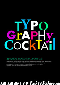
This design really stands out. Use of different typefaces and colors adds tremendous playful elements to it, making viewers link the playful design to the cocktail event unconsciously, which I believe is very very smart. Also, the designer chooses different sizes for each letter, making it even more lively. It’s fun to look at such design, as it spurs your imagination.

