TWLOHA
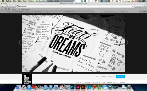
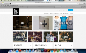
To Write Love on Her Arms is a campaign designed to allow anyone to express themselves as the wonderful individuals they are. TWLOHA aims to help people who are struggling with depression, addiction, self-injury, and suicide. Photography has always been a large part of this website, specifically because images of self harm, in any form, were used to encourage this sort of harm by others, and TWLOHA tried to be the movement to stop that. The black and white color scheme, and image at the top of the page, serves to provide a striking contrast to the world of color that we live in. Sometimes, dealing with any type of harm, can be seen as black and white, and the color that brightens a day has to be found by one’s support system – the point of this movement. The rest of the pages throughout this website are coded to an image, and the images have something to do with that specific page.
Inbody Redo
photography in website
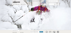
Patagonia is such a great company… and their website reflects it. Their homepage features spectacular photographs that take up the majority of the page. The photograph depicts people wearing their clothing while out exploring. Their clothes are made to be worn outdoors while performing arduous activities. This specific photograph exemplifies that their clothing can stand up to harsh conditions the person puts it through. It also is perfect for this time of the year when people are preparing to buy apparel and gear for winter season sports. It is a beautiful quality photograph… it has a nice white background which allows for the bright pink jacket to stand out… it also uses the rule of thirds… and the ski pole leads our eye to the Patagonia jacket.
Photography in Webdesign
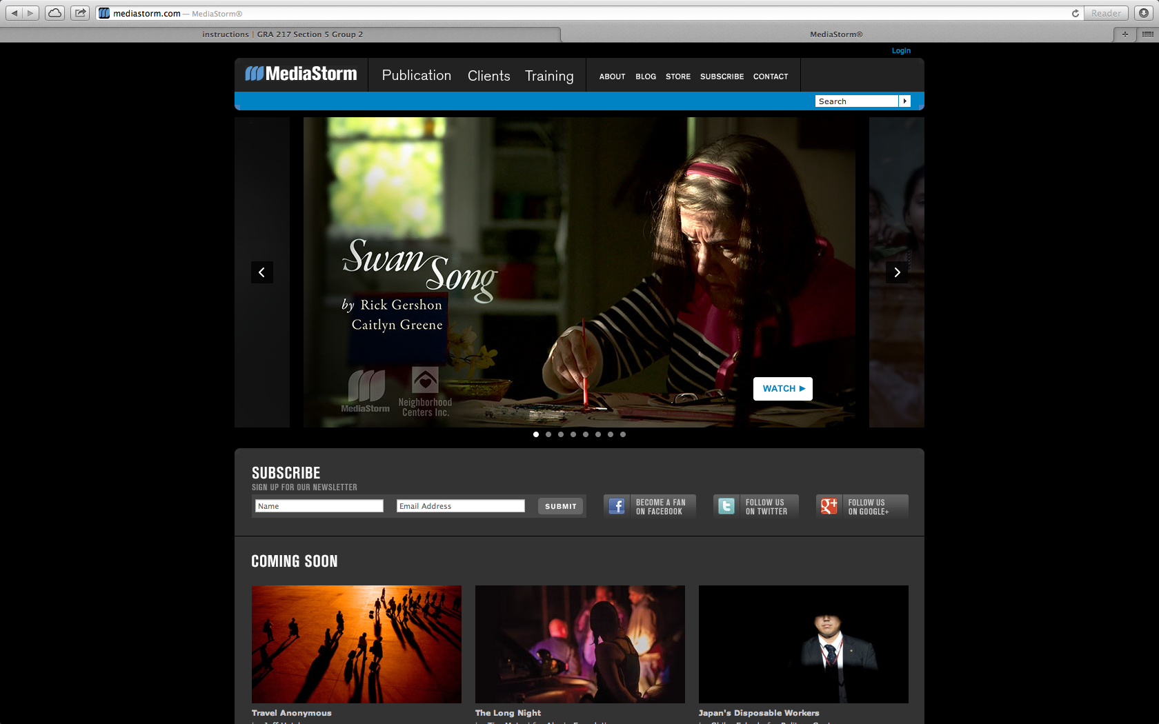
I chose Media Storm as a ideal site that uses photography to draw in an audience. The website is a place to display media and showcase photography. Here they use a key frame to draw the audience into the site and click on the video to see the story. The audience is for everyone, but probably mostly for other content creators to see what others are doing in the field. In this case the key frames in the videos are actually the bulk of the content making it user friendly and easy to navigate.
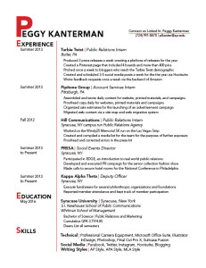
resume redo
Resume Redo
Photography in Web Design
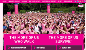
This is the Avon Cancer Walk website. The target audience of this website is anyone who wants to join the walk to raise money for a cancer cure. The image used on the homepage of the site is successful because it shows the emotions of the walkers and cancer survivors. It also shows depth with how deep the photo goes, making apparent all of the people who attend and support. The photo also supports the color scheme of the site (pink) and the words underneath the picture. The relationship here is meant to express “we survived cancer,” with hands in the air and happiness.
Redo Resume
Photography in Web Design
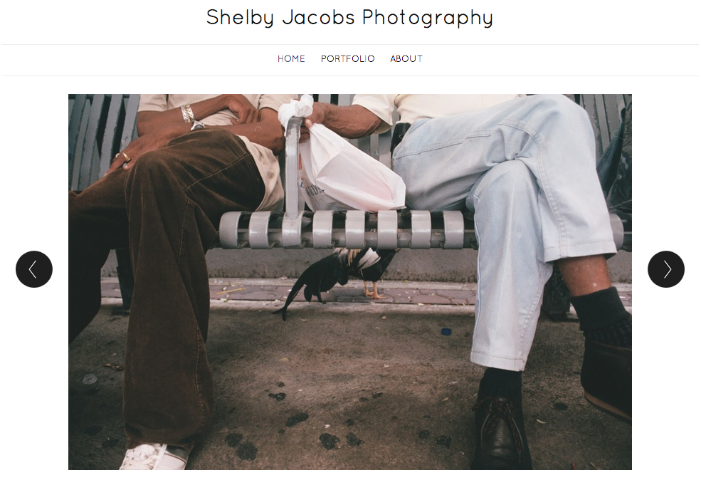
The large photo here was used as a visual element to effectively communicate with its viewers. Since this is a portfolio of Shelby Jacobs’ photography, the target audience of this is anyone who is interested in photography. She choose this particular image because it was simple, but could be interpreted in multiple ways. She also addressed a relationship between two people. According to Professor Taylor, showing relationships between people in photos is very important because it helps the viewers relate to the image. Additionally, I really like how the photo is taking up most of the space on the page. According to Bruni’s article, big photos sell! I also like how she used dark text over a light background. It helps the text stand out to the viewer.


