Headline: Beyond the Sling
Deck: A real-life guide to raising confident, loving children the attachment parenting way
http://www.pinterest.com/pin/39969515416497857/

Headline: Beyond the Sling
Deck: A real-life guide to raising confident, loving children the attachment parenting way
http://www.pinterest.com/pin/39969515416497857/
Headline: Don’t Miss a Beet
Deck: Tips for buying, storing, and cooking with beets, which are in season in November.
Retrieved from: http://www.bonappetit.com/columns/in-season-now/slideshow/buy-store-cook-beets/?slide=1
Headline: Marvel at the Possibilities
Deck: This year’s Comic-Con in San Diego gave Marvel fans plenty to talk (scream) about. The next three years are action packed with the releases of Thor: The Dark World, Captain America: The Winter Soldier, Guardians of the Galaxy, and Avengers: Age of Ultron.
http://insidemovies.ew.com/2013/07/20/marvel-captain-america-thor-guardians-of-the-galaxy-comic-con/
This headline and deck are featured in National Geographic’s August 2013 issue. I think the headline is clever and does a good job of introducing the article. The deck provides historical and current day information. I believe both the headline and deck catch the readers attention… it did with me at least. The photographs of the sugary goodness are really cool too. http://ngm.nationalgeographic.com/2013/08/sugar/clark-photography
HEADLINE: Out with the Old, In-dian New
DECK: Indian Motorcycle reveals its new 2014 lineup. Harley Davidson better watch out.
http://www.motorcycledaily.com/2013/08/indian-motorcycle-company-reveals-all-new-2014-indian-chief-motorcycles/
Hi everyone, for this week’s blog, you just need to post a well-written HEADLINE and DECK of a magazine FEATURE story. This post is due on Friday at midnight.
You don’t need to comment on others’ posts this week.
For those of you who are doing floating redos, please upload your project to the blog by Friday at midnight.
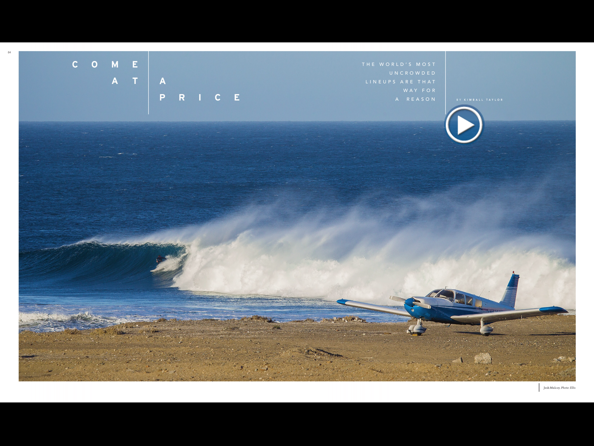
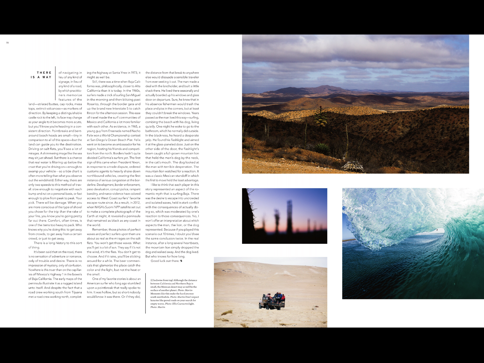
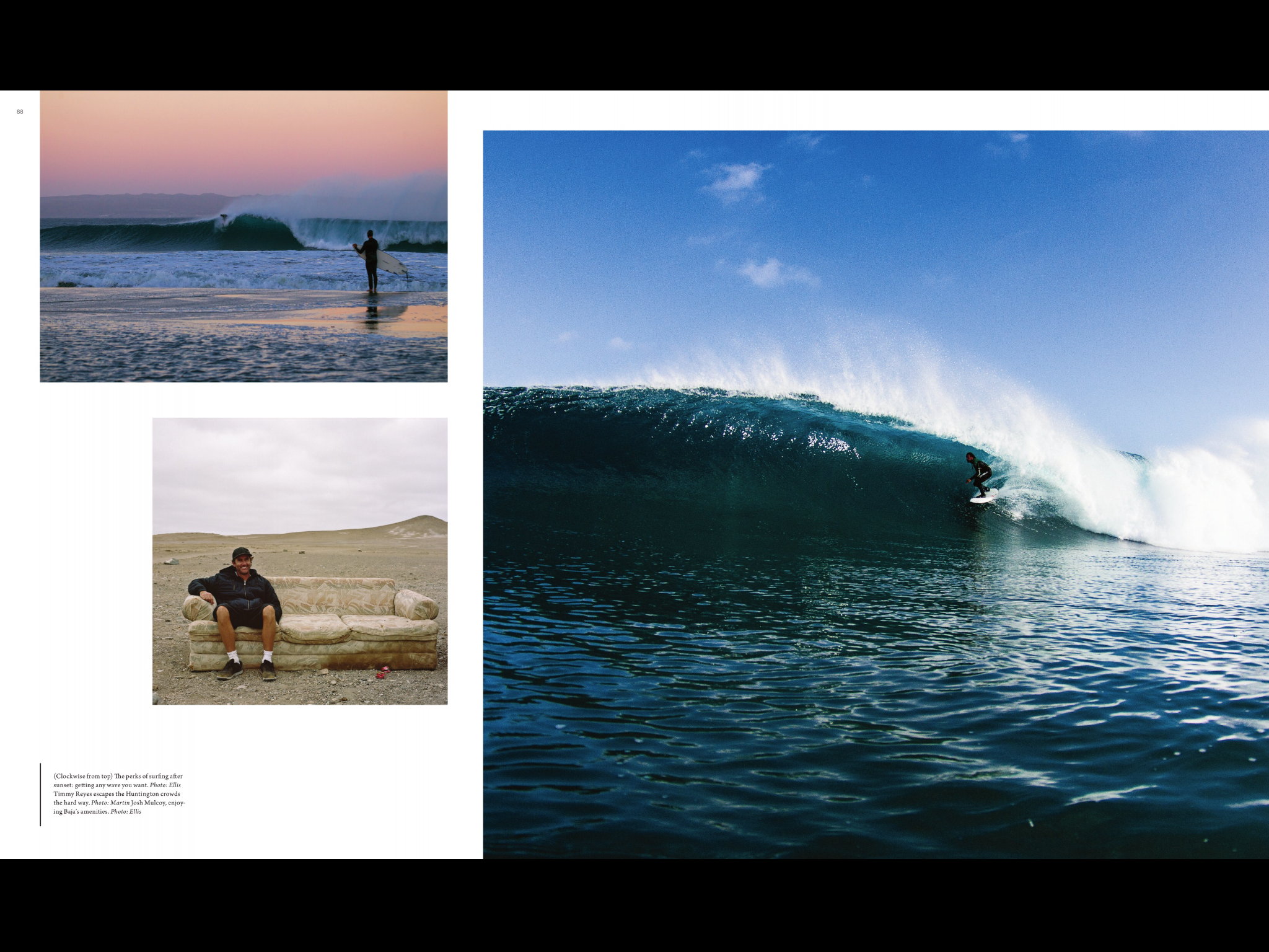
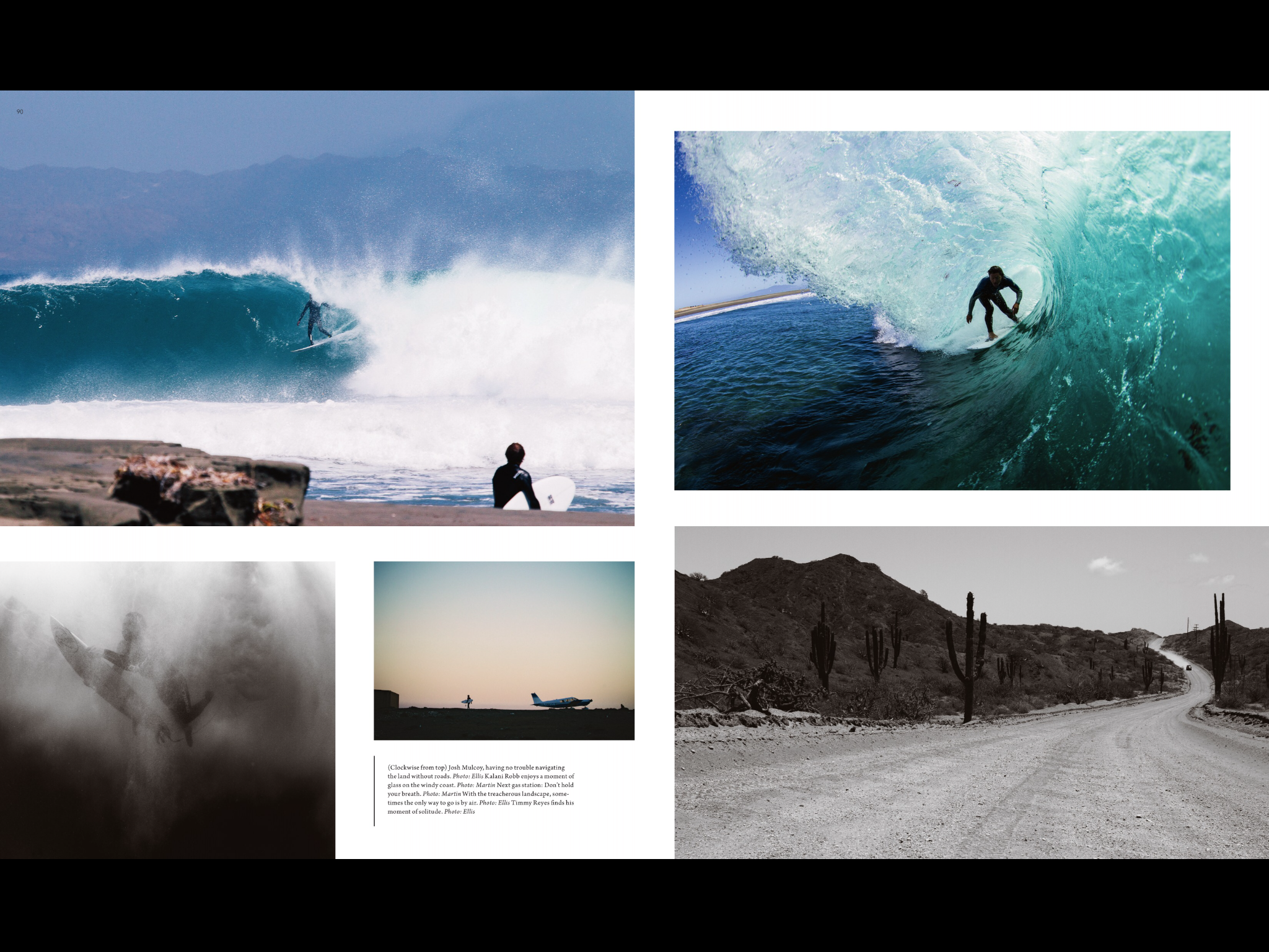
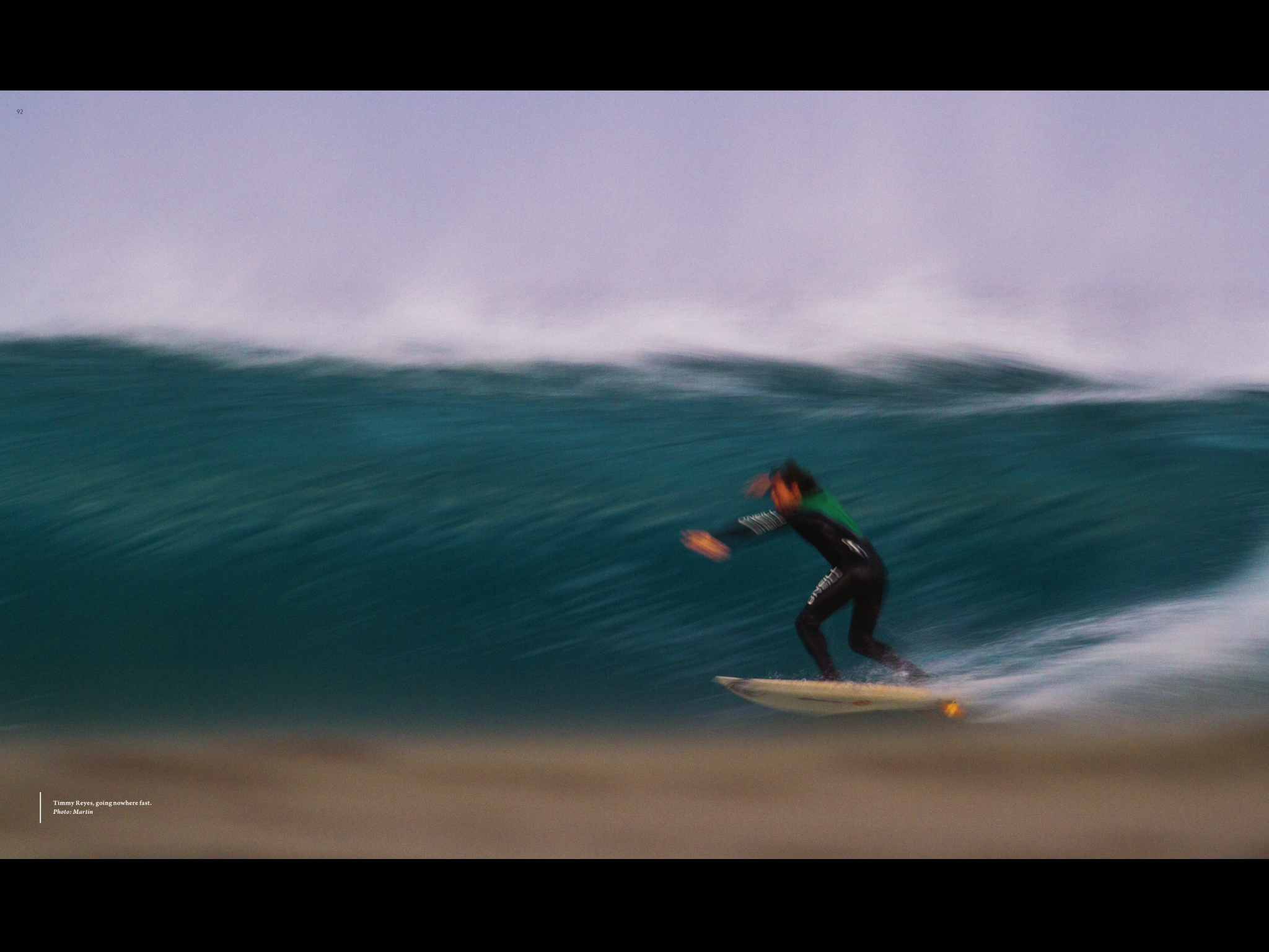 This is an article from Surfer Magazine. I really like this magazines layout because it uses so many pictures to tell the story and it breaks all kinds of rules for magazine layout. Like the center fold is not consistent and so pulls your eye from one page to the next. I also like that they normally put a sweet double truck photo in most of there articles. I also really like the use of color, there’s always a consistent with creating a theme and a feel to each article.
This is a spread from the December 2012 issue of National Geographic. It really utilizes photography in its design. I think it is really hard to convey how tall and magnificent these giant sequoia trees are in a photograph. However, I believe these photos do these trees justice. I like how they open with a full page photograph of the trees. The second page opens to an even larger photograph. The story begins on the third page. They utilize the drop cap and place the story within two columns on each page. The fourth page provides a visual layout of the anatomy of the trees and a map of Sequoia National Park providing facts. I think National Geographic does an excellent job combining the visual and the story in a clear and professional manner. It can be read and understood by anyone.