Author Archives: Nan Ding
Website – Roger Vivier
![]()
Roger Vivier’s website is one of my favorite website. As a fashion website, its very clean and elegant designed. The first page pop up is just its brand name in deep cherry pink in a white background. The wordmark is very elegant and classic which serves well as a fashion brand. The design makes people remember its brand at the first instant.
After choosing the language the customers would like to use, it pops up a funny cartoon video, which is also in red and black. People can choose to skip or watch the video. It attracts the eyeballs but not annoying (because you can just skip it) as well.
After that, you can see the homepage. The website has clear toolbars on the top including news, stores etc. You can find product information, location information, event information very easily just by clicking the titles. All the pages have either videos to help understand and explain the content or 3D cartoons to arouse customer’s interests. It also has some puzzle games to have fun on their website.
Some people complain they cannot shop on RV’s official website. However, personally I believe as a company’s official website, its main function to be promote the brand, introduce the products successfully and arouse customers’ interests. It serves very well. Once the customers have interests in it, they will always find their ways to buy products. This romantic, clean and elegant website is really good to visit.
Illustrator Tool

This is a very easy picture to create in Adobe Illustrator CC. The Ellipse tool under the rectangle tool can be used to create the basic shape of the donut. The gradient tool can create the gradient brown color we see on the donut. Besides, the pen tool can help create the irregular shape of the cream on the donut. Then, again, the gradient tool will fill the gradient pink color on the donut. Pencil tool can be used to draw the sprinkles on the donut. Then, it’s easy to fill in colors, create shadows, copy and paste all these sprinkles and put then in the place the designer would like to be.
WEEK 4 Typography
I really like how typography is applied to this picture.
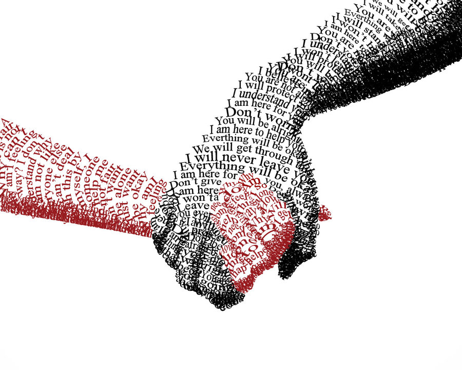
The sentences “You are alright, I am here to help you…” consists of the black hand, which holding the red hand. These comforting sentences give people a reliable feeling and the solid black appear grave and composed. It makes people feel safe when seeing that black hand.
The phrases and words “alone”, ”by my self”, “why people…” formed the red hand, which is held by the black one. These sensitive and incomplete phrases imply loneliness and a desire to be cared and loved. The red shows emergency, highlighting the desire to be cared. The contrast of black and red imply the big difference of two hands. With these two hands holding together, though the picture just simply uses typography, it strongly conveys designer’s ideas.
Resume
Nan Ding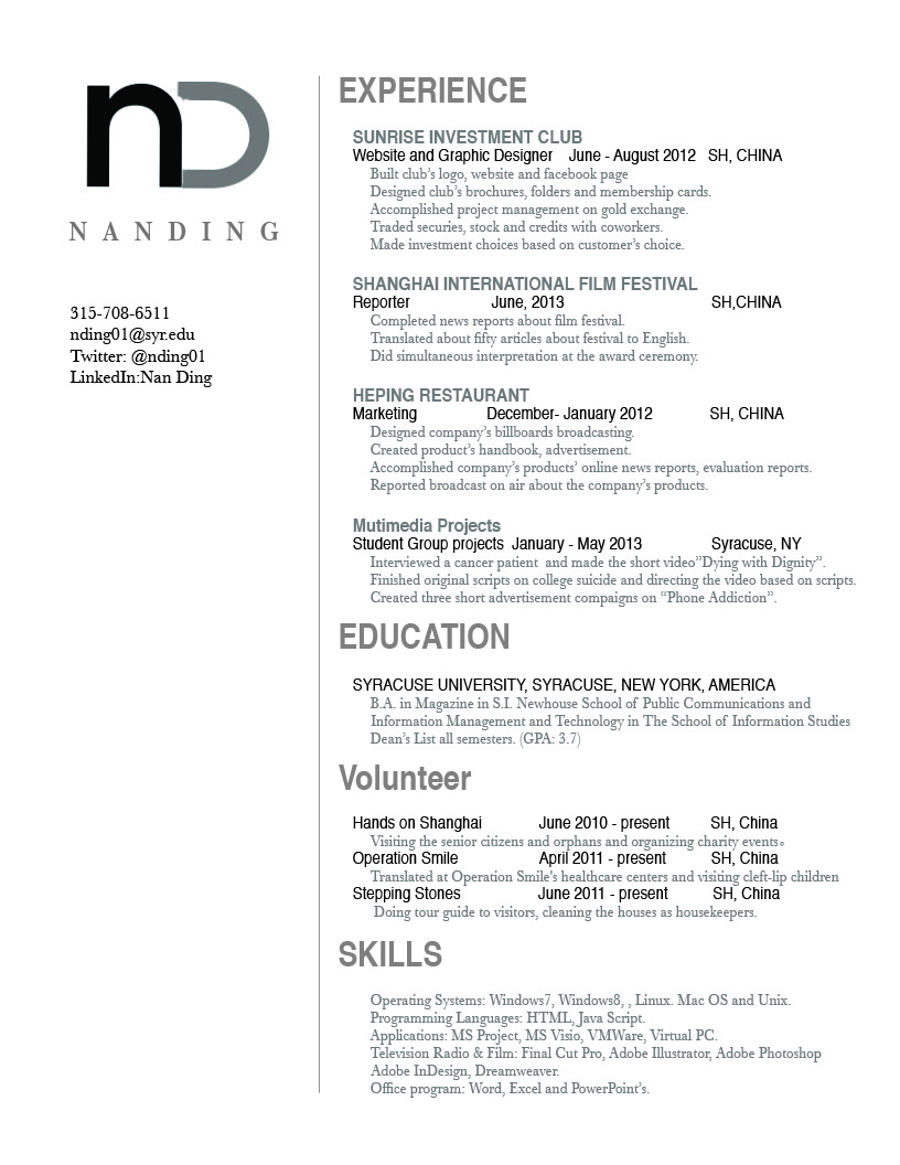
WEEK 2 The Phantom of the Opera

The beautiful poster for Andrew Webber’s opera-adapted film – The Phantom of the Opera – features fabulous design. The mixture of red and black conveys a mysterious, sad and dark phenomenon, which fits the touching but hopeless love in the film. Half of the phantom (the man in the poster)’s face is inside the dark color and the other half is behind the mask. It is just like him in the movie that he always lives in the darkness and hides the true self behind the mask. The light on the girl, Christine’s, face implies that she is the only hope inside the phantom’s life. He wants to touch and own her.
The typeface also fits the poster and the story. Since The Phantom of the Opera talks about a classic love story happened in an opera house back to the 19th century, the classic font fits the story well. The larger size of “phantom” and “opera” highlights the main character and place of the story.
Comments:

Wordmarks
![]()
Like New York Times, The Washington Post has one of the most memorable wordmarks in the news industry. As a news agency of a long history of almost 100 years, The Washington Post enjoys a public image of great reliability. This gothic and old English-like wordmark reminds people of its long history which helps them trust its reputation. This old English like logo also reminds people of some classic novels written in old times. It fits the image of a news agency, which runs the business in writing industry.
![]()
Visa changed its logo in 2006. The company simply capitalizes all the letters and made it all in deep blue. The capitalized letters in slightly italic typeface is very clear and easy to remember. Deep blue color gives people an impression of profession and business. The yellow represents the richness. As a credit card company, it easily builds an image of profession, richness and simplicity by its logo.
My Comments on classmates’ blogs: