Gestalt

Screen Shot 2013-10-10 at 11.30.55 AM


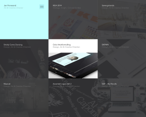
The website I chose is: http://janfinnesand.com/project/oslo-artistformidling. This website caught my eye because of the clean design without having a lot of white space.

Figure and Background: The background on the home page shown above is technically non-existent. Instead, all of the menu items make up the background. When you roll over one of the boxes with your mouse to select it, it turns to full color, like the middle box in the image above. When the one box is highlighted, then it is very clear that this object is standing out and the rest of the boxes that are in grayscale become the background.

Proximity and Alignment/Continuation: The alignment used in this website is very precise. All of the boxes are aligned in a grid on the page to help the user navigate the website. When one of the items are clicked on, the new page shows this menu bar:

Screen Shot 2013-10-10 at 11.45.05 AM

The design of the menu bar helps create unity within the site. Also, when you roll over the above home menu bar, another one scrolls down:

Screen Shot 2013-10-10 at 11.46.38 AM


The repetition of the strong alignment and color scheme help make the website distinct.

Visual Hierarchy: In this website, the colors drive the visual hierarchy. Because all of the boxes are the same size, the website relies on the colors changing when a user rolls over the item to guide the user around the page.

 

Website Design

Screen Shot 2013-10-02 at 6.41.14 PM

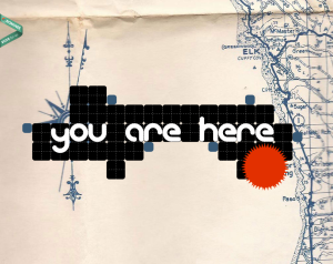
I was immediately attracted to this design because of it’s creative feel. Some of the other websites that I visited were very creative, but also slightly overwhelming. This one clearly features a map in the background that helps the viewer makes sense of the “you are here” graphic. A small critique–the menu did not show up until one scrolls down on the page, and then it is apparent. It was a little confusing at first. But it was also nice that when I did click on one of the menu options, it scrolled down to the section of the screen that corresponded with the menu item. It didn’t open a new page. All of the content is essentially on one really long page. The typeface was also a nice choice to contribute to the creative feel of the website.


Illustrator

http://www.dreamstime.com/stock-photography-image32594052

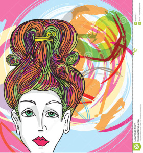
This image would be fairly easy to complete in Illustrator. The woman’s face can be used with the pen tool and making curved vectors and making sure that it’s not exactly perfect so it comes out slightly abstract. These curved vectors can be used for all part of the face. Even the shadows on her face can be made with the pen tool. Her hair can be made with drawing curved lines. The color in her lips and eyes can be used with the paintbucket tool and the color in her hair along with the color in the back are all used with the pen tool and making vectors. The very background color could be made with the shape tool. The colors’ opacity has been altered and the vector shapes overlapped to get a more abstract look.


Typography Post

ikea


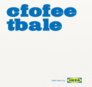
A few years ago, a study came out about being able to read and comprehend jumbled text. Here’s an example from FOX News, too — http://www.foxnews.com/story/2009/03/31/if-can-raed-tihs-msut-be-raelly-smrat/. I thought it was very clever of IKEA to make use of this trend in one of their ads. Along with clearly rearranging the letters, the typeface that they used is very effective. It being large and essentially the only thing on the image is eye-catching and makes people stop and wonder what the ad is about. Also, the slogan that is printed on the bottom, “Make Home Fun” goes along perfectly with the message that their use of typography is conveying.

Global Warming Poster

global-warming-awarness-poster-design (3)


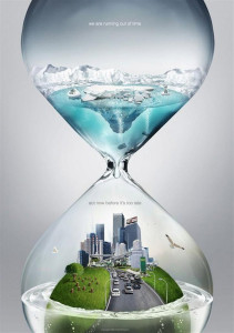
The poster above is dealing with the concept of global warming and the need for people to act now, before we see further consequences. The designer creatively used an hour glass to convey the idea of urgency. By placing the melting icebergs on the top of the hourglass, the water is dripping down onto the Earth and slowly drowning it.

In case the viewer did not understand the message just through the visual aspect of the poster, the designer makes his/her message very clear through his use of typography. By adding “we are running out of time/act now before it’s too late,” the designer eliminates any possibility of the audience misinterpreting the message. The words work well with the visual images because the sans serif typface and using all lowercase letters is a modern approach to a modern problem.

The colors used are effective because the blue and green stand out against the grey background. It seems as though the water turns clear when it drips from the icebergs to emphasis the idea that once the icebergs melt, we can’t get them back.

The poster is effective and does achieve the marketing goals because it is simple, clear and does not confuse the reader with statistics, numbers and terms that the audience may not understand. The only change I may make with the poster design is the background. Although it is effective the way it is, a solid black background may also be affective to enunciate the impending doom that the poster is suggesting.

Week 2 – Wordmarks

1. Five Below

Lowercase and capital letters were used unconventionally in the wordmark above, which initially caught my eye.  The mix of the lowercase and uppercase letters and the sans serif font gives the store a young vibe which is consistent with its target audience–young teenagers looking for cheap buys. The lowercase “o” in the raise position over the “L” gives the viewer a sense that it is the degree symbol, and -5 degrees is pretty “cool.” The store does not sell anything above $5, so the actual meaning of the wordmark is consistent with the store’s mission.

2. JanSport

This second wordmark is a well-known company around campus. In terms of the kerning, because the letters are all connected and bold, it gives the name strength, which is an important attribute for backpacks that are often heavy. Dropping the “J” and “S” down further than the rest of the wordmark separates the words and makes it easier for the reader to recognize the name. JanSport’s mission states that they are interested in “the discovery of fun, freedom and adventure.” As their mission, including “sport” in their name is beneficial because it attracts sporty, athletic people that are also keen on discovering new things and going on adventures.

Sarah Graham