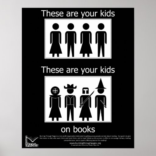
I like the design of this poster because it is straightforward and to the point. There is no elaborate typography or coloring to convey a message. Instead, the designer of this poster decided to use basic images to convey the message that reading is fun and makes children use their imaginations. Therefore, parents should encourage their children to read more.

I think this poster in particular drives home the point that graphic design doesn’t always have to consist of elaborate typography with gradient coloring and fantastic pictures. Sometimes the simpler the design is, the better and more effective it is. I don’t feel that here’s any need for improvement with this poster because it hits the nail on the head upon first glance – reading is fun; reading is engaging; kids should read more. The design and the message are so clear that children and adults alike can understand it.

Global Warming Poster

global-warming-awarness-poster-design (3)


The poster above is dealing with the concept of global warming and the need for people to act now, before we see further consequences. The designer creatively used an hour glass to convey the idea of urgency. By placing the melting icebergs on the top of the hourglass, the water is dripping down onto the Earth and slowly drowning it.

In case the viewer did not understand the message just through the visual aspect of the poster, the designer makes his/her message very clear through his use of typography. By adding “we are running out of time/act now before it’s too late,” the designer eliminates any possibility of the audience misinterpreting the message. The words work well with the visual images because the sans serif typface and using all lowercase letters is a modern approach to a modern problem.

The colors used are effective because the blue and green stand out against the grey background. It seems as though the water turns clear when it drips from the icebergs to emphasis the idea that once the icebergs melt, we can’t get them back.

The poster is effective and does achieve the marketing goals because it is simple, clear and does not confuse the reader with statistics, numbers and terms that the audience may not understand. The only change I may make with the poster design is the background. Although it is effective the way it is, a solid black background may also be affective to enunciate the impending doom that the poster is suggesting.

POSTER CRITIQUE

37495093452_eJPwYwMp_l

Out of all the different posters I looked through this is the one that stood out to me the most, both visually and conceptively.

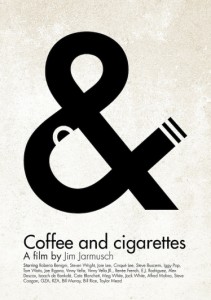
The simplicity and cleverness of the poster is what makes it stand out. By visually representing both coffee and cigarettes in the & symbol, the poster conveys the essence of the film to the general audience, which according to IMDb is a “series of vignettes that all have coffee and cigarettes in common”.

I think the designer had two reasons for picking black and white for the color of the poster. One is that Coffee and Cigarettes is shot in black and white, so by choosing those colors he or she stayed true and inline with the film’s visuals. Another reason for reason is that the white resembles the color white walls will eventually turn if someone is constantly smoking near them.

The title Coffee and Cigarettes is perfectly matched up with the visual elements. The coffee cup is aligned with the word coffee, the & symbol with the word and, and the word cigarettes with the visual cigarette created by the large typography. The visual is clean and to the point. I would not change anything with this poster. The design makes it clear that it is a poster for a film. It also engrains the title of the film into the viewers mind while illustrating an important theme in the film at the same time.