Monthly Archives: October 2013
Photography in Web Design
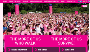
This is the Avon Cancer Walk website. The target audience of this website is anyone who wants to join the walk to raise money for a cancer cure. The image used on the homepage of the site is successful because it shows the emotions of the walkers and cancer survivors. It also shows depth with how deep the photo goes, making apparent all of the people who attend and support. The photo also supports the color scheme of the site (pink) and the words underneath the picture. The relationship here is meant to express “we survived cancer,” with hands in the air and happiness.
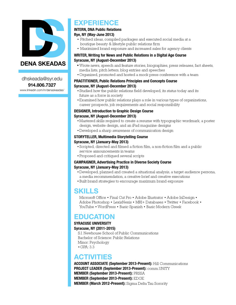
Redo Resume
Photography in Web Design
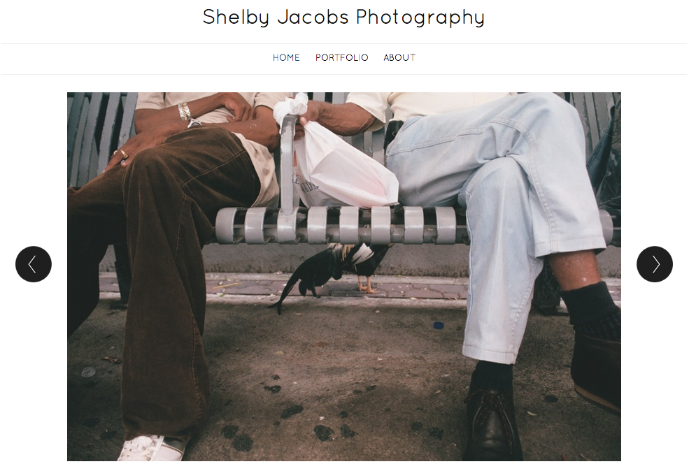
The large photo here was used as a visual element to effectively communicate with its viewers. Since this is a portfolio of Shelby Jacobs’ photography, the target audience of this is anyone who is interested in photography. She choose this particular image because it was simple, but could be interpreted in multiple ways. She also addressed a relationship between two people. According to Professor Taylor, showing relationships between people in photos is very important because it helps the viewers relate to the image. Additionally, I really like how the photo is taking up most of the space on the page. According to Bruni’s article, big photos sell! I also like how she used dark text over a light background. It helps the text stand out to the viewer.
Resume (Redo)
New Resume
New Resume
Photos in web design
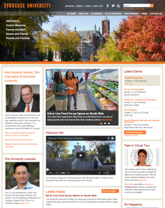
This is the homepage of Syracuse University’s official website. Photos are used very effectively on this page. The big picture in the header shows the current season in Syracuse, giving readers a sense of what the place SU sits looks like. Also, the picture blends greatly into the navigation bar. Pictures on the left side are also very effectively used, considered the text information it provides. Headshots in those pictures are clear — the background is blurred, making the subjects popping out. Also, picture in the main section also looks great — the photo is sharp; it has rich colors in it, which makes the photo look fun and interesting. It also relates closely to the story it is covering.
Sweet Picture by Sweet Basil
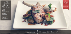
The photo on this website was used to give the viewer a sense of the restaurant. It is apparent by the appealing visual presentation, that the restaurant serves upscale food. The target audience is people who can afford and are willing to pay for an expensive/luxurious meal. The designer chose this image to entice the viewer to make a reservation and come to the restaurant. The visual works really well with the content on the page as well. The bone on the lamb points to the navigation and directs the viewer’s eye to the information about the restaurant. The footer is appropriately placed below the edge of the plate. This is an excellent use of a photo background; I know I found the food very enticing.
Blogging Assignment: using photos in web design
This week, you need to post a screenshot of a website and explain how photos were used as a visual element to effectively communicate with the viewers, or add depth into the overall design. What’s the target audience of the website? Why did the designer choose this particular image? What’s the relationship between the photos and other contents? Read this excellent article before you get started.
- Deadline for this blog post: Friday 11:59 pm.
- Please also upload a JPEG of your new resume by Friday at 11:59 p.m.
- Deadline for two comments on your classmates’ web design blog post : Sunday 11:59 p.m.
- Those students who are doing floating redo for the poster project, please upload a JPEG of your poster by Sunday at 11:59pm.

