A Booming Web Design

Screen Shot 2013-10-02 at 9.42.00 PM


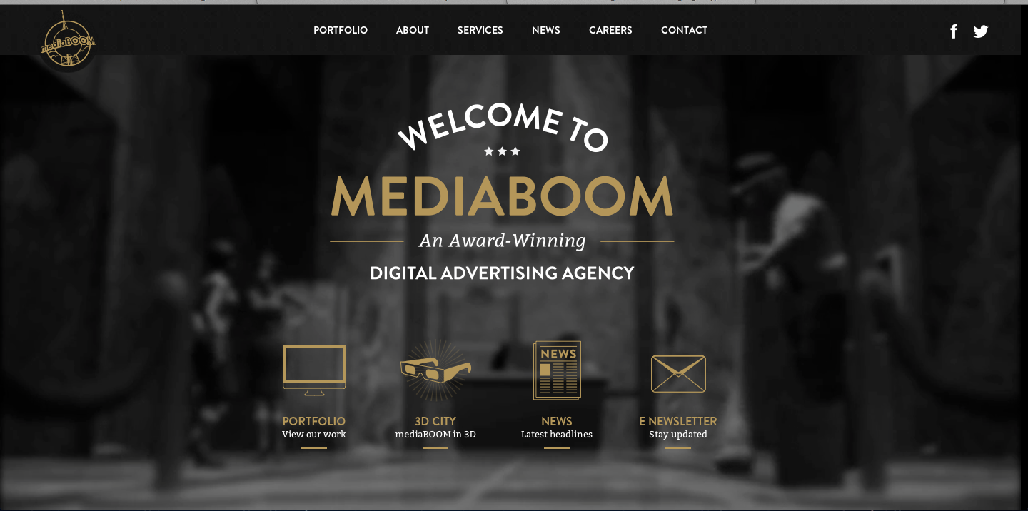
I really love this website design. The darkness of the background contrasts excellently with the white and gold colors used for the type. I also really like the way the overhead lights in the background frame the type on the page. It looks as though the lighting comes from the tabs at the top and then as it shines down and widens its scope of light, the type on the rest of the page fills up that lightened space. I also approve of the way the picture is blurred in the background; it allows the viewers eye to be focused on the clear type of the page.

I find the visual hierarchy on this website design to be very effective. My eye naturally focuses first on the largest size type of the most important word, “mediaboom.”The san-serif typeface is easily readable, and layout of the type is playful and interesting. The links with the visuals at the bottom of the page do a great job of capturing my attention. The visuals allude to the information that will be described on the different pages, and they are neatly organized at the bottom of the page. Overall, I feel this website design is organized and visually appealing.

Niko’s Greek Taverna Website Design

Screen Shot 2013-10-02 at 9.24.21 PM

I absolutely love this website design. It’s clean, appetizing and easy to navigate. The name of the restaurant, Niko’s Greek Taverna, is right there in the top corner. Then, on the navigation bar, there lists home, menu, wine, social and press. These are all links that customers want to have access to before dining at the restaurant. Next, there is a picture flow; the screenshot is stuck on the salad photo, but there are other photos of a fish dish and people happily dining. In addition, on the home page there is a Facebook section, which allows people to “Like” the page right there and even see how many other people “Liked” the page as well. Furthermore, there is the restaurant address and hours of operation, which is super important because it is a common reason why people go to website pages in the first place. Lastly, it does not show on the screenshot here, but there are links to Niko’s Greek Taverna’s Facebook, Twitter and RSS pages.

http://www.nikostaverna.com/


High Performance. Delivered.

Screen Shot 2013-10-02 at 6.35.49 PM

I am very biased in this post, as my parents work here, but whatever. I like Accenture’s website design primarily because of the scrolling visuals that are always present on their homepage – with the clients that they represent and their logo, the accent mark (ahem, hence ACCENTure), moving forward, etc. The links to different aspects of the website are clearly defined, and contrast with the colors of the backgrounds they are on. Red is a warm color, thus standing out to whoever is viewing the page. Also, at the bottom of the screen, there are short snippets of information as the “latest news” section of the homepage. Not included is the very bottom of the website, which includes social media such as Facebook, LinkedIn, Twitter, YouTube, Google+, an RSS feed, podcasts, blogs, and much more. It’s a very clean design, emphasizing the modern and advanced nature of the services one could get by working with Accenture.

Interesting camera

retro


This picture, which was designed by Illustrator, is interesting. The major tool for this picture should be pen tool, and texture effect. The first step may be to create the two hands and the camera. The shape of the hands and the camera are easy to be created by using pen, rectangle and ellipse tools. And then, we can use different colors to make the figures more detailed and clearer. The next step may be to add some wood grain texture to the camera, and another dots texture to the hands and the part of the camera. The last step should be to rotate the whole image.

Week 5 AI techniques

hope-poster-78907e8fea9d1b5a9649277c760828ae15c7b024-s6-c30

This is a poster of Obama’s 2008 presidential campaign. The poster is designed by Shepard Fairey. The artist used several layers to introduce a 3D effect. Tools the artist could’ve used include paint bucket, filters (to transform the texture from photo-alike to sketch-alike). The major steps for producing this poster would include setting multiple layers with each in different color, filtering, and using paint bucketing.

Marley’s World

Bob Marley

This illustration of Bob Marley is made with a black background then layers and layers of colored geometrical shapes placed on top of each other. The layers are necessary to get the overlap of shapes and to create the angles that emphasize the details of Marley’s face. The only circular area of this illustration are Marley’s eyes, but aside from this, this entire picture could have been created using both the pen and shape tools. By using white in the middle of Marley’s face, the artist has created the illusion of light shining from the aside which makes the entire piece look more three dimensional despite the hard angles and modern design. What I like most about this piece is the way the artist used all different shades of green, yellow, red and orange which is very indicative of Bob Marley and the way he has always been publicly portrayed. Even with the harsh sides and angles of the shapes emotion and personality still shines through Marley’s eyes and face in general which I think is well done considering the design of the illustration.

Week Four Post – Illustration

This illustration of John Lennon was made using a combination of the pen, brush and gradient tools. When making illustrations like this you have to use multiple layers and change the stroke on the lines to get the nice shapes and harder edges that make this illustration work. What I really like about this one is the expressionistic use of color the artists take on how the light hits the subject. This piece was probably a trace from a portrait of Lennon, but I could be wrong. Either way avery nice piece in my opinion. johnlennon

Atlanta Falcon

299

This fine piece of artwork was made with the pen tool. I’m also pretty sure the artist used multiple layers while making this. One separate layer for each color, and one for the shape of the white beak and eyes. It’s made with straight lines and bezier curves. It’s a straight forward layout, but it embodies the strength and power of the mighty Atlanta Falcon.  If I were to recreate this, I wouldn’t. It’s already perfect.

Adobe Illustrator Rock Out

adobe_illustrator_tutorials_27

In order to create this artwork on Adobe Illustrator, the designer selected a horizontal document. Then, the designer took a photograph of the man singing, and inserted that photo onto the document. In order to create the shapes, the designer probably used one of two possible techniques. One, he or she used the symbols tool and dragged the loop symbols onto the document. The other option is that he or she used the arc tool to make the arcs of the loops. Next, the designer used the shape tool to make the circles. After the designer had all the symbols and shapes in the desired placement, he or she filled them in with different colors using the swatches library. Lastly, in order to create the shading in the some of the circles, the designer most likely went to ‘Recolor Artwork’ and added black or white tint.

Adobe Illustrator Artwork

artwork_flickrmap

This is an infographic created using Adobe Illustrator. I found this infograph from a Adobe Illustrator tutorial website. This is definitely a very high-level difficulty work that requires lot of knowledge about the program to make it. However, if I were to guess what the designer have done to create this project, The first thing I can think of is setting up the three-dimension grid, based on the  three dimensional rectangular platform. Also, one would have used the pen tool to create figures like houses, trees, train station, and the beach scene.