Illustrator Techniques: Save Water, Save Life Illustration

savewatersavelife
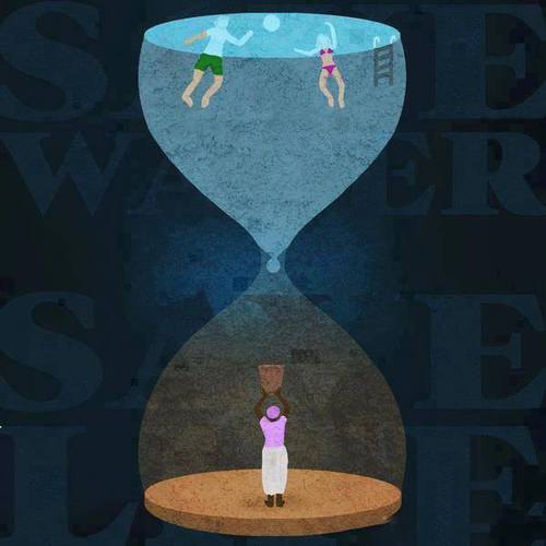
This illustration effectively identifies the disparity in water distribution throughout the world in one clever image. Yet how is it so effective?

In Adobe Illustrator and illustrating in general, perspective is key. Through applying multiple shades of color throughout the image and placing the words behind the illustration, there exists a sort of depth that wouldn’t exist otherwise. It is also important to note the figures within the hour glass and even the hour glass are simplified. There is very little detail in the shapes, but the shapes are recognizable. Most if not all of the shapes involved in the illustration can be created through utilizing the pen tool. There are other tools such as the gradient tool that can also provide shadow or a sense of light progression which can be seen in the faint aura behind the drop of water.

The most effective illustrations are not complicated yet discuss an intricate, complex idea. A simple hourglass is transformed into a potent metaphor of the water crisis that the world is facing.


Illustrator Inception

Inception-Movie-Poster-redesigned

This poster is a simple design that is really effective for the movie Inception. The visual uses the pen tool, the direct select arrow, and the color bucket in the creation of these figures.  If I were to produce a similar illustration, I would draw one of the figures with the pen tool, and then I would make duplicates of the figure. Next, I would use the direct select arrow on each duplicate to change the hairline a bit, and the paint bucket to change the color. This poster is simply designed yet it is clever and creative.


Simplicity is like a Box of Chocolates

tom hanks

Another personal favorite (sorry guys for all of the movies). This is probably one of the simplest designs on Illustrator anyone will find. The park bench, where Forrest tells his story, is central to the movie itself, without being one of the scenes to capture his life story. The pen tool is obviously used to create the straight lines of the park bench, and none of the curves of the pen tool were used because it simply was not necessary. This poster is simple and straightforward and captures Forrest’s simple attitude towards life effortlessly. Go pen tool.

Vivaciously V

v for vendetta

V for Vendetta is another cinematic favorite of mine, and this poster brilliantly utilizes the main character, V, and his famous speech in a visually appealing way. The large V takes up most of the space on the page, because V’s vibrant character is the main player in the movie. Because his speech uses words that start with V to emphasize the creativity of V’s character, this visual is stunning in its use of the starting V as the main V for all of the words in his speech. The red and black color scheme are his standard colors, for darkness and blood, but it allows for a pop of color against the dark black and white contrast. Also, the letter V is very balancing and captures the eye wonderfully.

Hamburger Ingredient Typography

Screen Shot 2013-09-20 at 11.16.54 PM

This hamburger design primarily relies on its typography. The sorts of typographic elements that make it stand out are the different typefaces that spell out the different components of the hamburger. The typeface of the each ingredient is the correct color, texture, and look of the actual ingredient itself. This allows the word to accurately resemble the ingredient that it’s representing. I think that this design is very effective.


Week 4 Blog: Typography

this-graphic-from-the-national-highway-traffic-safety-administration-also-uses-text-letters-to-illustrate-the-consequences

This design solely relies on typographic to create this image of a gun. The purpose of this graphic is for public service announcement, raising awareness for the danger of texting while driving. By creating a shape of a gun through face found in regular phone while texting, it allows viewers to create the realtionship between the gun (and its associated values such as violence) and texting in the car.

Starbucks Typography Poster

826271266470550


I really like this typography poster designed for Starbucks. It is a very smart design that the words are combined as a typical Starbucks’s coffee cup. The upper and lower words are white color, while the middle ones are brown color that implies the cup sleeve. The typeface of the words should be sans serif grotesque. Creatively, all the words are about coffee, like “Macchiato”, “Vanilla”, and “Foamed”. And the logo at the middle of the “cup” is bright and impressive, which gives people a clear idea that this is a Starbucks’s poster.

Bauhaus?

07

I’m not even sure what I’m looking at, but I love the way the letters are arranged. They create a maze like object and it leads you all around the image. I was drawn to this typography because of the use negative space. It’s heavy on one side, but I like the asymmetrical balance, it adds to the maze-like design. I think the color scheme is awful. I hate it. But other than the terrible colors I think this is a solid piece.

Week 4 Blog Post

downloadI enjoy typography that not only is visually appealing but also can display another message. In this case, instead of simply typing out a country name, the typographer arranges variations of the country’s name to form a visual map of the world. The double emphasis of the name and visual representation hammers home the concept of national borders and national identity.


Apple Blog 4

Apple


I really like the typography, arrangement and spacing on this t-shirt design. I like the way that the words make the shape of an apple. The word apple is the biggest in size and stands out the most, which makes sense because all the other words describe aspects of apples. The typography works really well on this design because the curly letters add to the element of the curved outside lines of the apple. Overall, the typography is fun and the arrangement of words is clever.