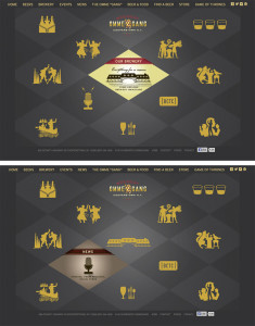
The website for Brewery Ommegang is simple and clean, using the same plaid motif they decorate bottles with, but in two shades of gray to allow other content to stand out in the bold yellow they chose for text and icons. When the mouse is rolled over any of the icons, the diamond containing that icon switches to a colored graphic with more information. Icons are silhouettes of designs used on bottles for each variety of beer they make along with complementary icons to represent the brewery, news, events etc.
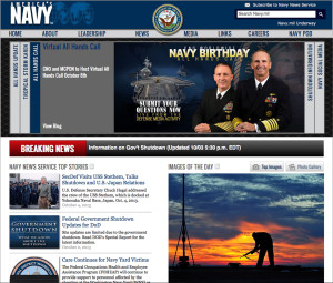
America’s Navy
Website
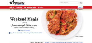
A Wegmans employee, I love this website because it is so easily navigable and is visually appealing. The white background with the red banner (a warm and visually eye catching color), makes this site simple yet attractive. The red banner pops but allows the bar to be visible where all information you’d need to find can be sourced by clicking on the links. Also, as you scroll down the page (not seen here), there are pictures different areas of the store you can click on and social media links, as well. I also like that the front image (of the chicken, here) constantly changes to different meal images, keeping it interesting and appealing. This is a great website.
A Booming Web Design
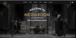
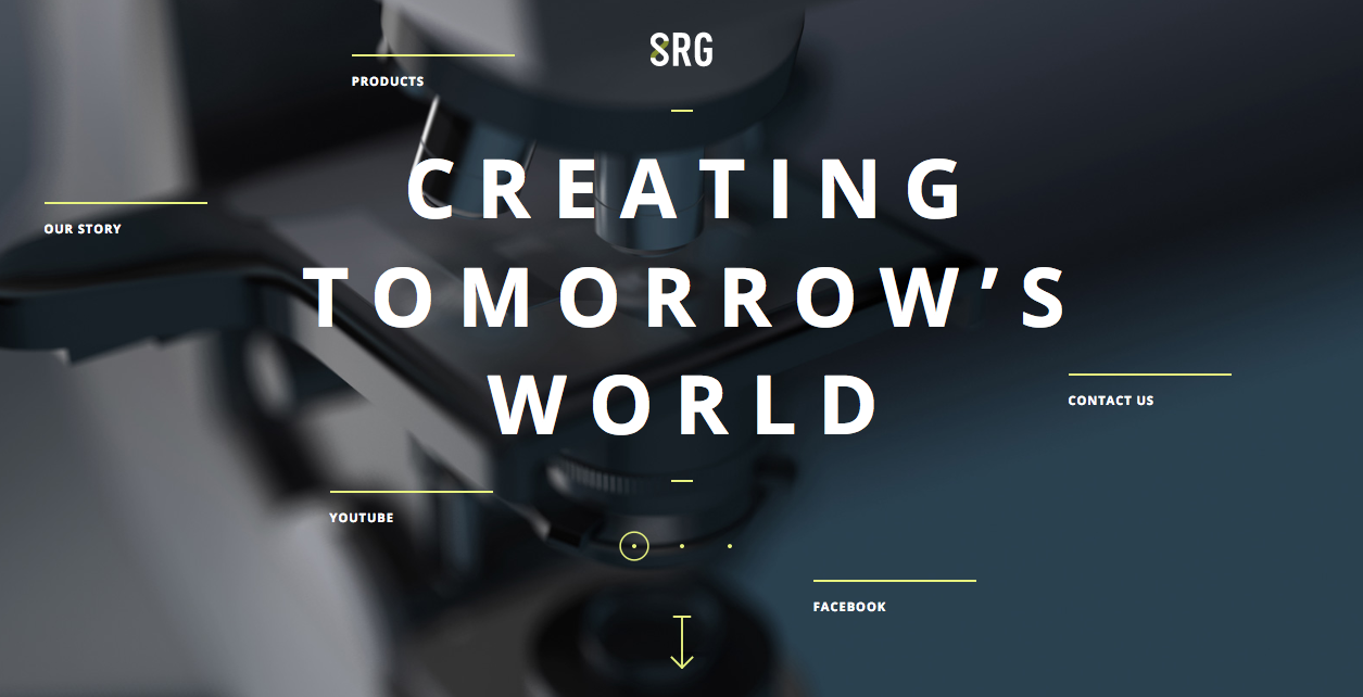
I really love this website design. The darkness of the background contrasts excellently with the white and gold colors used for the type. I also really like the way the overhead lights in the background frame the type on the page. It looks as though the lighting comes from the tabs at the top and then as it shines down and widens its scope of light, the type on the rest of the page fills up that lightened space. I also approve of the way the picture is blurred in the background; it allows the viewers eye to be focused on the clear type of the page.
I find the visual hierarchy on this website design to be very effective. My eye naturally focuses first on the largest size type of the most important word, “mediaboom.”The san-serif typeface is easily readable, and layout of the type is playful and interesting. The links with the visuals at the bottom of the page do a great job of capturing my attention. The visuals allude to the information that will be described on the different pages, and they are neatly organized at the bottom of the page. Overall, I feel this website design is organized and visually appealing.
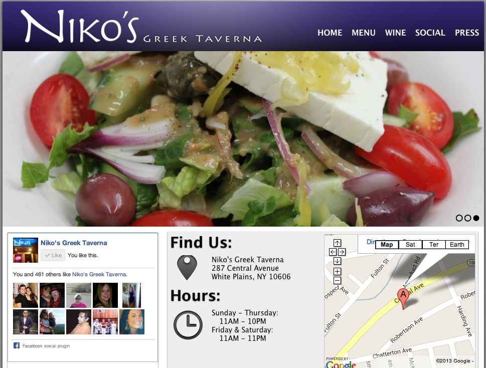
Niko’s Greek Taverna Website Design
I absolutely love this website design. It’s clean, appetizing and easy to navigate. The name of the restaurant, Niko’s Greek Taverna, is right there in the top corner. Then, on the navigation bar, there lists home, menu, wine, social and press. These are all links that customers want to have access to before dining at the restaurant. Next, there is a picture flow; the screenshot is stuck on the salad photo, but there are other photos of a fish dish and people happily dining. In addition, on the home page there is a Facebook section, which allows people to “Like” the page right there and even see how many other people “Liked” the page as well. Furthermore, there is the restaurant address and hours of operation, which is super important because it is a common reason why people go to website pages in the first place. Lastly, it does not show on the screenshot here, but there are links to Niko’s Greek Taverna’s Facebook, Twitter and RSS pages.
http://www.nikostaverna.com/
Web Design
I personally like this web design very much. I think it is a good example of how Gestalt principle (similarity, continuation, proximity, closure and figure/ground) is applied.
For example, through the use of “containers” all in spoon shapes throughout the website, the designer nicely introduces similarities that make the website look very organized. The background color is clean, which makes objects in the foreground stand out. The website also uses very effective visual elements, especially the image of chips whose reflections add huge dimension to it and make it pop out.
I also like the typeface the designer has chosen, which looks really neat, clean and relaxing.
High Performance. Delivered.
I am very biased in this post, as my parents work here, but whatever. I like Accenture’s website design primarily because of the scrolling visuals that are always present on their homepage – with the clients that they represent and their logo, the accent mark (ahem, hence ACCENTure), moving forward, etc. The links to different aspects of the website are clearly defined, and contrast with the colors of the backgrounds they are on. Red is a warm color, thus standing out to whoever is viewing the page. Also, at the bottom of the screen, there are short snippets of information as the “latest news” section of the homepage. Not included is the very bottom of the website, which includes social media such as Facebook, LinkedIn, Twitter, YouTube, Google+, an RSS feed, podcasts, blogs, and much more. It’s a very clean design, emphasizing the modern and advanced nature of the services one could get by working with Accenture.
Blog Assignment: Website Design
This week you need to post a screenshot of a web page and briefly comment on why you like its design.
Here are some web design resources:
- AWWWawards : One of the most prestigious awards for web designers.
- CSS Design Award: An archive of the world’s greatest websites with high level of visual creativity.
- FWA: Favorite Website Awards, an industry recognised internet award program with high emphasis on web technology innovation. FWA is partnering with Adobe and Google for some pretty awesome digital creative programs, such as the Creative Sandbox.
Other interesting ones curated by individuals:
- Minimal Sites
- Unmatched Style
- CSSA
- The world’s best web design : At the bottom of this site’s main page, you can see a huge list of web design galleries and design tools. Check them out if you want.
Hope you can find some inspirations for your own interface project!
Deadline for the post: Friday 11:59 PM
Deadline for two comments: Sunday 11:59 PM
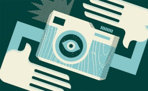
Interesting camera
This picture, which was designed by Illustrator, is interesting. The major tool for this picture should be pen tool, and texture effect. The first step may be to create the two hands and the camera. The shape of the hands and the camera are easy to be created by using pen, rectangle and ellipse tools. And then, we can use different colors to make the figures more detailed and clearer. The next step may be to add some wood grain texture to the camera, and another dots texture to the hands and the part of the camera. The last step should be to rotate the whole image.

