Adobe Illustrator

illustrator_artworks_showcase_57

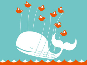
Here’s an image that was created in Adobe Illustrator. The whale could’ve been drawn with the pen tool or had been an original image that was recreated using the trace tool. The same applies to the birds. However, the artist only needed to create one bird and then   the bird could be copied and pasted and mirror flipped to create multiple identical birds. I imagine the waves were created that way as well. This image just involves heavy use of the  pen tool and active paint bucket. I think this is an awesome image, personally.


Typography

typographic_elephant_by_lish_55-d30qrbr

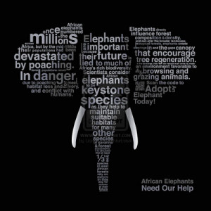
I really like this poster because it uses typography to be informational for a good cause. I think the sans serif typeface was ideal because it makes each word fit its place better. I also think the strategic sizing of different words help to spread more information at first look. It is very clear that the picture is of an elephant. But with ‘elephants’, ‘poaching’, ‘in danger’ and ‘millions’ all written in large letters its very clear what this poster is suggesting that we do. I find this poster to be very creative and effective.


Week 3 Post

Dave-Matthews-Band-Saratoga-Springs-John-Vogl-Postermethwestpalmleft

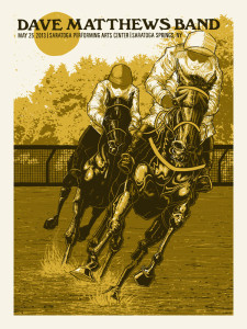
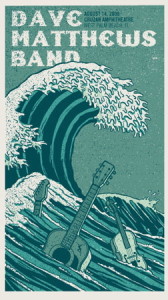
For my poster critiques I chose the concert info posters for Dave Matthews Band. What draws me to these posters is that illustrations are changed to fit the concert venue. For example, the poster to the left has racehorses because the concert was to be held in Saratoga, which is known for its racetrack. The poster to the right has wave because it was to be held in Palm Beach. These posters do their jobs well. Immediately you’re attracted to the picture. Next, the giant Dave Matthews Band at the top. If you’re interested in the concert its very easy to look next to the date and venue written right next to the title. Both posters use a serif typeface that’s easy to read and draws the eye. They both have a very relaxed tone to them, which is consistent with the relaxed feel of the artist’s music.


Week 2: Wordmarks

pinkberry-logo


The first wordmark I chose was Pinkberry’s because its a logo that I’ve always been attracted to. The sans serif typeface makes it fun and easy to read. The colors and simple side logo add a refreshing look. This logo represents the company well because I would want to go get a nice froyo after looking at this.

images

The second wordmark I chose was Tostitos. I’ve always liked this logo because at first glance it seems pretty typical- a sans serif typeface with a bit of novelty thrown in. However at second glance you realize that the T’s and I’s are actually people sharing chips and salsa. Hence, a total representation of the company.