Poster-Slow Food Baltimore (click)
Author Archives: Leanna Garfield
B-Reel
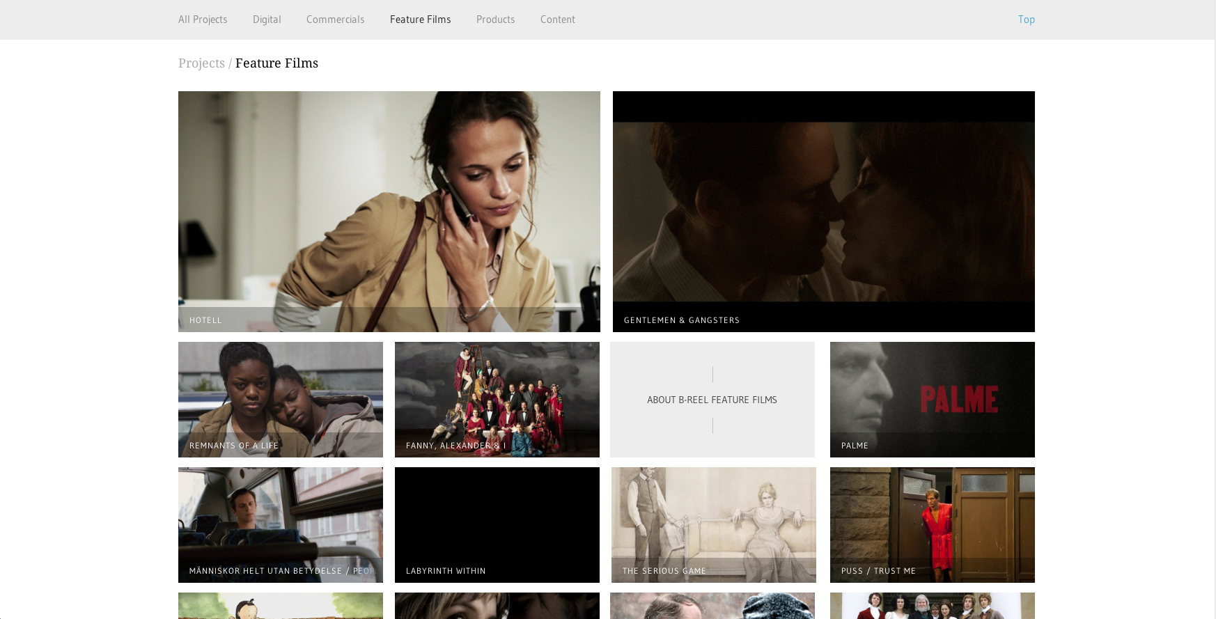
I chose B-Reel, a production company that has offices all over the world and who recently won an AWWWard in design. Since B-Reel produces films, commercials, etc., it makes sense that they would design their website to be extremely image-heavy. They separated their content into pages that are easy to navigate: Digital, Commercials, Feature Films, Products, and Branded Content. Their site is rich with large images, the largest at the top as features, creating visual hierarchy. It’s also a very clean design, making them look credible and professional.
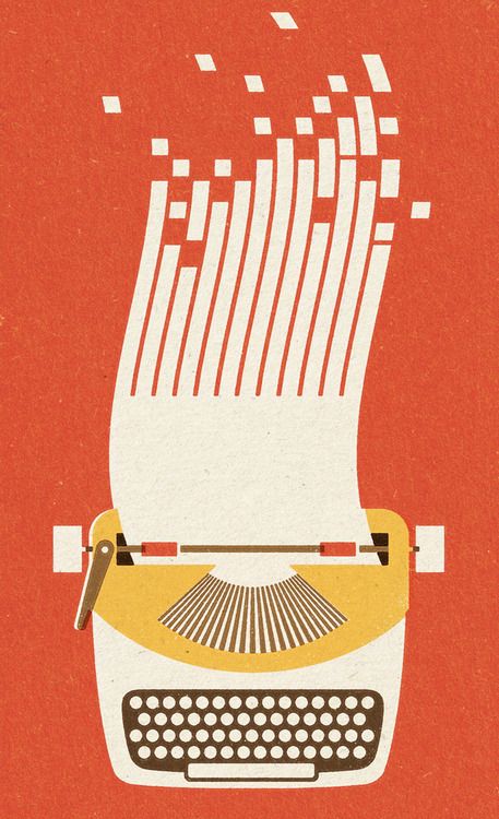
typewriter illustration
For this illustration, it appears that the illustrator may have scanned in some type of textured paper or used a textured paint fill. For the white keys, the illustrator used the shape tool to create perfect circles (the same technique was probably used for the other basic shapes to create the typewriter). For the splitting paper at the top which morphs into data bits, the artist must have used the curved pen tool. For the slanted squares, the illustrator could’ve transformed the squares by pulling on the corners. I like that it is very minimalist and uses simple geometric shapes to create the illustration.
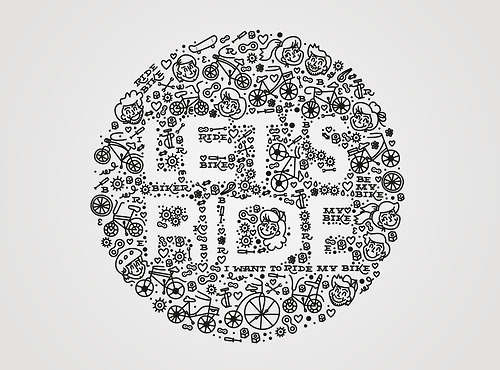
Bicycle Typography
I love that this designer thought to use negative space to form the type. The doodle-like illustrations surrounding the letters give it a playful, childlike feel. Riding your bike has an element of a youthful mentality, and I think this typography executes that very well with the illustrations of children. It’s hard to notice at first, but there’s phrases like, “I want to ride my bike” and “Ride Bike” in small serif type. It’s interesting that the designer included type within the typography, but it works because there’s a contrast between the white and black.
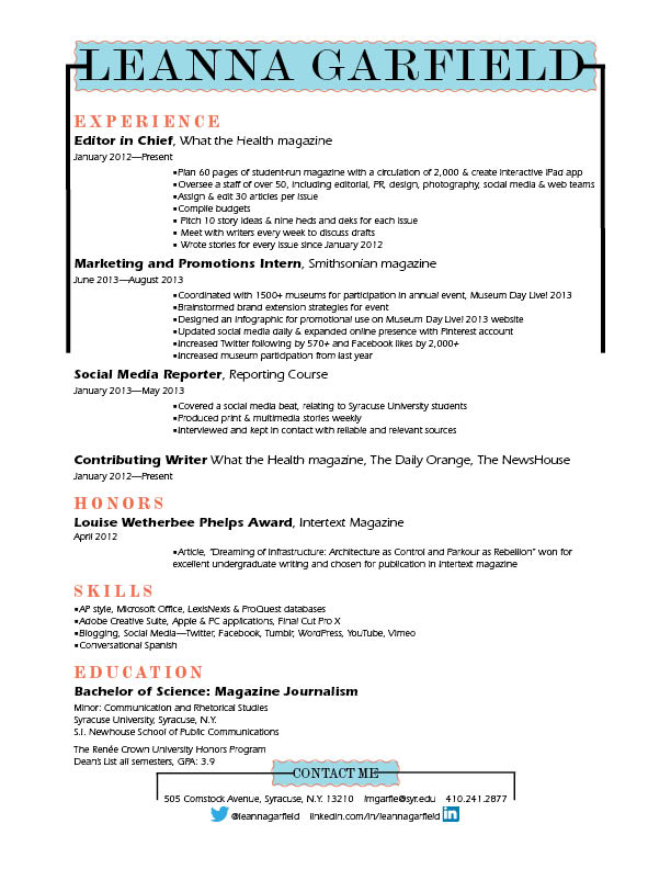
Resume
WWF Posters
 I’m a big fan of Word Wildlife Fund posters. You might need to enlarge it to see it, but all those tiny colorful dots represent “all the world’s tigers.” I thought this was especially effective to their message, because it shows the viewer visually that there aren’t too many tigers left and that we need to save them. I also think this poster works well as an infographic, because it splits up the amount of tigers by region funneling down to South China–where only 20 tigers inhabit. It is incredibly minimalist, which I think makes it also look more modern and striking. The black, bold capitalized “ALL THE WILD TIGERS OF THE WORLD FIT ON THIS POSTER” at the bottom of the page gives it a very ominous tone and leaves the viewer with an empty feeling in their stomach. The design gives the issue and element of surprise and prompts the public to help the cause.
wordmarks to admire
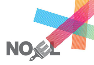
This first wordmark was designed for house painter, Noel Devereux. By rotating the E, part of his name transforms into a paintbrush with colorful strokes extending beyond the margins. Through this playful typographic design, Noel is able to brand himself not only as creative, but also professional. The use of a sans serif font, as well as the juxtapositions of color, give it a modern look.
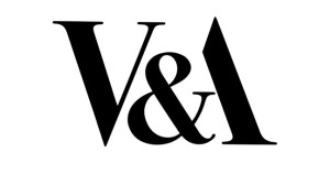
It’s only fitting that the Victorian and Albert art & design museum in London would have an attractive wordmark. I love their use of negative space and how the end of the ampersand fits as the crossbar of the A. It’s a great example of minimalist design, since the rest of the A doesn’t even need to be filled in. The exclusion of color gives the museum an elegant persona, acting as a symbol of status in the art world. I also think the serif font combined with the simple design shows that the museum is rooted in tradition but still understands contemporary art and design.

