Author Archives: Nicole Harris
Website Design
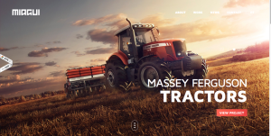
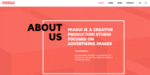
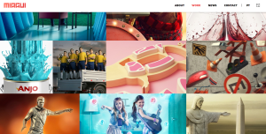
The website I chose was for Miagui Imagevertising, which creates images for advertising. The first thing that drew me to the homepage was its ease and simplicity. The picture of the tractor takes up the entire screen, and the unique perspective and warm, vibrant colors draw you in. Since Miagui specializes in creating images, it is very fitting that the home page of its website relies entirely on images. The white sans-serif text looks clean, fresh and natural across the photo. The only problem I see with it is that some words in the navigation bar (like “contact”) are hard to read against the background. The title of the website, Miagui, stands out in the upper left-hand corner. However, the eye is initially drawn to the featured item, Massey Ferguson Tractors, and the viewer of the site can easily click on the red button to learn more about the project. This feature, combined with the navigation bar, demonstrates the ease of navigation. The menu bar is clean and simple. When you visit a different page, the title in the menu bar switches from white to red. When you scroll down on the homepage, more information about the company appears. This information also relies heavily on images, and includes links to different sections of the website. I also like how the red Miagui color is consistent throughout the website, as shown in the “About” page below. My favorite page on the website is the “work” page (shown below), which is basically a showcase of images created by Miagui. People can scroll down the page to load more images. The design of this page is creative, functional and appealing.
Adobe Illustrator
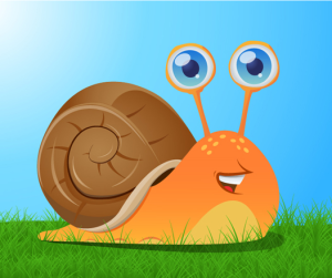
This image of this snail was probably created using a variety of tools in Adobe Illustrator. The basic shapes, such as the orange snail body and the brown shell, were created with the pen tool, focusing on curved lines. The gradient tool was used for the orange fill, since the color is lighter on bottom and darker on top. The ellipse tool created the small yellow ovals on top of the snail, and possibly the larger half-ovals near the grass (these ellipses were just trimmed in half). The pen tool was used for the orange part of the eyes, and the ellipse tool was probably used for the silver and blue part because the circles are nearly perfect. A blue gradient was used in the eyes, and light ovals created by the ellipse tool inside of the eyes create dimension and light. The pen tool was also used to create all of the small details (like on the snail’s shell and its mouth) and the paint tool was likely used to fill everything in. Since the snail was created with Illustrator, it looks imperfect. However, the imperfections make the image appealing.
Week 4: Typography
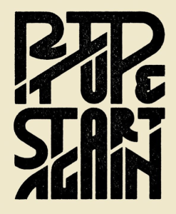
The intricate design on this “Rip It Up and Start Again” poster relies entirely on typography. Many of the letters have double functions and work in two separate words. For example, the “P” works in both “rip” and “up” and the “A” works in both “start and again” Similarly, bottom stroke of the “I” in “rip” doubles at the top stroke of the “T” in “it.” The double functions work because of the way the words are strategically stacked on each other. Instead of being confusing, though, the design is effective because of the white space and kerning. People can tell that the “P” works with “rip” because it is attached to the “I,” but it also works with “up” because of the tight kerning between the “U” and the “P” and the fact that the bottoms of the two letters line up. I also find it interesting how the letters are different sizes and shapes in order to fit together nicely. The white space also clearly separates the words and provides balance, order and a “clean” look. However, the connections between the letters and tight leading and kerning bring the entire design together.
Week 3 Post: National Poetry Month Poster
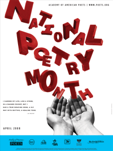
The poster promoting National Poetry Month is creative and unique. The eye is immediately drawn to the large red type displayed across most of the poster, which stands out against the plain white background. The letters look “messy” in a variety of sizes and angles, but this design works effectively for the poster because poetry is supposed to be creative, unique and individual. The letters seem to be floating out of the image of the hands, which connects to how poetry is supposed to flow. The designer probably chose a sans-serif font since the letters would look messy, chaotic and hard to read with added serifs. The sans-serif font also keeps the poster from looking too formal. I like how the rest of the poster is simple – minimal black text in an attention-drawing font with a white background. The black text matches the black-and-white image of the hand nicely, so the hand doesn’t look out of place. Also, the blue box on the bottom of the page provides separation and serves as a nice contrast to the red “National Poetry Month” type. I think the poster does a good job at promoting National Poetry Month and capturing the essence of the event.
Week 2 Post: Wordmarks
The wordmark for Tiffany & Co. represents the high-end jewelry store very nicely. The large serifs and thin letters make the typeface look formal and proper, which signifies the elegance and class of the items in the store. The plain black type, simple letters and uniform kerning between letters also show how the merchandise at Tiffany’s is classic and traditional. Every letter is a capital letter, which draws attention, but the “T” and “C” rise above the others to create a bit of separation.
The wordmark for Little Tikes is very colorful and bold. Since the company manufactures young children’s toys, and since the word “little” is part of its name, all of the letters in the wordmark are lowercase. Red and blue are colors often associated with children, especially young boys, so it seems fitting that these colors were chosen for the Little Tikes wordmark. The bold and unique letters, especially the letter “e,” also give the wordmark a childish vibe. The tight kerning allows the reader’s eye to skim quickly over the company name and allows both words to easily work together as one name.

