Interaction is key

Screen shot 2013-10-03 at 4.11.55 PM Screen shot 2013-10-03 at 4.13.41 PM Screen shot 2013-10-03 at 4.13.22 PM


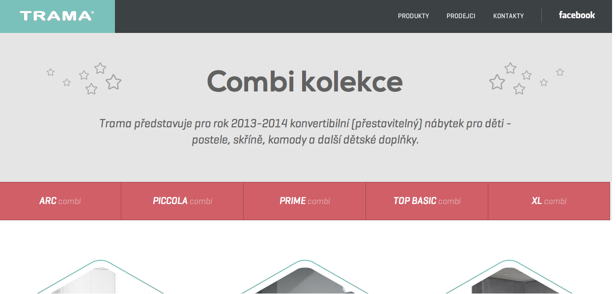
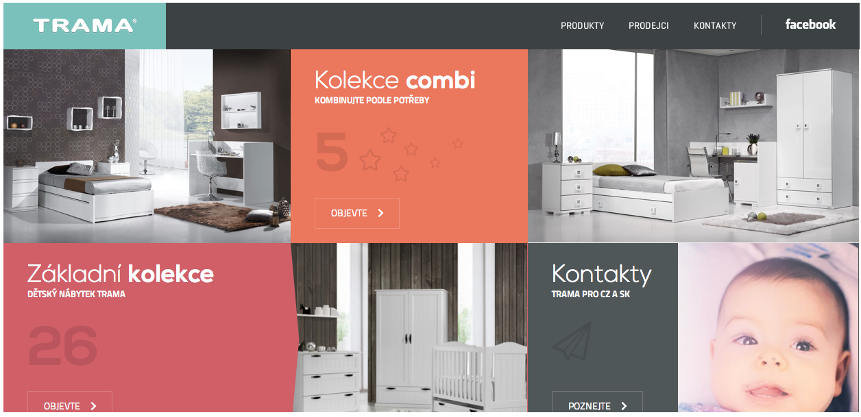
The reason that I chose this website was because even though it is in a different language, it easy really simple to navgate. I was initially drawn to the home page which contained a combination of moving visuals, pictures, and automatic videos. The baby in the bottom left of the home screen is actually in motion when you visit the site. Another aspect that I liked was the color scheme through out the entire website. The organization deals with children, and because of this I felt that the warm colors that were used were appropriate. One of my favorite things about the website overall was the way it allows you to interact with everything on the screen. The hexagons above all twist and reveal a bigger part of the image when you hover over them with your mouse. The website is very interactive and makes it fun to navigate through all of the pages because you never know what is going to happen next. Overall I feel as if this website gets the point across with easy to read type, encompasses a personality of its own, and keeps the viewer interested at all times.

Adobe Illustrator

5732312725_d11f72ca8a

This image was made in adobe illustrator by scanning or uploading a photo that the artist took. The original image is on the left while the manipulation of the image is on the right. The artist used the pen tool to create the outline of the girl as well as various shape tools to create the details. She may have even have used the pencil tool to create some of the small details such as hte dimples in the girl’s cheeks. I am also assuming that the artist used the paint bucket tool to color in the girl’s hair, shirt, skin, and background color. To create the pop art effect, a lot of different steps were taken. First the entire area, such as the skin, is highlighted in the color that the artist wanted the dots to be. Then the effects button is selected. Effects>Phantasm CS>Halftone. Once this is done a box will pop up with a variety of fine tuning options. The artist selected the shape to be a circle, but I do not know what other specificiations she used with this effect to create this image.


Typography

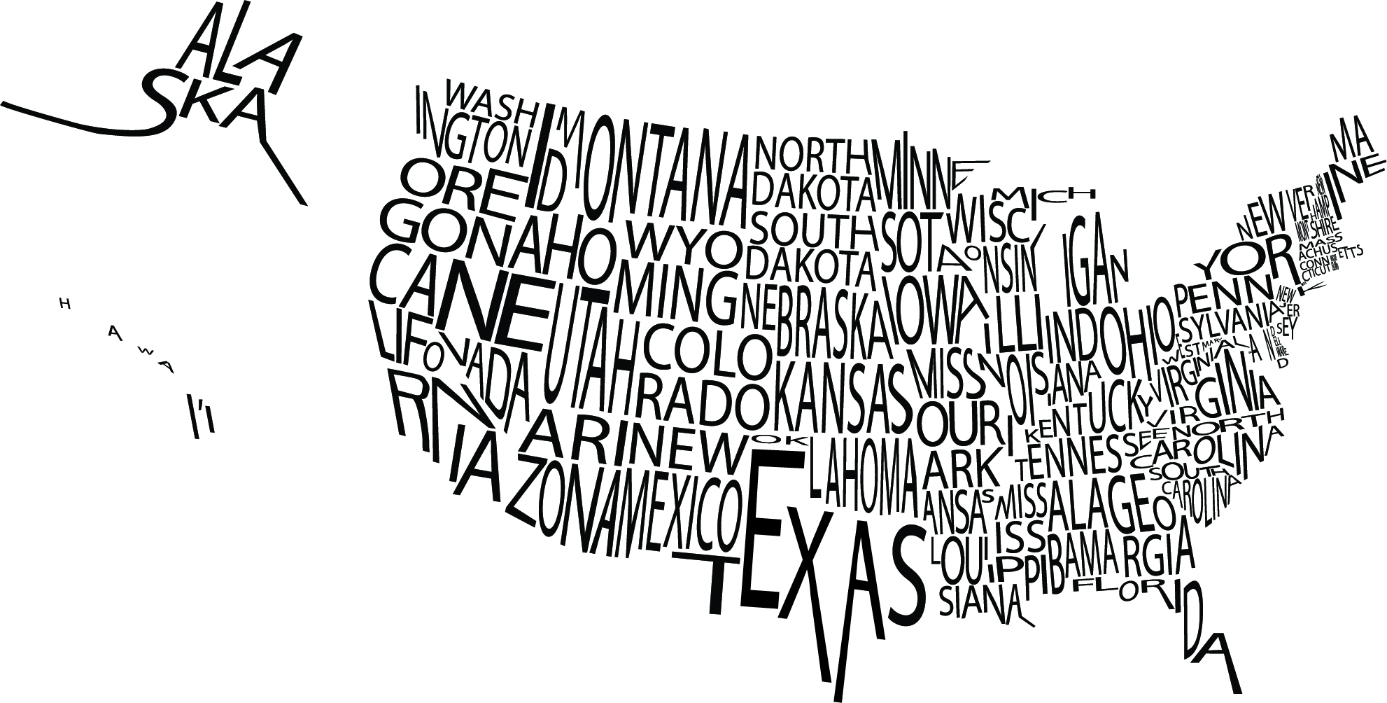
typographic-map-usI was particularly drawn to this image because of the visual image it creates not only with the type, but with the white space as well. The letters in the names of the states are kerned close enough together that the overall image is understood while not making the graphic seemed too squished. If you take the time to actually read each state name, they are all legible which must have proven to be a challenge for the designer.


Power of Words

1995-GENERAL-Amnesty-Inte-003

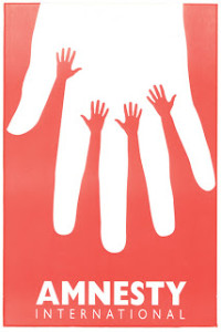
This poster struck me as standing out from all other posters I searched primarily due to its color and white space. The first image I saw was the bigger white hand which intrigued me because I was wondering what the hand represented. After I saw the smaller hands reaching up and the type below the message hit me. The message the this poster conveys for Amnesty International is simple, yet powerful. The color is enough to grab your attention, but not overwhelming. The white space is what makes the poster so powerful. I feel as if the poster did its job and the message of the organization is clear.


Kerning Plays an Important Role

Screen Shot 2013-09-05 at 3.00.17 PM

The wordmark above is representative of Michael Roth, an independent consultant. After scrolling through hundreds of wordmarks on a particular website that I came across, this one specifically stuck out to me. The color struck me right away. It was bold enough to stand out from other work marks, but not overpowering to the point where its design turned me off. I felt that the text led me in the way it was supposed to due to the kerning choices that were used. The kerning was slight enough that it allowed me to see the overall image (the letter m) first, then leading my eyes to the individual r that came after. Finally I understood the entire meaning of the wordmark by reading the full name printed underneath. I think I was so attracted to this wordmark initially because it was bold enough to grab my attention while still staying simple enough to the point where it looked professional.


Screen shot 2013-09-05 at 6.00.12 PM

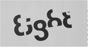
When I first came across this wordmark for the company eight, I had to take a second glance. Immediately the number “8” jumped out at me because my eyes focused on the first two characters coming together as one image. However, after staring at the wordmark for a little I saw the bigger picture. The letters e, i, g, h, and t were all formed out of the numerical version of 8. While the letters are not the first thing my eyes were initially attracted to, I was able to understand the meaning immediately. I like how this wordmark made me think. The way in which the number 8 is cut to make the letters and the way each letter is positioned is what made this wordmark so interesting to me.