Charity : Water – Use of Photography on Web

Screen Shot 2013-10-18 at 11.47.19 PM

This is the “Donate” page for Charity : Water website. I specifically chose this page instead of the conventional “Home” page because I wanted to to see the organizations use of photography in a page that is the most essential for convincing or persuading audience to take action.

This is the view of the website after I zoomed out three times to get the whole layout of he page. In original setting, the two photos will be bigger than the window itself that I need to scroll down to finish the photo. I love their use of two images of very cute children who serves as the faces of the mission of this organization, and thus very relevant. The use of complementary colors attracts the viewers more to the page and the contents on the photo (donate). Also, the color used for typeface contrasts with the photo that it is very legible. The target audience could be seen as in the wide range of teenagers to seniors. The call-to-action is purposely on the photo so that the message will associate with the beautiful photos, evoking ethos to the audience.

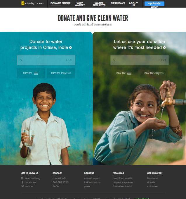
Photo in Web Design

Screen Shot 2013-10-18 at 11.15.33 PM Screen Shot 2013-10-18 at 11.15.44 PM


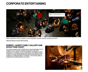
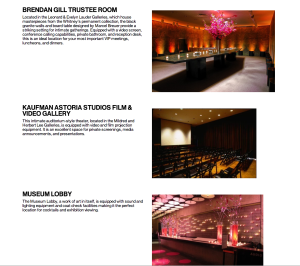
This webpage is about corporate entertaining. The Whitney Museum of American Art encourages corporations rent their places to hold events. Those photos work very well. The target audience are corporations which are going to hold various events and finding places. All of the photos show gorgeous rooms with luxuriant decorations. All of them are very attractive. The biggest one shows the scene of cocktail party from a high angle. It is unique and gives people a sense that they are monitoring the party as a planner.

Afgn

Afgn


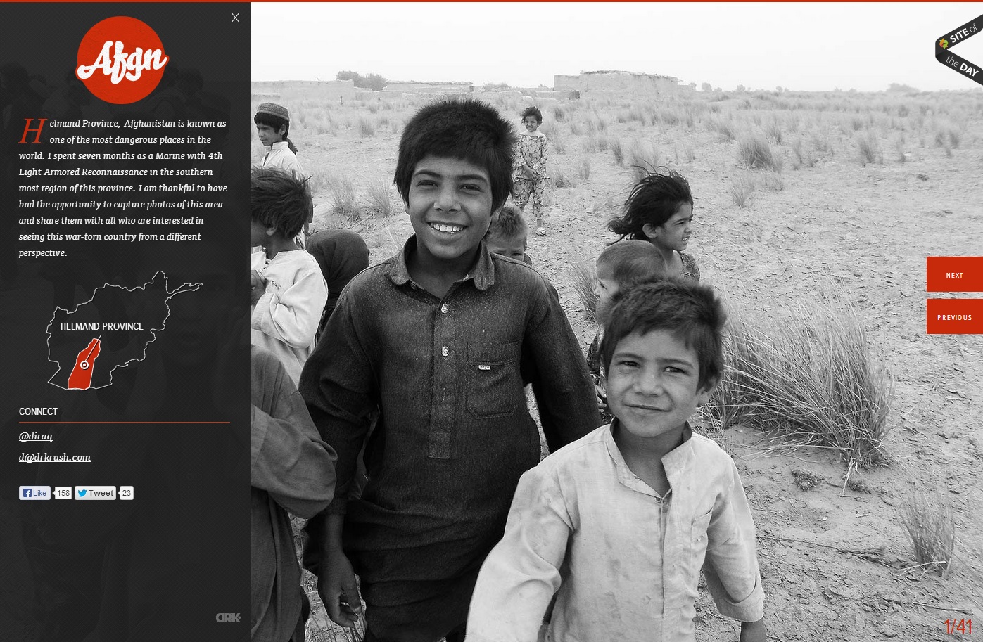
In this website, the photo of the children in grayscale provides a means of emphasis in the orange-red type and graphics. The heat of the color contrasted with the black and white of the photo creates key emphasis of the Afgn logo, the dropcap, the Helmand Province graphic, and the previous and next buttons. All of the emphasized aspects are vital to the webpage. However, they do not stand out from the picture, which creates a friendly face for the area and detracts from the Islamist extremist stereotypes of the region. The photo is covered up by the black transparency on the left, but the whiteness of the boy’s smile captures the initial attention in the site.

TWLOHA

Screen Shot 2013-10-18 at 4.22.24 PM Screen Shot 2013-10-18 at 4.22.46 PM

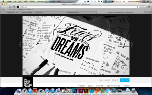
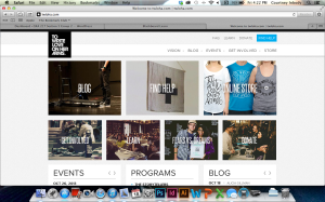
To Write Love on Her Arms is a campaign designed to allow anyone to express themselves as the wonderful individuals they are. TWLOHA aims to help people who are struggling with depression, addiction, self-injury, and suicide. Photography has always been a large part of this website, specifically because images of self harm, in any form, were used to encourage this sort of harm by others, and TWLOHA tried to be the movement to stop that. The black and white color scheme, and image at the top of the page, serves to provide a striking contrast to the world of color that we live in. Sometimes, dealing with any type of harm, can be seen as black and white, and the color that brightens a day has to be found by one’s support system – the point of this movement. The rest of the pages throughout this website are coded to an image, and the images have something to do with that specific page.

photography in website

patagonia

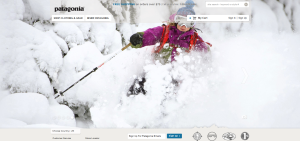
Patagonia is such a great company… and their website reflects it. Their homepage features spectacular photographs that take up the majority of the page. The photograph depicts people wearing their clothing while out exploring. Their clothes are made to be worn outdoors while performing arduous activities. This specific photograph exemplifies that their clothing can stand up to harsh conditions the person puts it through. It also is perfect for this time of the year when people are preparing to buy apparel and gear for winter season sports. It is a beautiful quality photograph… it has a nice white background which allows for the bright pink jacket to stand out… it also uses the rule of thirds… and the ski pole leads our eye to the Patagonia jacket.

Photography in Webdesign

Screen Shot 2013-10-18 at 3.45.52 PM


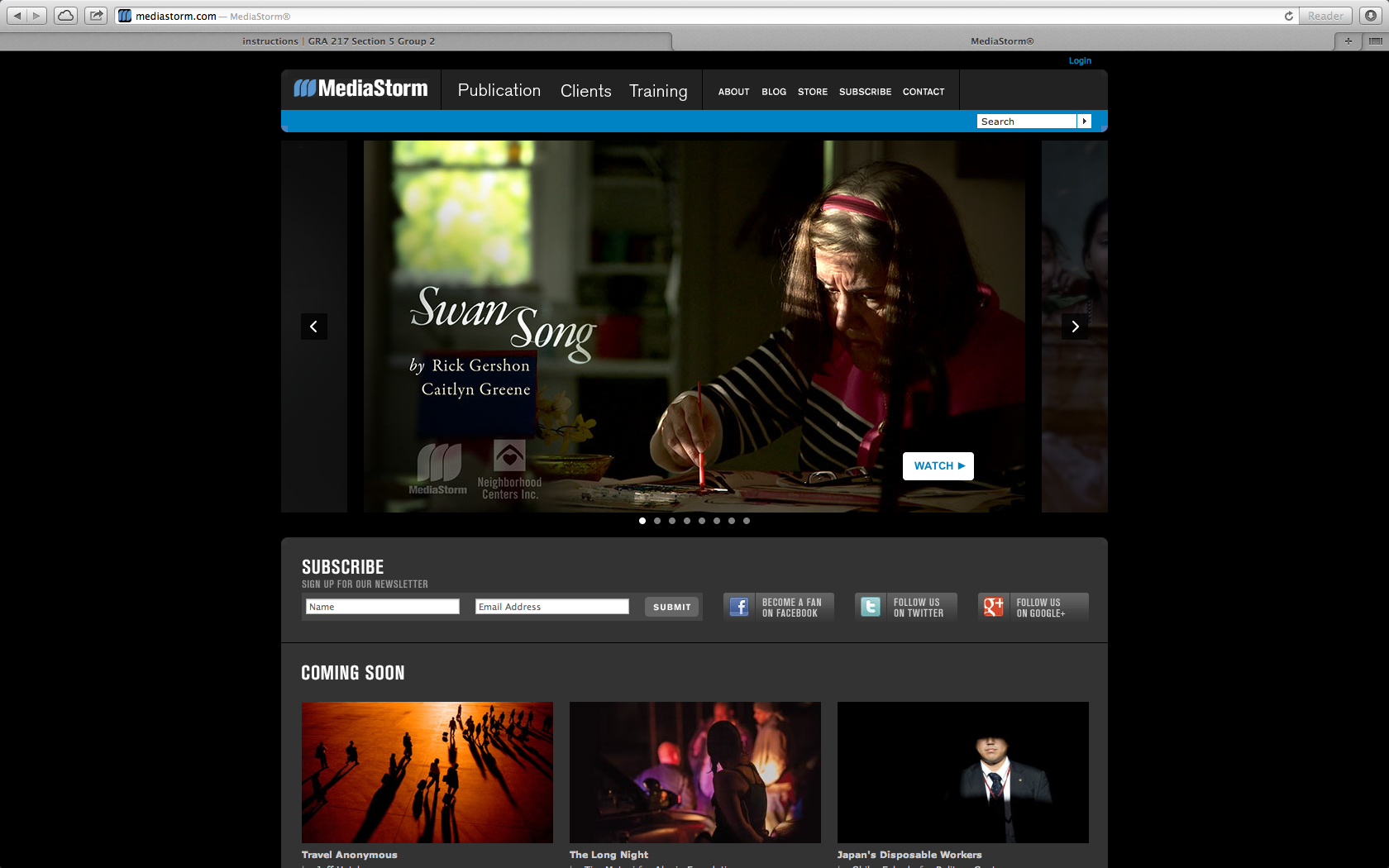
I chose Media Storm as a ideal site that uses photography to draw in an audience. The website is a place to display media and showcase photography. Here they use a key frame to draw the audience into the site and click on the video to see the story. The audience is for everyone, but probably mostly for other content creators to see what others are doing in the field. In this case the key frames in the videos are actually the bulk of the content making it user friendly and easy to navigate.