Solar Storm iPad Cover

Ipad Horizontal Solar-Storms Print


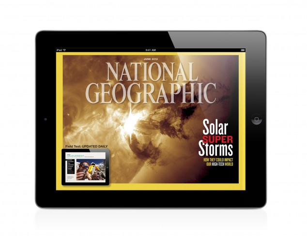
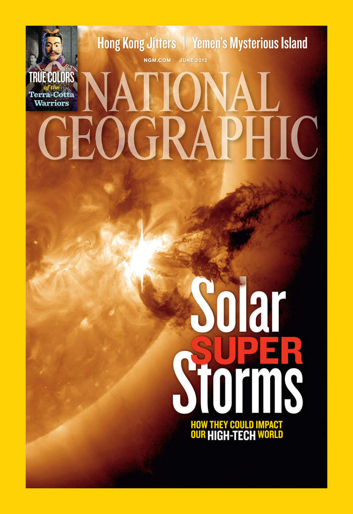
I couldn’t find the vertical version of the iPad design cover, but I did find the print version. I really like the design because the picture is extremely powerful, and the nameplate is cool because it’s opacity is not 100%. There are slight differences between the iPad design and the print. For example the size of the typeface is bigger in print, and the spacing and cropping of the picture is slightly different due to the vertical and horizontal spaces used. I really like how the burst of the solar storm leads to the headline of the article, and I like the leading done on the headline as well. Overall, I really like the cover design done on this National Geographic issue.

Slugger iPad Magazine Cover

iPad Magazine Cover:screen568x568

Print Magazine Cover:bmwmm13-spread-2

Unfortunately, this magazine cover only had a horizontal layout. I like it a lot though, especially because it resembles what I want my iPad designs to look like. The way the motorcycle bleeds off the top and bottom of the design really gives way to the engine and the pipes. The typography is well-chosen as well because it is sleek and silver; similar to the pipes of the motorcycle. The biggest difference between the digital cover and the print cover is that the type in the digital cover is larger. In addition, the image in the print cover appears to larger than the image in the digital cover.

Feature Article in Surfer Magazine

The Alchemy of Gambia

by Will Bendix

Chasing Elusive Perfection on West Africa’s Coast

The sound of metal on metal scraped through the air with a crack, sending the pack of naked boys that waited nervously on the shore scattering into the shallows. Behind them stood a tall, orange creature with fibrous cords covering its entire body like the straw stalks of a scarecrow, with each hand clutching a long, sharp blade. The air was tinged with smoke and steady beat swelled from a nearby drum circle as the creature again smashed the blades together and wailed to the ocean. It was time to lop off some foreskins.


Headline & Deck

Headline: Marvel at the Possibilities
Deck: This year’s Comic-Con in San Diego gave Marvel fans plenty to talk (scream) about. The next three years are action packed with the releases of Thor: The Dark World, Captain America: The Winter Soldier, Guardians of the Galaxy, and Avengers: Age of Ultron.

http://insidemovies.ew.com/2013/07/20/marvel-captain-america-thor-guardians-of-the-galaxy-comic-con/

Indian Motorcycle Headline & Deck

HEADLINE: Out with the Old, In-dian New
DECK: Indian Motorcycle reveals its new 2014 lineup. Harley Davidson better watch out.

http://www.motorcycledaily.com/2013/08/indian-motorcycle-company-reveals-all-new-2014-indian-chief-motorcycles/

Magazine post

photo 1 photo 2 photo 3 photo 4 photo 5This is an article from Surfer Magazine. I really like this magazines layout because it uses so many pictures to tell the story and it breaks all kinds of rules for magazine layout. Like the center fold is not consistent and so pulls your eye from one page to the next. I also like that they normally put a sweet double truck photo in most of there articles. I also really like the use of color, there’s always a consistent with creating a theme and a feel to each article.

Magazine Layout

09b18ef000e976d8e28e5b9792c2747c b475e8aa55d1a72d27ada5e41272614e 39802e3311d8cd63d0e7fb9aca7686b7 Magazine LayoutsI LOVE everything travel and this is the quintessential magazine spread that makes you want to pack your bags, hope on a plane and lose yourself in explorative bliss. These two spreads are reasonably simple in their style with a lot of white space, uniformed typefaces and fantastic use of color. Looking at the gestalt theory #6, which says that everything contributes the greater whole, I can really see how each individual component plays its own part to make a really striking end products. Color has been used really effectively in this piece with the designer pulling out the most attractive and vivid shade of each photo and using it in the typefaces of the headings. Photos have been placed in a grid like form with the exception of the third page where it is on an angle, giving the page a very aesthetically pleasing look. Overall I think it is a very appealing and effective spread.


Capri and Malta anyone?


Magazine Feature Layout

6a73e5fea56af3654bca692dfa098eec

I like this layout especially because of its creativity and originality of using a fabric instead of regular table to display the fish. I also love their use of color, orange, blue (turquois), yellow, and green seems to be complementary and supplementary to each other.