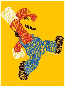
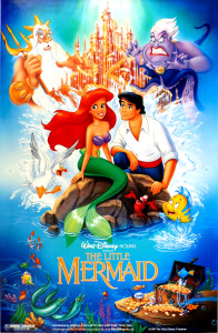
I really like this poster. The colors drive one to get inspiration and move, with the red background. The typography is very playful and almost looks hand drawn to emphasize people have power and can change the world. The typeface is of the novelty variety and is very successful with the message it is trying to convey.
Category Archives: Uncategorized
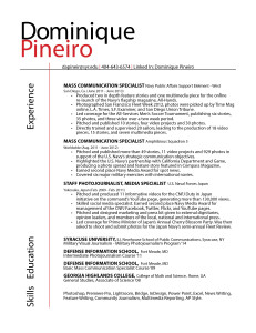
Dominique Pineiro Resume
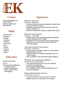
Ethan Kleinberg Resume
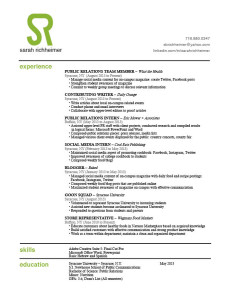
Sarah Richheimer Resume
Mario poster
Tim Burton’s A Nightmare Before Christmas
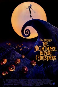
I think the Nightmare Before Christmas poster is exceptional because it embody the graphic style and essence that come to signify Tim Burton’s work using a simple and contrasting, but complimenting color pallet. Color is used sparingly to bring just enough detail from the black background to create the image. The ornate, whimsical and somewhat ornate typeface also sets an accurate expectation for the feel of the movie — fun but freakish.
This is Birdemic
Everything about this poster conveys the look and feel of a “Birdemic”. The designer’s use of “Ariel Bold” for the title creates a sense of impact, and helps reinforce the film’s serious tone. One of the things I really like about this poster is how the designer created a “three dimensional space.” You’re not seeing just one element, but you’re seeing many elements and it helps tell the overall story. The way the birds are closing in on an unsuspecting sleepy town really creates a feeling of claustrophobia and terror.
Part of your world
 (Warning: Torrey Lee is talking in jest in most of this piece and depiction’s shouldn’t be taking as fact. Its just meant to be satarical to make you read everything. He actually loves Neil Carter, Ron Clements and John Musker. Except for the Princess and the Frog…You know what you did.)
Oh the days when Disney Princesses ruled the magic kingdom. I mean seriously, what do men get out of the deal? Aladdin was technically a Disney prince (after the whole street rat deal.), but who gets the thespian running around the parks to take photos, PRINCESS Jasmine… Where’s the justice? Lets get back on point before I get into a rant.
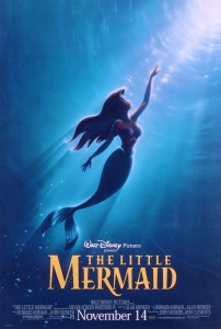
I love The Little Mermaid poster. Might it have been me as a seven-year old crushing on an animated hottie, or the future teenage me cheering on a rebelling aqua-human teenager.
This poster has all the elements to sell the idea. The wordmark used accents that cater to the water aspect of the movie. A majority of the movie, you are watching a pissed-off teen singing about living under the sea. Apparently the graphic designers of this poster wanted to showcase the feeling of someone yearning for a new world. Though her life is pretty fun, and she’s the favorite daughter of the sea-king, the artist depicted her in darkness (depression) looking for more. Well done, senior graphics-guy.
Though really, he didn’t’ have much to work with in this piece filled with racism and misogyny. Come on, we all know that Ron Clement and John Musker were sitting around saying;
Ron: “Dude, how I am supposed to make this chick depressed? The movie can’t progress.”
John: “Well you were the one that wanted her singing with that Jamaican crab.”
Ron: “Hey! He’s Caribbean! Besides, they’re a jovial people.”
John: “Alright, Alright. You just need to make her shut up for half of the movie.”
Ron: “I got it! A sea-witch steals her voice. What’s that fat lady’s name from Gimme a Break?”
John: “You mean Neil Carter?”
Ron: “Perfect, we’ll name her Ursula.”
John: [sighs] “I’ll prep the legal team.”
Though in all seriousness, I liked the poster because it’s simulated use of light. Back before those days, artist just drew a character in darker shade and assumed that would display a lack of sunlight. The artist had to incorporate the coldness (color temperature) of the sea while showing Disney vibrance. Then again, the artist get’s one for two in his designs…You’ve seen the other with the phallic castle right? Yeah…look real close…
Rosie The Riveter Poster
This is a poster that has been around since 1943, but became more noticed in the ’80’s. It is an American wartime propaganda poster produced to emphasize feminism and women workers in World War II. Now, many people know the poster as “Rosie the Riveter”, named after a female worker in the war.
I like this poster because it draws the eye from one end to the other effectively. When you first glance at the poster, you see the woman’s arm which directs you to the caption at the top of the poster. The colors are bold and allow the words to remain visible. I think the slab serif font style is successful in this case because it is easy and clear to read at a quick first glance.
The words in the poster “We Can Do It”, are supported by the woman displaying her muscles because she’s showing the public that woman are just as capable as men and “can do it too.” Also, the yellow background is so bright and strong, emphasizing the strength of the woman. I don’t believe there are improvements to be made here, I think it’s a very successful, well cherished poster.


