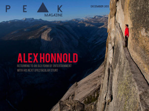
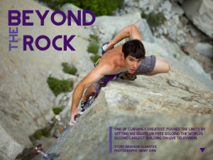
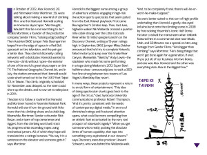
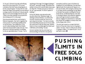
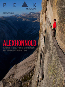
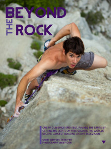
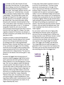
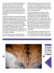
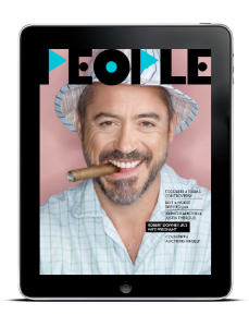
I learned a lot while creating this project, especially how to create interactivity. So cool! I now really appreciate all that magazines do to draw in an audience. There is a lot of work that must go into the story, the photography, and the design process… and then they must convert it to work in different formats. So much work!
Category Archives: Uncategorized
Zalkind Tablet Layout

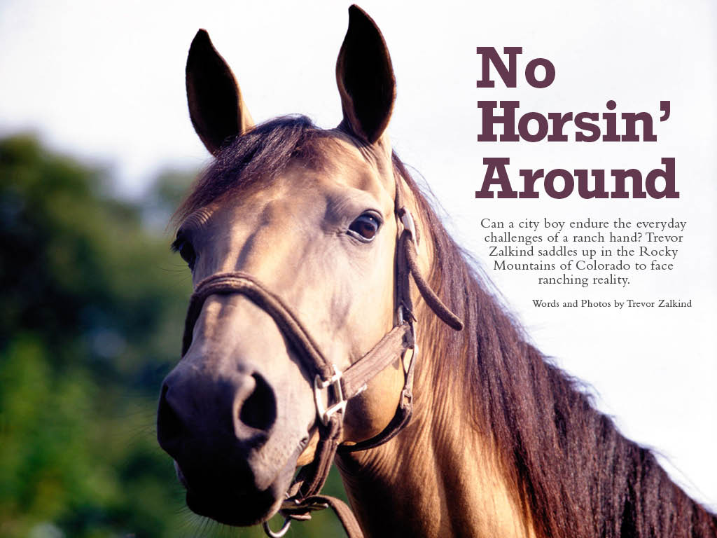
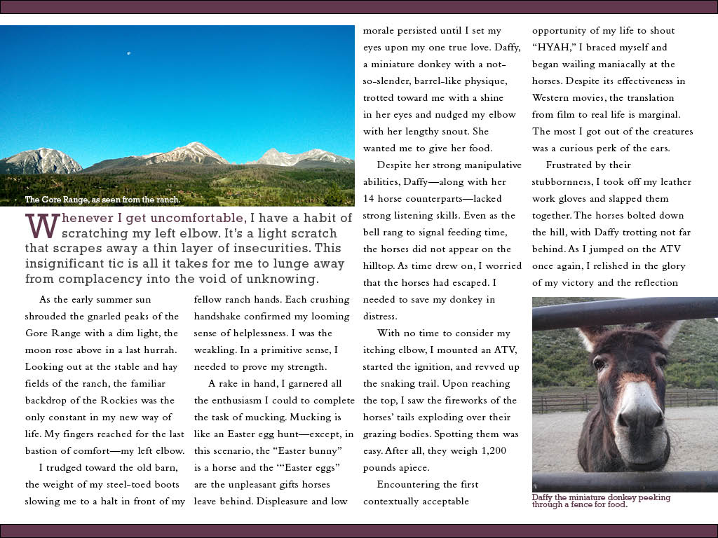

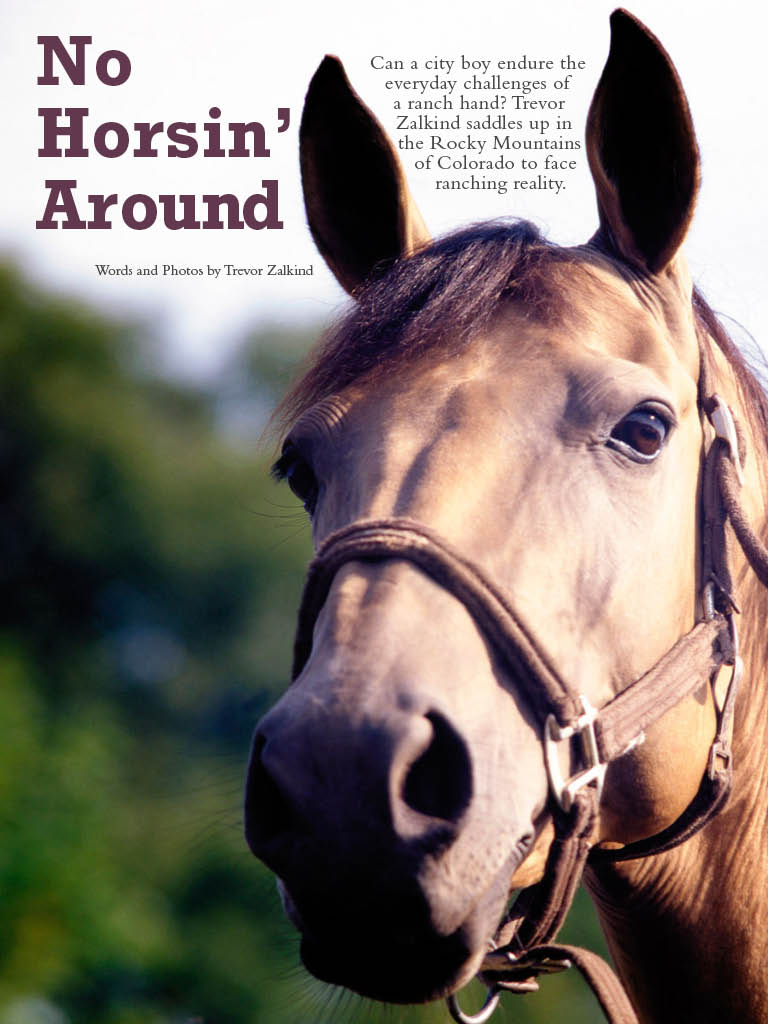
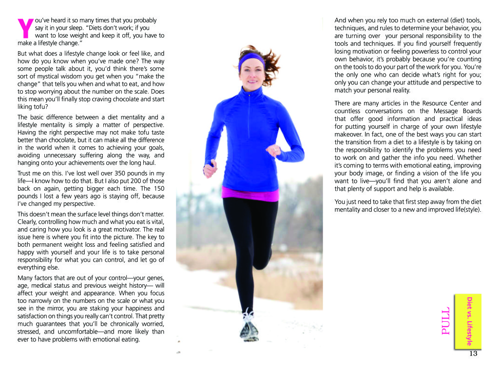
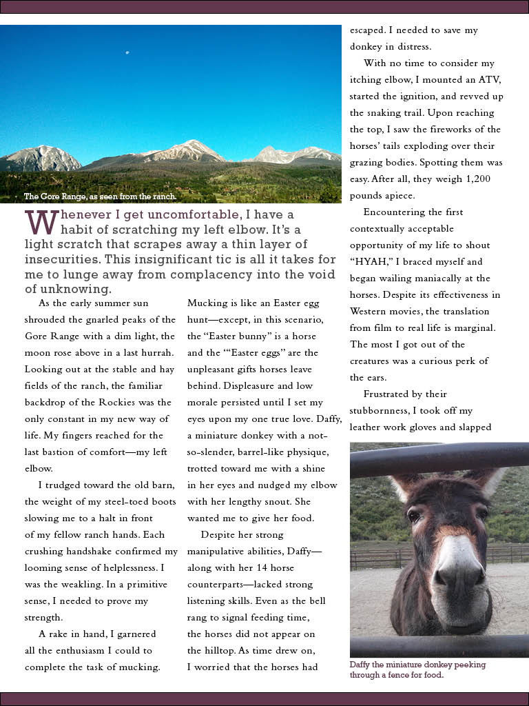 I learned how vital it is for the visuals to match the written content. My opening page is probably the strongest of the three pages because of the connection. I also noticed how effective continuation throughout the pages in the form of text, colors, and content to pull the magazine into one cohesive unit.
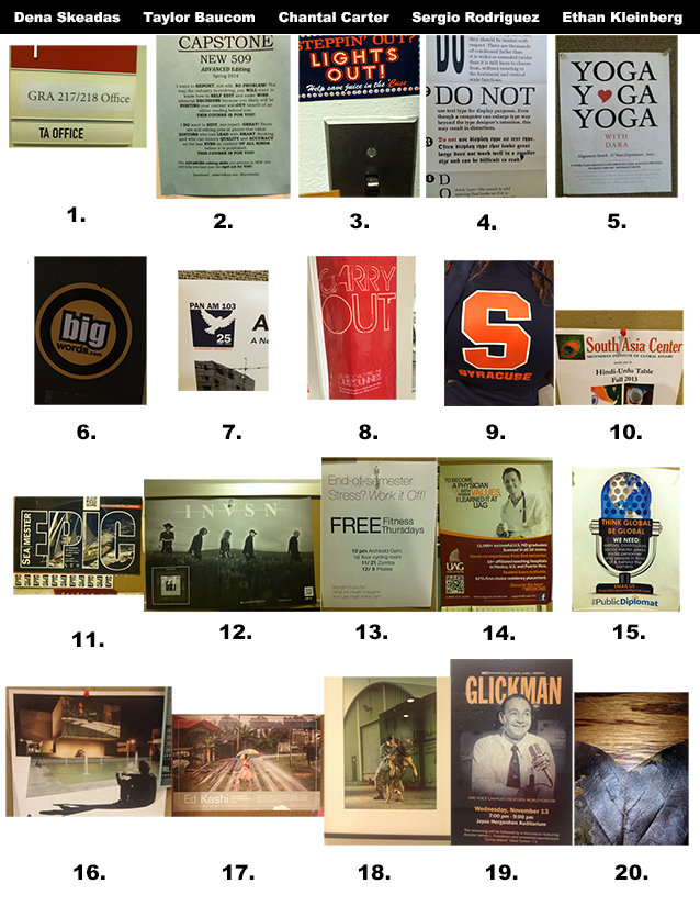
Dena Skeadas, Taylor Baucom, Chantel Carter, Sergio Rodriguez, Ethan Kleinberg
Kim, Graham, Harris, Zalkind Scavenger Hunt
Gallery
This gallery contains 20 photos.
20.19. 18. 17. 16. 15. 14. 13. 12. 11. 10. 9. 8. 7. 6. 5. 4. 3. 2. 1.
Navy Team Scavenger Hunt
Jon Rasmussen
Antonio Turretto Ramos
Torrey Lee
Dominique Pineiro
#1 Old Style Serif
 #2 Modern Serif

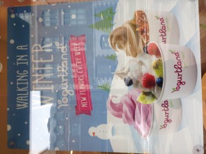
5 Pictographic logo
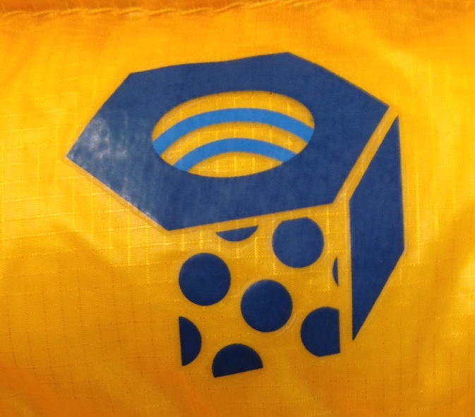 6 Effective logo
 7 Silhouette logo
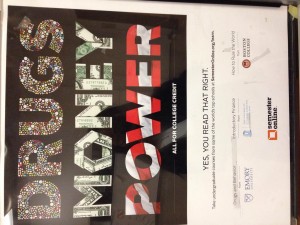
 8 Analagous color
 9 Complementary color
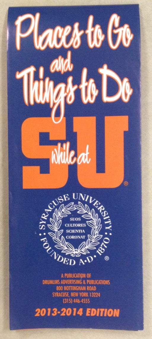 10 Color Repetition from photo to type
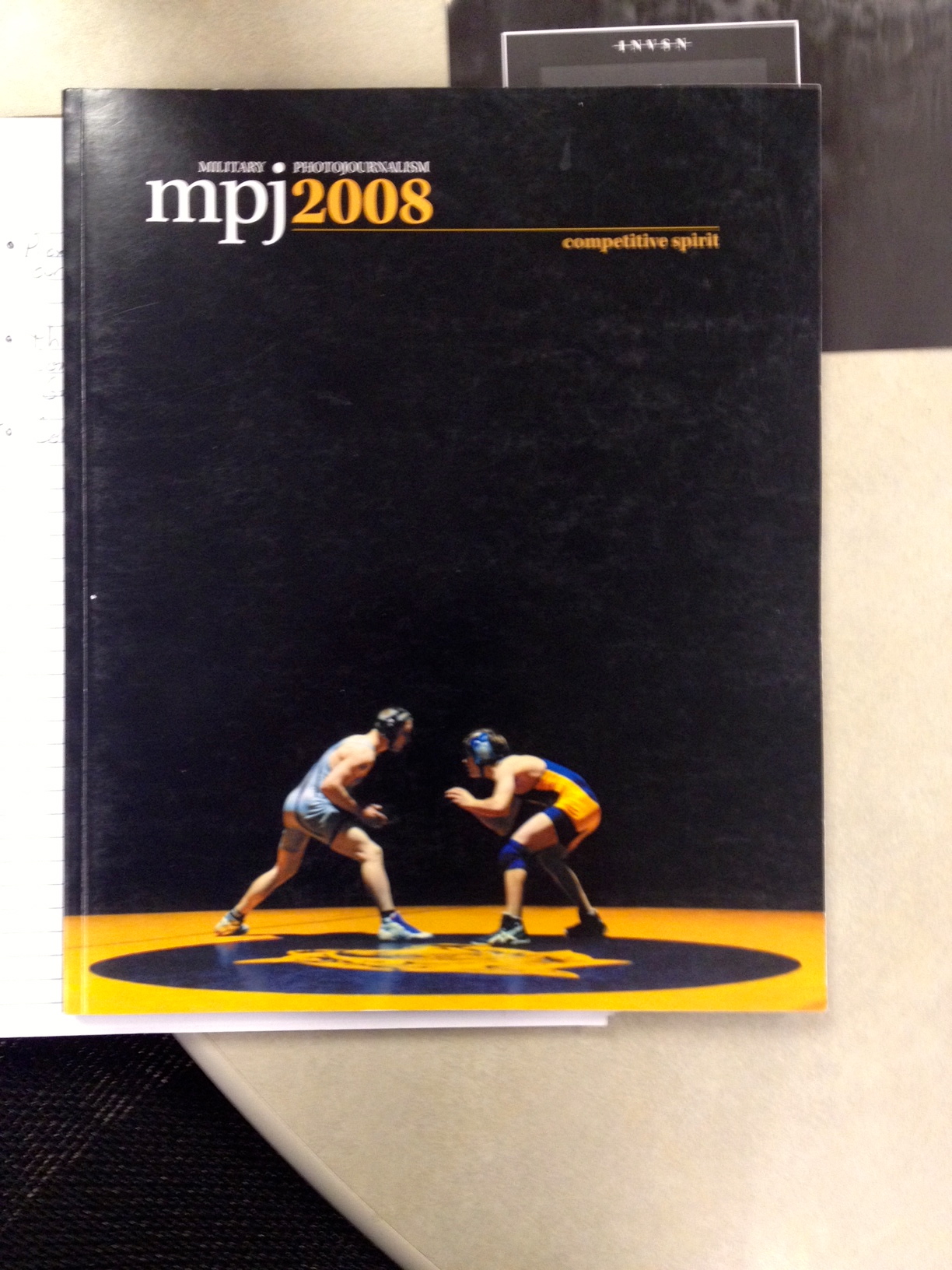 11 Isomorphic correspondance
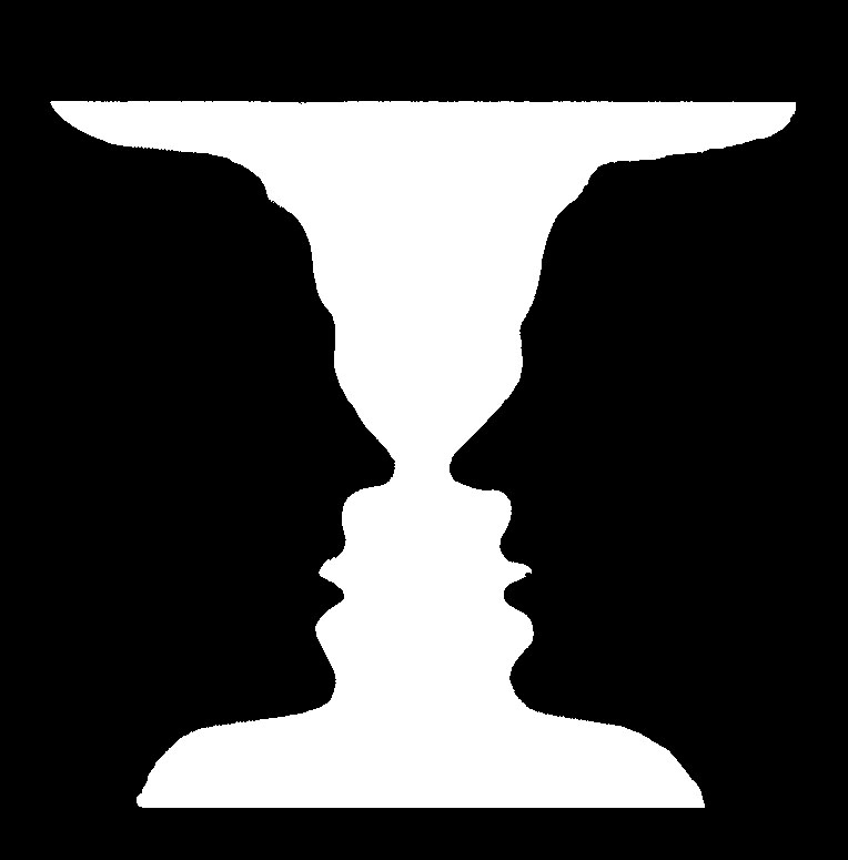 12 path or continuation
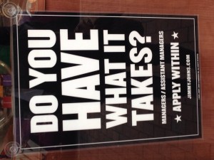
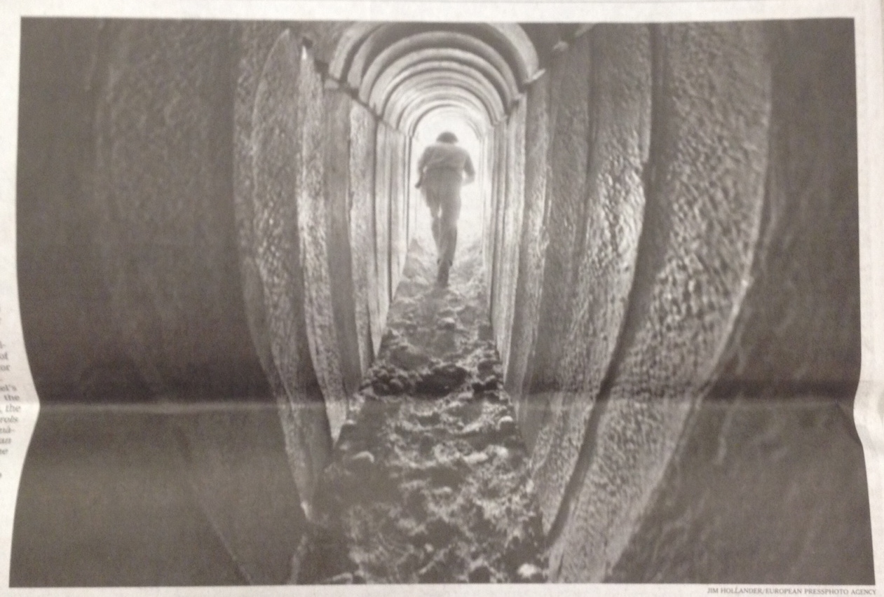 13 Word emphasized in type size
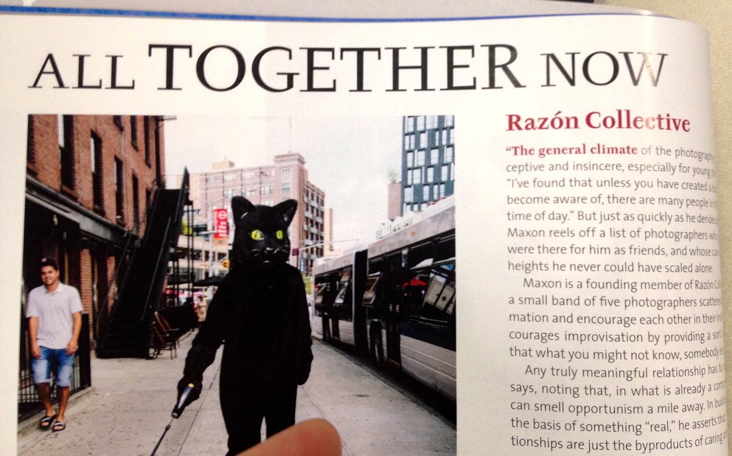 14 word emphasized in color
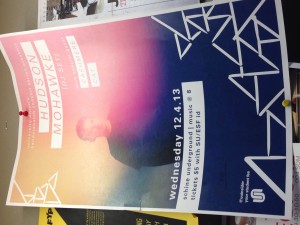
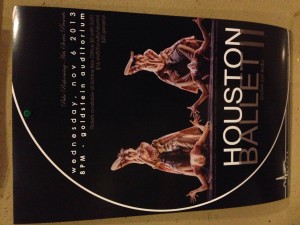
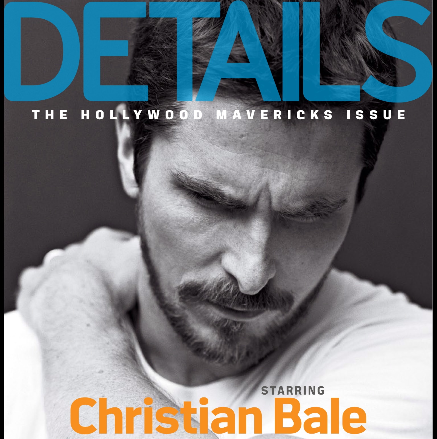 15 Good poster design
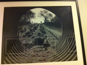
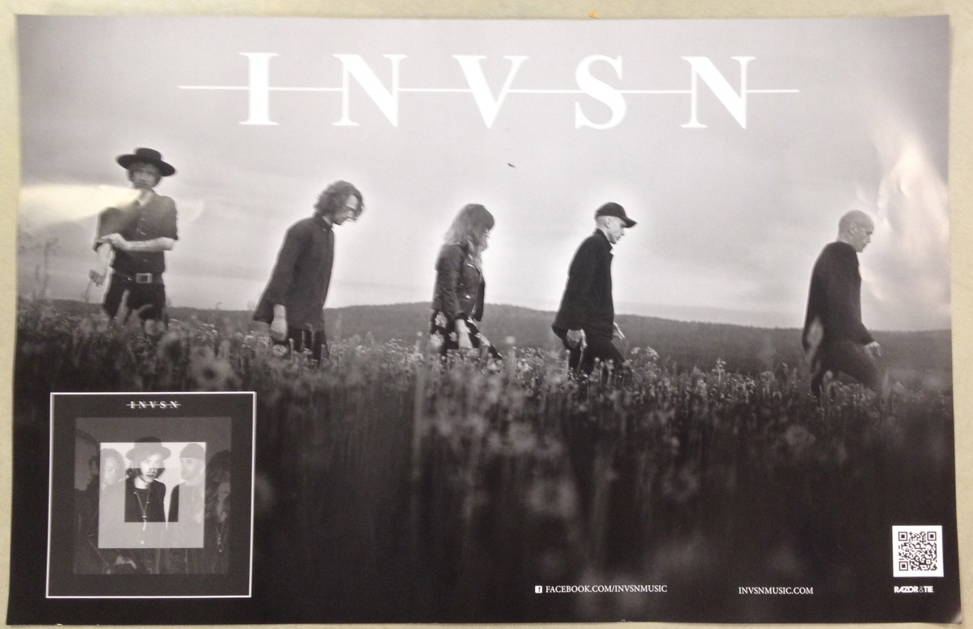 16 rule of thirds
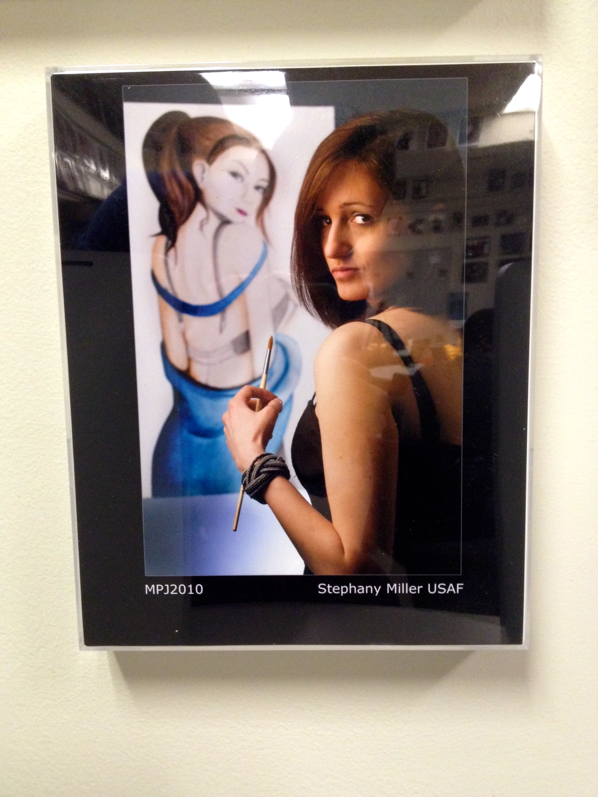 17 leading line
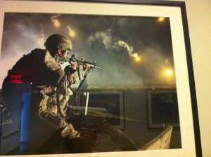
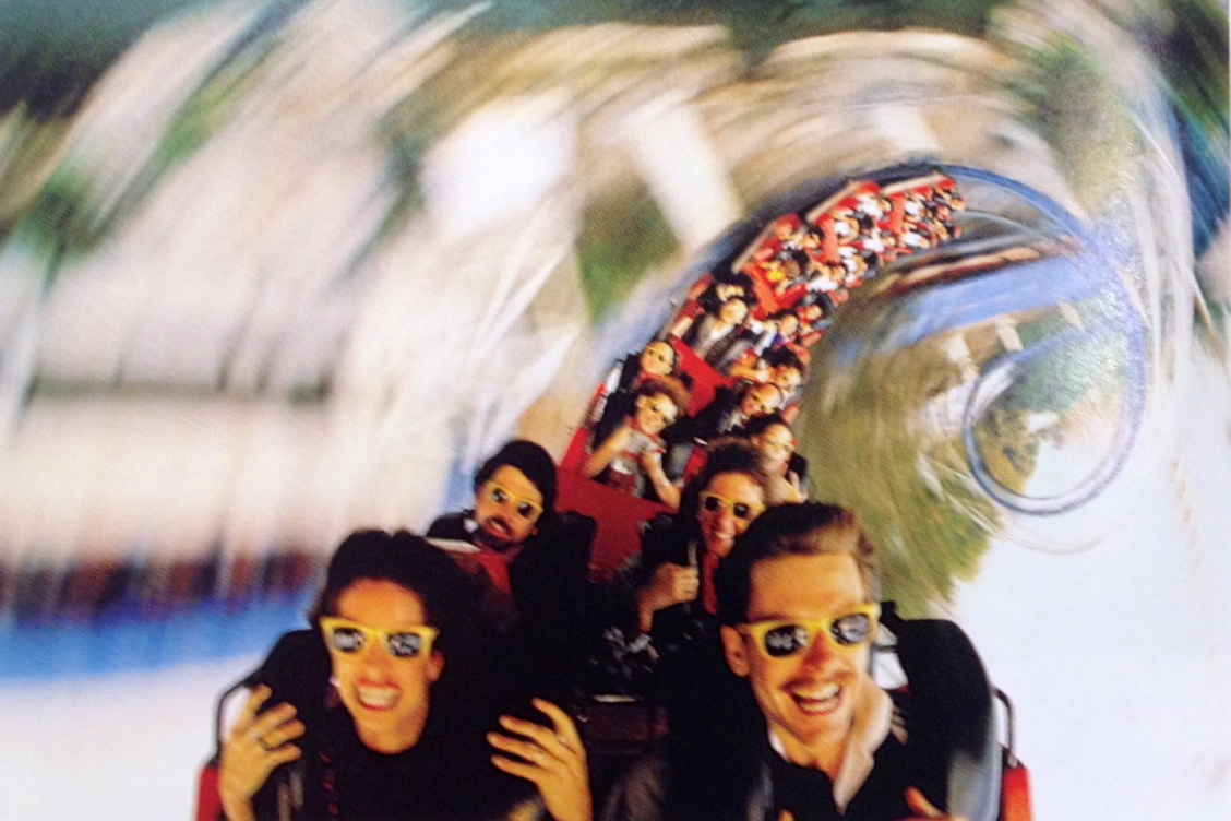 18 picture using stopped action
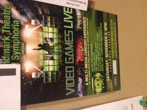
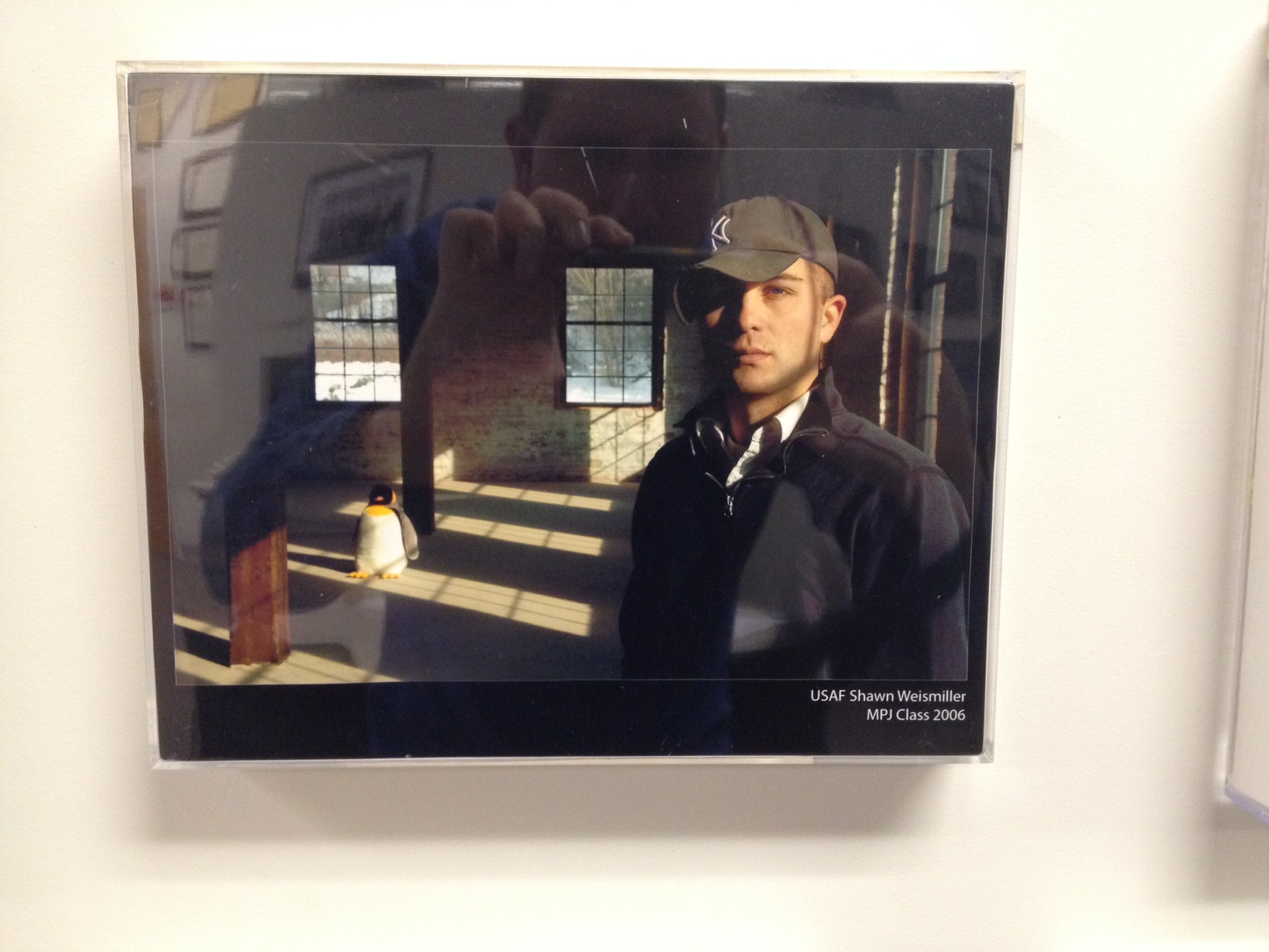
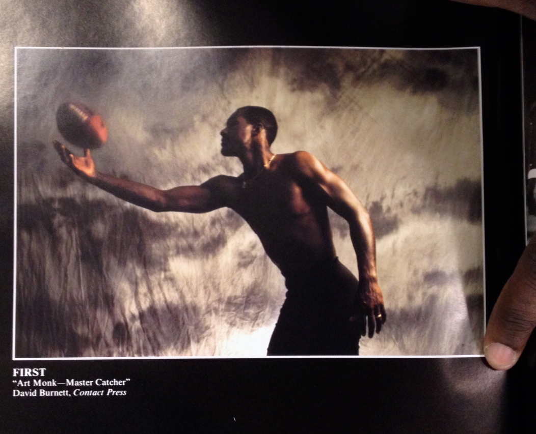 19 Environmental portrait
Zhang & Xu & Chen & Ding
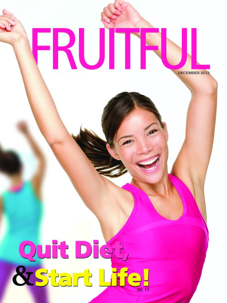
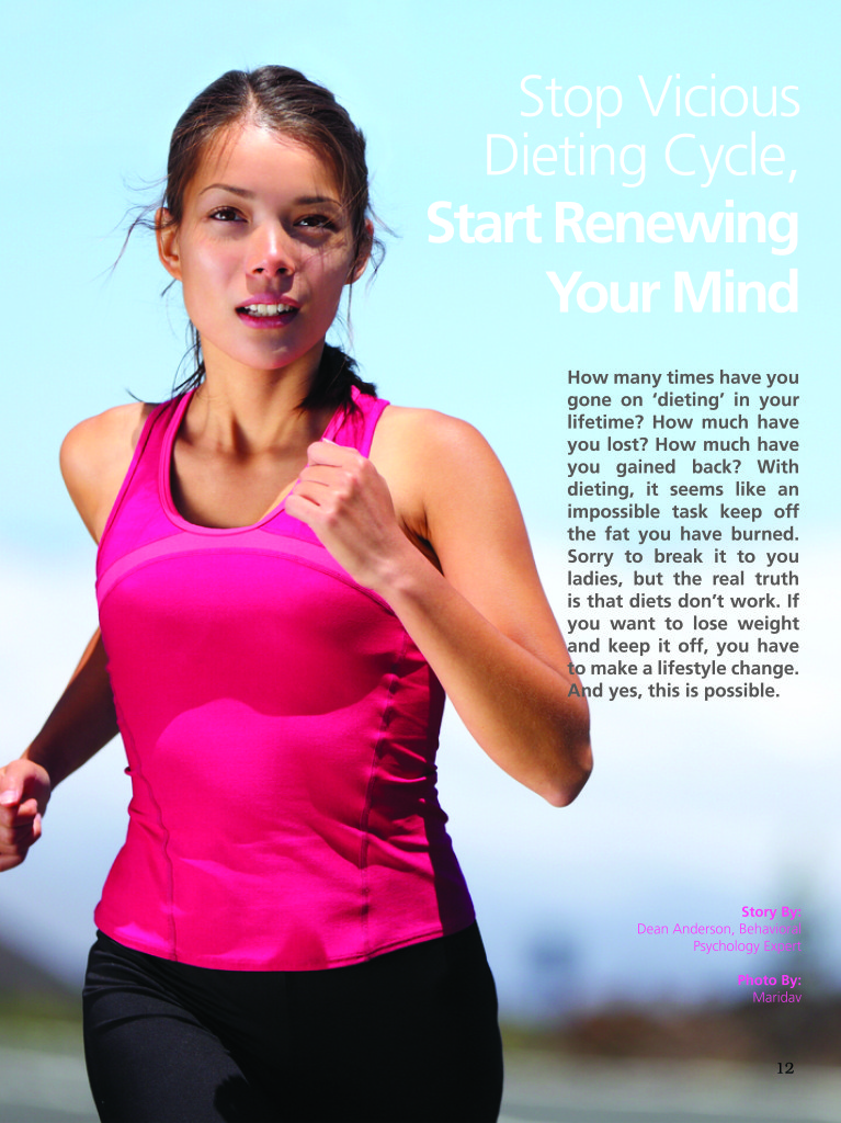
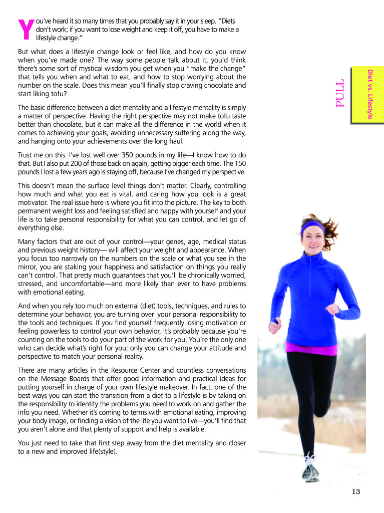
FRUITFUL iPad
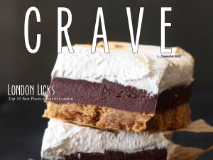
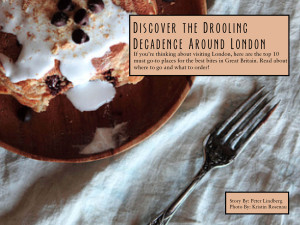
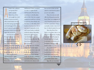
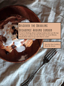
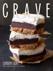
Ipad Project- Crave Magazine
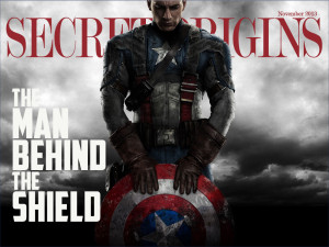
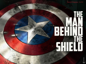
Cap iPad
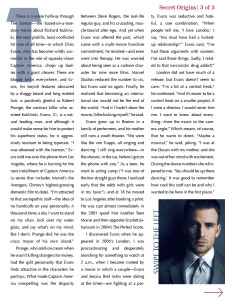
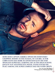
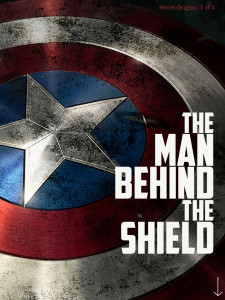
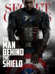
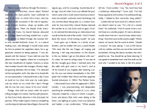
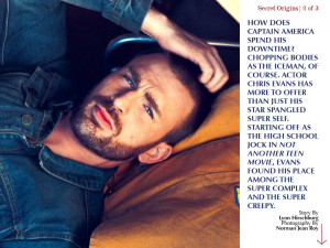
I learned that you cannot do any project with a subject that you do not like or are not interested in. Therefore, you’re welcome for Chris Evans, aka Captain America. Secondly, I learned that InDesign is irritating and doesn’t like to hyperlink properly. Third, I learned how to use a tiny box to keep my pull tab in place. Go me – or go whoever did the tutorial that showed me how to do it.

