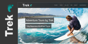
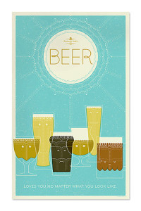
I think this web design looks really neat. i love the color scheme and the big picture and how simple the layout is. i hope everyone enjoys it
Category Archives: Uncategorized
Fashion PR Confidential
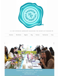
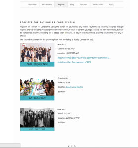
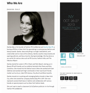
This is a website for promoting a 2-day crash course in Fashion PR in NYC. This is a event website that is similar to our projects, so it is valuable for us to study. I really like this website, because it look bright, simple and stylish. And it is very easy to navigate. Its logo, which is on the top of the home page, is very impressive and can catch people’s attention once they open this website. I think one of the reasons make this website so attractive is that it makes a good use of white color, which occupies most of the space. Also, the color of the logo and the theme color are almost the same. All in all, this website can be a very good example for promoting an event.
Simple is more
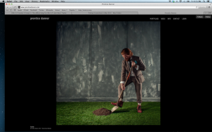
So I am doing my favorite site, Prentice Danner. Danner is a photographer and as you can tell by the website he likes things to be simple clean and not distracting. Sure I love website with lots of elements and creativity, but when it comes to the mind of this photographer, I want to be consumed by his work and not the other things. The navigation is simple and too the point. I promise to be colorful again next week.
website.
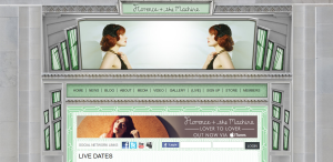
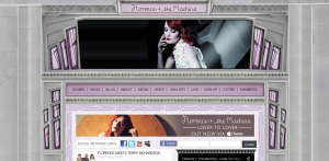
Florence + the Machine has a very aesthetically pleasing website. I like the 20’s/art deco style of the web design. It correlates with Florence’s actual fashion style. The website includes very dramatic and quality photographs of her. The colors of the windows and the photos at the header change while you are viewing the page. It is very clear and easy to navigate. I believe that many artists and bands have really nice and quality websites and Florence + the Machine is no exception. http://www.florenceandthemachine.net/index
Brewery Ommegang – Simple – Beautiful
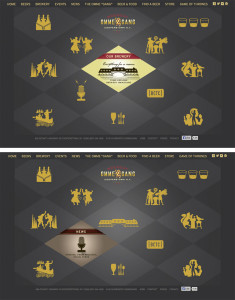
The website for Brewery Ommegang is simple and clean, using the same plaid motif they decorate bottles with, but in two shades of gray to allow other content to stand out in the bold yellow they chose for text and icons. When the mouse is rolled over any of the icons, the diamond containing that icon switches to a colored graphic with more information. Icons are silhouettes of designs used on bottles for each variety of beer they make along with complementary icons to represent the brewery, news, events etc.
Website
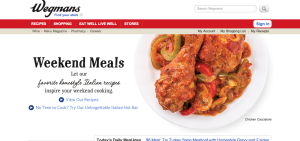
A Wegmans employee, I love this website because it is so easily navigable and is visually appealing. The white background with the red banner (a warm and visually eye catching color), makes this site simple yet attractive. The red banner pops but allows the bar to be visible where all information you’d need to find can be sourced by clicking on the links. Also, as you scroll down the page (not seen here), there are pictures different areas of the store you can click on and social media links, as well. I also like that the front image (of the chicken, here) constantly changes to different meal images, keeping it interesting and appealing. This is a great website.
Web Design
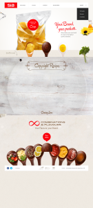
I personally like this web design very much. I think it is a good example of how Gestalt principle (similarity, continuation, proximity, closure and figure/ground) is applied.
For example, through the use of “containers” all in spoon shapes throughout the website, the designer nicely introduces similarities that make the website look very organized. The background color is clean, which makes objects in the foreground stand out. The website also uses very effective visual elements, especially the image of chips whose reflections add huge dimension to it and make it pop out.
I also like the typeface the designer has chosen, which looks really neat, clean and relaxing.
Austism Awareness
illustrator.
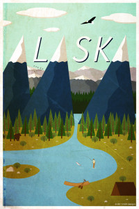
This is a Alaska travel poster made with Adobe Illustrator. It is a very linear design, so I assume the designer used the line segment tool to create the mountains, trees, tent etc. They probably used the arc tool to create the lake, the island, and any other rounded objects. I am sure the designer created only one mountain and one tree and duplicated them and changed the colors. They added dimension to the mountains by adding highlights and shadowing just by making one side of the mountain a darker shade of blue. They also made the mountains and trees in the background smaller and with less detail to create depth. They cleverly positioned the mountain peaks to be the “A”s in Alaska. The other letters were created with the type tool and given dimension with the dark shading behind them.

