New Resume
New Resume
Photos in web design
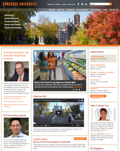
This is the homepage of Syracuse University’s official website. Photos are used very effectively on this page. The big picture in the header shows the current season in Syracuse, giving readers a sense of what the place SU sits looks like. Also, the picture blends greatly into the navigation bar. Pictures on the left side are also very effectively used, considered the text information it provides. Headshots in those pictures are clear — the background is blurred, making the subjects popping out. Also, picture in the main section also looks great — the photo is sharp; it has rich colors in it, which makes the photo look fun and interesting. It also relates closely to the story it is covering.
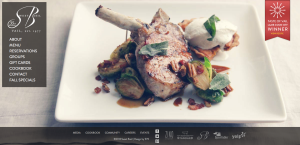
Sweet Picture by Sweet Basil
The photo on this website was used to give the viewer a sense of the restaurant. It is apparent by the appealing visual presentation, that the restaurant serves upscale food. The target audience is people who can afford and are willing to pay for an expensive/luxurious meal. The designer chose this image to entice the viewer to make a reservation and come to the restaurant. The visual works really well with the content on the page as well. The bone on the lamb points to the navigation and directs the viewer’s eye to the information about the restaurant. The footer is appropriately placed below the edge of the plate. This is an excellent use of a photo background; I know I found the food very enticing.
Blogging Assignment: using photos in web design
This week, you need to post a screenshot of a website and explain how photos were used as a visual element to effectively communicate with the viewers, or add depth into the overall design. What’s the target audience of the website? Why did the designer choose this particular image? What’s the relationship between the photos and other contents? Read this excellent article before you get started.
- Deadline for this blog post: Friday 11:59 pm.
- Please also upload a JPEG of your new resume by Friday at 11:59 p.m.
- Deadline for two comments on your classmates’ web design blog post : Sunday 11:59 p.m.
- Those students who are doing floating redo for the poster project, please upload a JPEG of your poster by Sunday at 11:59pm.
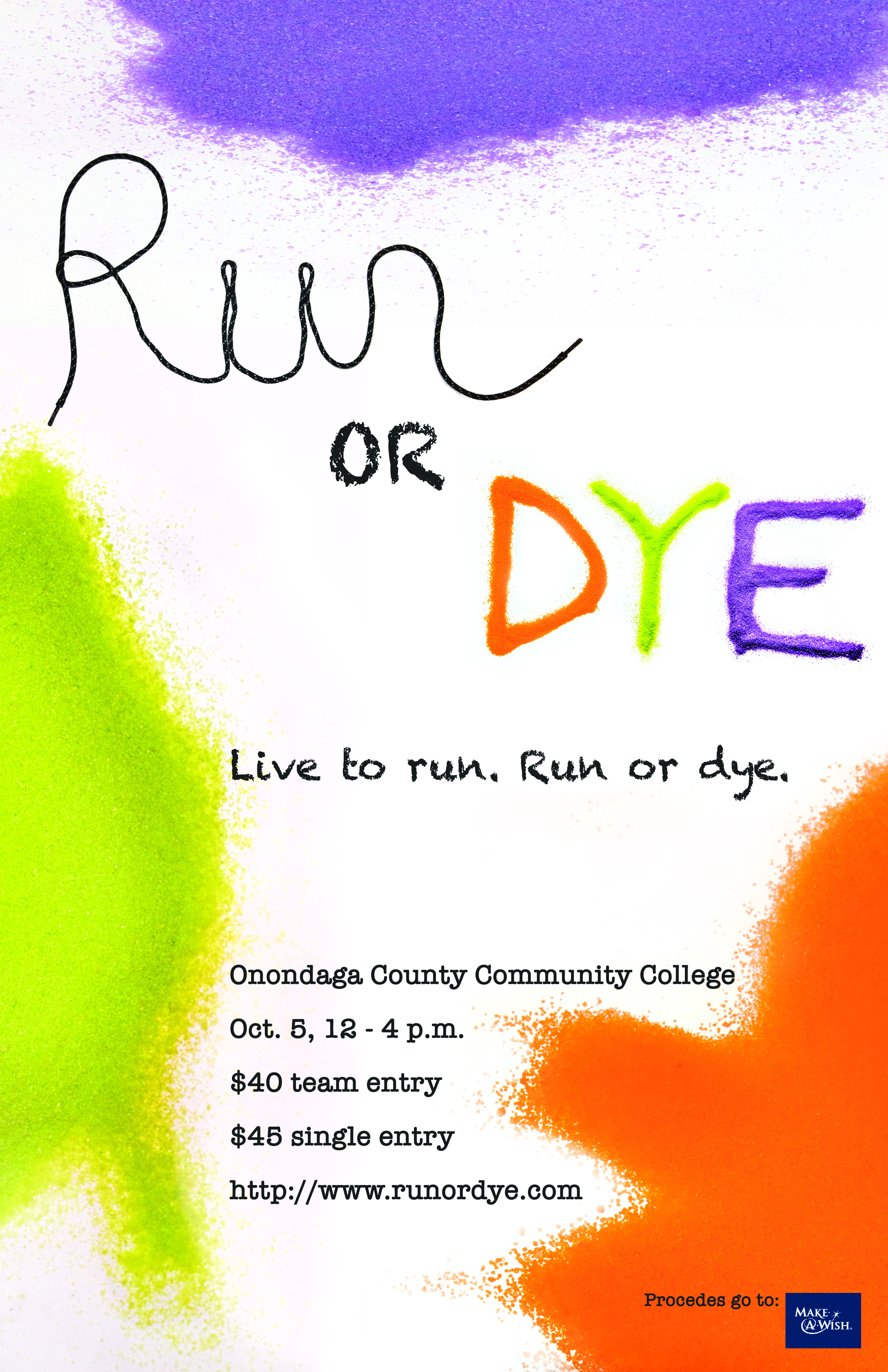
Poster Project
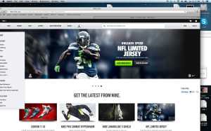
As a photographer I am really into Nike’s designs. They love dark gradients, and that really sells if for me, because Nike shoes are so colorful. The visuals that you will always see in Nike is that when they design they keep the same pallet. like lime green shoes, with a link bar with the same effect.
Website – Gestalt Design “Uggs”
No website needs to be more visually appealing and attractive than a website trying to sell an object/item to its viewers.Websites that are the home base for selling clothes and shoes need to be universally simple to use while portraying their products as expertly as possible.
The Australian shoe/boot/slipper manufacturer Ugg’s has progessviely become more and more popular on an international scale. Products are shipped worldwide so the website that advertises its goods may send the viewer a message of quality and luxury – two characteristics that this company is known for.
Figure and ground: The Ugg website does a great job of using white space. Products are used in appealing photography, however, when shopping for an individual piece, it stands alone. The foreground is not interrupted by a busy background. It is clean, simply and visually appealing.
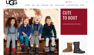 Proximity and alignment: The website does a great job on continuity throughout its pages. All typefaces are the same apart from the companies iconic logo which stands tall and strong on the top left hand corner of every page. Colors are explosive and appealing, but they all stay within the ‘prime colors’ zone and mix very well. Colors are also in their block for, they are not patterned or textured, just simply and uniformed.
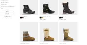 Lastly, visual heirachy is used in the display pictures that are feature points. There is quality photography throughout the site which features some of Uggs most popular products. The actual items for sale are separated by neat and easy to navigate boxs. Overall it is a great website.
The Whitney’s Website and Gestalt Principles
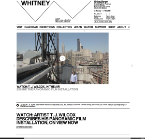
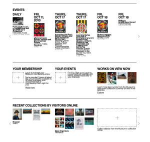
This website was newly published by the Whitney Museum of American Arts. I think it serves as a good example for other museums how to make pages readable and clear. It uses white color as a background and black color for most words, and the visuals are very colorful. Hence, it is such a great contrast that objects can easily stand out. We can see that it groups information well under the “EVENTS” column. Top is dates, middle is visuals and bottom is the name and other information. White space is between each event. Each group of information can be clearly consider as a unity and separate with each other. Regarding visual hierarchy, the website uses the same font but different colors, different sizes, bold or regular, and upper or lower cases. For example, it uses black color, bigger size and upper case for the dates in EVENT column, while uses smaller size and lower case for the events’ names. And it uses grey colors, for the least important information—the time.

