Over the summer the New York Times Magazine published a feature story of The legendary family of authors headed by Stephen King. The spread was very simple but the color scheme was dark and the pictures old and eerie in a similar fashion to his writing style. The article gave timeline info on King’s career and the progression of his family. The pictures are intriguing because they show a very interesting family. They are the main guiding points of the article and most of it is consumed by the text.
Monthly Archives: November 2013
Magazine Spread Design
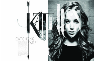
I really love this two page spread, and not just because I love the Hunger Games. Although this design shows no color, it is far from plain and simple. The typeface used for “Katniss” is extremely creative. The designer also incorporated a different picture within the typeface to contrast from the picture of Jennifer Lawrence. The texture seems to be either dirt or blood stained, sticking to the theme of the movie. The arrow going through the K also fits perfectly with the theme of the written piece (which is about Jennifer’s role in the movie) because it is one of the main sources of survival for Katniss. The designer further perfected this design by making the arrow go through the K in Katniss, the I in Catching and the F in Fame. Not to mention that Jennifer Lawrence looks absolutely beautiful.
Web Interface
Magazine Spread Design
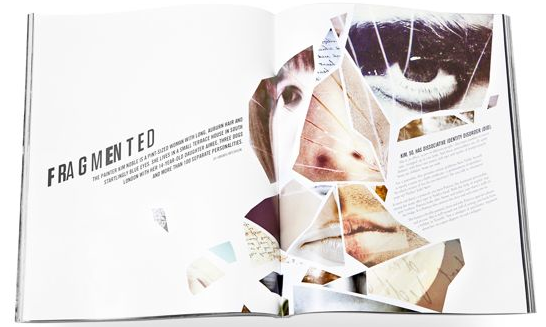
- Principle 2 (Continuation): The hed and dek leads the eye upward toward the visual, then to the text.
- Principle 3 (Closure): I think this spread most heavily uses the Gestalt principle of closure. Although the visual is a collage of random face parts of different people, our eyes are able to close the gaps between the pieces and understand that it’s a complete face. The text container also fills the face, even though it’s completely different from the rest of the objects.
- Principle 5 (Figure/Ground Relationship): Our eyes move through the page in a left to right motion.

