Typography_by_DamagedInnocence


Dictated, but not read.

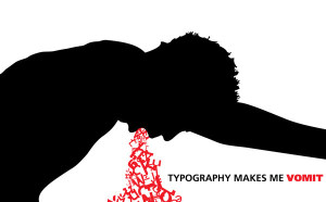
Typography is interesting good typography can really shock something out, but the bad version, can really make you think “what the hell were they thinking?”, but as I’ve learned this week, black layers on white paper is only a fraction of typography. There are bold elements that we can use, like a vibrant red to express the point. I just want to really comment on the fact that when typography is good it’s really good, but when it’s bad it can look like, as Professor Golden would say “total crap”. So simply less is more in typography.

I prefer to use simple statements in my typography. So personally I am fond of the impact font. For my style and designing I generally lean towards white impact fonts on top of full color images. It gives the impression of a stamp on a photo sort of like the stamp of rejection or approval.

Sincerely,

The Office of Torrey Lee

Hamburger Ingredient Typography

Screen Shot 2013-09-20 at 11.16.54 PM

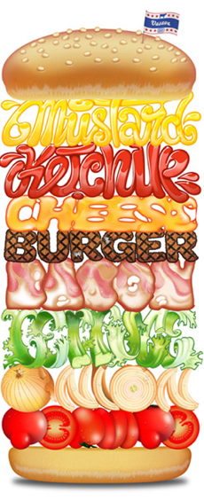
This hamburger design primarily relies on its typography. The sorts of typographic elements that make it stand out are the different typefaces that spell out the different components of the hamburger. The typeface of the each ingredient is the correct color, texture, and look of the actual ingredient itself. This allows the word to accurately resemble the ingredient that it’s representing. I think that this design is very effective.


Typecycle

Bike

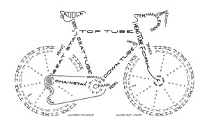
I really like this image of a bike built using typography because not only does the name of each part create that part of the picture, but also because of the way certain letters in key positions are styled to better fit the shape of the part it represents.

Typography.

Print

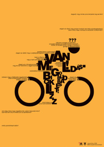
This poster cleverly uses typography to give the essence of motion. I like how it is a recognizable figure yet still abstract. It effectively uses the type’s size to create form, especially the very small type to invoke speed. The design is simple and has nice contrast against the yellow background.The giant “O’s” as wheels draw the viewers eyes in but do not distract from the whole image over all.

Week 4 Blog: Typography

this-graphic-from-the-national-highway-traffic-safety-administration-also-uses-text-letters-to-illustrate-the-consequences

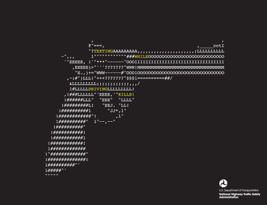
This design solely relies on typographic to create this image of a gun. The purpose of this graphic is for public service announcement, raising awareness for the danger of texting while driving. By creating a shape of a gun through face found in regular phone while texting, it allows viewers to create the realtionship between the gun (and its associated values such as violence) and texting in the car.

Starbucks Typography Poster

826271266470550


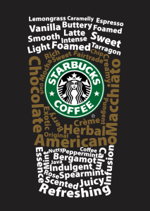
I really like this typography poster designed for Starbucks. It is a very smart design that the words are combined as a typical Starbucks’s coffee cup. The upper and lower words are white color, while the middle ones are brown color that implies the cup sleeve. The typeface of the words should be sans serif grotesque. Creatively, all the words are about coffee, like “Macchiato”, “Vanilla”, and “Foamed”. And the logo at the middle of the “cup” is bright and impressive, which gives people a clear idea that this is a Starbucks’s poster.

Bauhaus?

07

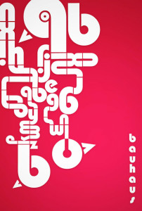
I’m not even sure what I’m looking at, but I love the way the letters are arranged. They create a maze like object and it leads you all around the image. I was drawn to this typography because of the use negative space. It’s heavy on one side, but I like the asymmetrical balance, it adds to the maze-like design. I think the color scheme is awful. I hate it. But other than the terrible colors I think this is a solid piece.

Week 4 Typography

I think this really demonstrates how typography can really drive home a message or theme. I think it’s really interesting how words alone from this image. The words are describing challenges faced in President Obama’s administration, and the image depicted shows the burden of leadership. I think this is a creative way to show how typography can be really powerful when different elements are combined.

01-extremely-awesome-typography

Week 4 Blog Post

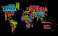
downloadI enjoy typography that not only is visually appealing but also can display another message. In this case, instead of simply typing out a country name, the typographer arranges variations of the country’s name to form a visual map of the world. The double emphasis of the name and visual representation hammers home the concept of national borders and national identity.