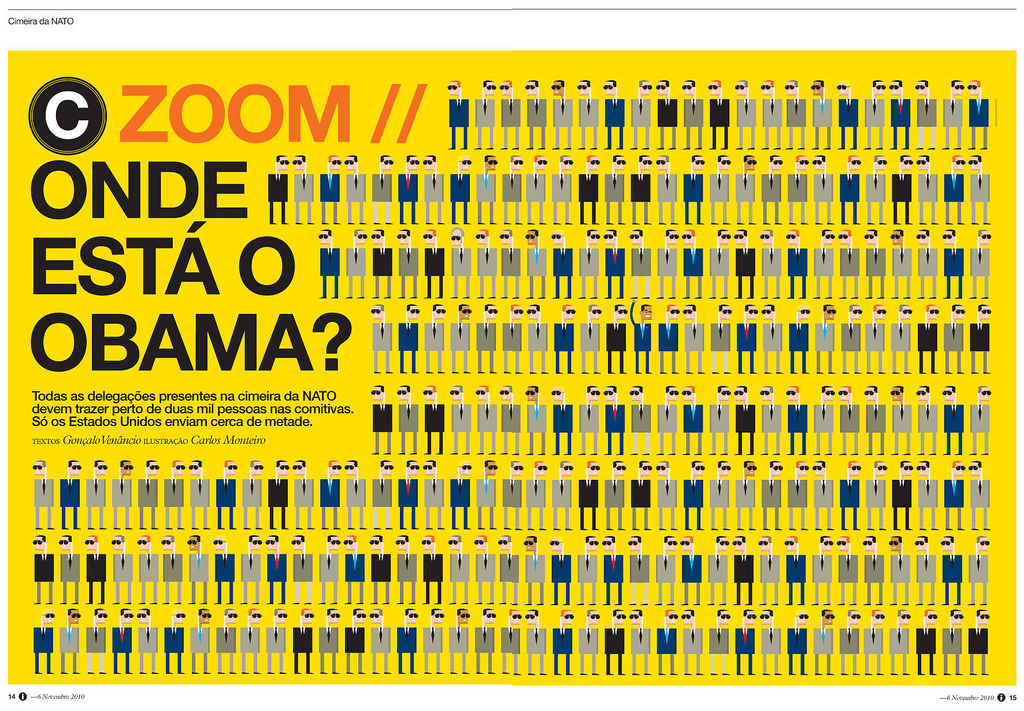
 This Portuguese news magazine, i jornal, is consistently one of the most well designed news magazines in the world. Even their website can be placed among the top tiers in web design. However, at a more fundamental level, this individual spread stands out because of the simplicity, repetition, and the visual connecting with the words. Even if you can’t read Portuguese (I sure can’t) the article is about Obama and his place among other political leaders. This can be seen in the quirky-yet-simple portrayals of the individuals and the contrast of Obama’s arm raised. The yellow background also draws the eye in to see what the fuss is about.
Category Archives: Posts
Feature Magazine Spread
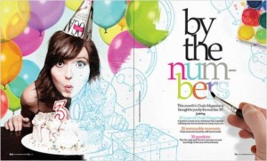
I love this feature spread about being 30. I think the way that the picture starts out in color but gradually turns into a sketch is very fun. I also like the way the hand is then painting in the colors on the headline. My eye is automatically drawn to the headline because the hand is pointing right to it. I also love how the picture overlaps from the left page to the right. It keeps my eyes interested and leads them straight to the text. Overall, this is a very fun magazine feature spread layout.
Queen of Zef Magazine Spread
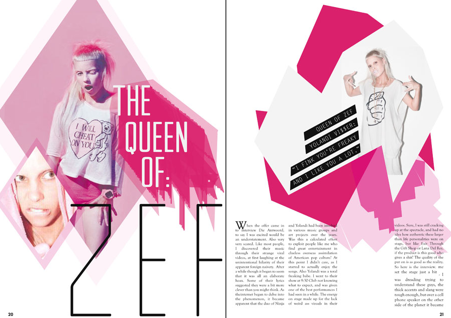 This magazine layout screamed out to me when I first saw it. It totally stands out and pulls the reader into it. It defines the essence of Gestalt theory that the whole is greater than the sum of its parts. This is because there are so many obscure pieces that make this piece what it is; it has the hot pink color, the wild facial expressions on the woman, and the retro typeface.
Turretto logo
Trevor Zalkind Logo
 For my logo (created haphazardly in Photoshop), I used my initials and the text creatively to form one object. My full name, Trevor John Zalkind, is represented. Through decreasing the type of the “J,” I deemphasized the initial, while maintaining a closeness between the “T” and the “Z.” I used ITC Franklin Gothic Bold Condensed for the typeface, which is a very masculine and defined typeface. The color, a dark blue, is also relatively masculine and contrasts greatly with the white background of the page. The only similarities with my initials was the bar at the meanline, so I made sure to make that the combining factor of the logo. Instead of being three separate letters, the logo now combines my three initials into a single entity.
CKI logo
I created my logos on photoshop – seemed easier. Yes, I have a thing for butterflies. Yes, I have a thing for bright orange and turquoise-y blue. Therefore, here you go! I like the simplicity of combining the letters with tight tracking, and I have always been drawn to lowercase letters – they seem more inviting. I think I like the bottom one better, because the i and b are attached, and allows for the creativity of my last name and my personality to come out. Both of these would be put on a vertical business card, if anyone was wondering.
Logo Sketch
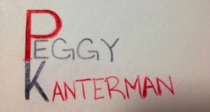
Now obviously this is just a sketch. If I were to put it into photoshop, the text would be straight and the image would be much cleaner. The thought process behind my logo stemmed from my word mark. I used red as my warm color in my word mark and in this sketch of my logo to draw attention to my name. I connected the P and K for stylistic reasons, but to ensure readability, I used black for the K. I also made the P and the K more bold than the rest of my name to draw attention to my initials. I wanted to keep my logo as simple as possible, and I felt this arrangement of my name was the best way to do so.
dhs logo sketch
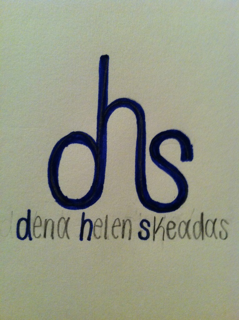 Above is my personal logo sketch. Behind this design, my thinking process is as follows: I wanted to use all three initials in my name because I think my name is unique and stands out. With this in mind, I wanted to incorporate the “d”, “h”, and “s” together, so this sketch is the way I thought it looked the best. I chose to use lowercase letters because it is the only way I could incorporate the letters together next to one another without flipping them around. I like how the “d” and the “s” are the same size, but how the “h” is slightly bigger. I also like the type is curved; it adds a touch of gentleness. If I were to implement this sketch, I would make the “dhs” a little bolder. I would keep the “d”, “h”, and “s” in the full name the same blue color as the initials above it. Then I would make the remainders of my first, middle and last name white. Blue and white are Greek colors, and if you couldn’t tell from my name, my name is Greek.
WWF
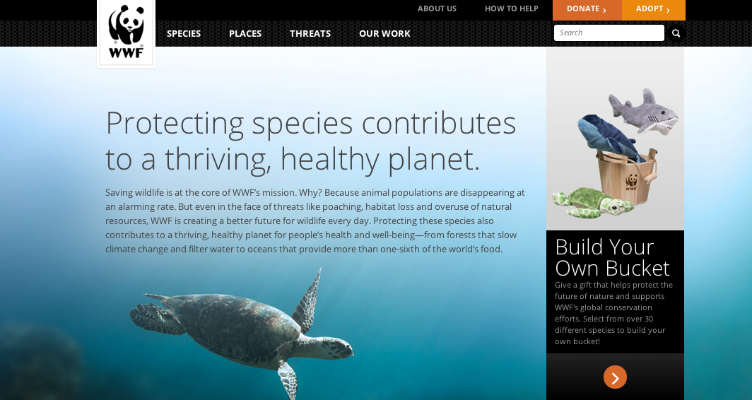 The World Wildlife Foundation employs the use of exquisite photography in an animals most intimate setting. This is essential to the success of the organization as it must appeal to its followers and subsequent donators that the very objects this website advertisers are worth saving. These photos are always of incredibly high quality and attempt to capture the detail and beauty of the environment in which the animal is set. Whether that be by using a wide angled lense to capture the greater area of a habitat (like shown with the turtle above) or zoomed in amazingly close, this website always parades its photos in an incredible way. The above picture really plays with light well as you can see the rays from the sun flooding in on the turtle from above and leading the viewers eye to this tranquil animal, imploring for the viewer to help it in its time of need. The blueness of the water is very calming and easy for the viewer to look at. This is often how the WWF displays its pictures as it evokes the most appropriate response from viewers.
Charity : Water – Use of Photography on Web
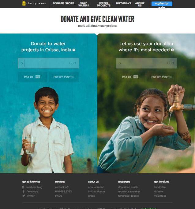
This is the “Donate” page for Charity : Water website. I specifically chose this page instead of the conventional “Home” page because I wanted to to see the organizations use of photography in a page that is the most essential for convincing or persuading audience to take action.
This is the view of the website after I zoomed out three times to get the whole layout of he page. In original setting, the two photos will be bigger than the window itself that I need to scroll down to finish the photo. I love their use of two images of very cute children who serves as the faces of the mission of this organization, and thus very relevant. The use of complementary colors attracts the viewers more to the page and the contents on the photo (donate). Also, the color used for typeface contrasts with the photo that it is very legible. The target audience could be seen as in the wide range of teenagers to seniors. The call-to-action is purposely on the photo so that the message will associate with the beautiful photos, evoking ethos to the audience.

