Studio MPLS Gestalt Principles

studiompls


Many of my favorite websites are often simplistic. This website, studiompls.com is no different. A good website also follows gestalt principles. Here are a few examples of gestalt found in this example:

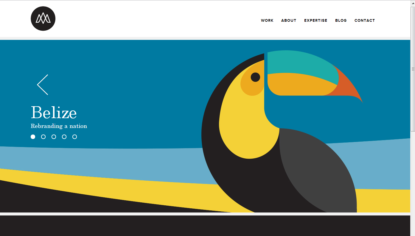
Similarity: This site has panels that change. The grouping of the multiple shapes into the form of the toucan creates a similar shape that distinguishes itself from the rest of the web page.

Closure: The toucan beak is not connected or closed off with the rest of the toucan, so the mind seeks closure and does so to assume the beak and body are one object.

Proximity: The formation of the section words in the top right are close together in proximity, allowing for the mind to group these concepts together.

Figure and Ground: The website easily differentiates the background with the figure because the background is white. Regardless, even with the toucan graphic, the toucan is easily distinguishable from the background because of the vertical vs horizontal contrast.

Law of Symmetry in Circlex Web


34493

This website uses Gestalt’s Principle- Law of Symmetry. The main image of the web has a element of rotational symmetry because it has a central reference point (the hands) and rotates around the central point.  Because of it, the web looks much more interesting, engaging, and attractive to the visitors.


Rule of Three

Screen Shot 2013-10-11 at 4.38.12 PM

The Rule of Three website applies many gestalt principles.  Most notably, visual hierarchy, figure and ground, and proximity and alignment.

The dark background and white letters allows the viewer to easily navigate the website’s text. The layout’s is very simple, and the word “Words,” is the most prominent figure on the screen, It’s also what the website sells. The website is very organized. Even though there’s only one type of font used, it’s used very effectively with grouping. All the areas with like information are equally separated, and the use of different sized fonts helps readability.

Gestalt Principle — The New Yorker

The New Yorker

The New Yorker website is definitely among those well-designed news websites. The Gestalt Principle is applied throughout the site.

  • proximity and alignment: achieved through dividing content into two/three columns and align them neatly.
  • similarity: through placing images in square shapes of the same size within each section; same typeface among each section; unified format in each “story box”, following the rule of headline-author-brief summary-section name.
  • visual hierarchy: achieved through smaller intro texts following bigger headlines; also achieved through use of difference sizes of images.


David’s Refuge Gestalt Principles

Screen Shot 2013-10-09 at 9.00.11 PMThis designer of this website had gestalt principles in mind as he or she was designing. For one, there is figure and ground because the image of the bed stands out against the tan and dark green backgrounds surrounding it. In addition, there is proximity and alignment because the designer used the same typeface in the David’s Refuge logo and in the “Caring for the caregiver” tagline. Furthermore, there is continuation because the faded words “Retreat” and “Renewal” are placed on lines, which indicates continuation and connectedness. Lastly, there is visual hierarchy because the image of the relaxing bed is the first and most important thing that my eyes look at.

Kit-Kat Gestalt

Screen Shot 2013-10-09 at 8.29.47 PM


My love for Kit Kat aside, this website applies many gestalt principles. The Kit Kat bars stand out clearly from the background due to the color difference and three dimensionality aspect. The colors are very consistent on the page. They stick to the classic red and white colors that are associated with the Kit Kat brand. The font is aligned well and gives the look of an organized page. Lastly, the hierarchy is very apparent and visually appealing. The words at the top are the biggest, most bold, and italicized. The following line is much smaller and the following block of text is the smallest. Overall, this page is very appealing and applies the gestalt principles very well.

Hulu. Who Knew?

Screen Shot 2013-10-09 at 8.05.01 PM

Thinking about the gestalt principles, and because I just had a viewing party of SHIELD in my room 3 hours ago, I decided to use Hulu as my website. Who knew Hulu would have used these principles? Anyway; seeing as these are all video clips, the images themselves stand out against the grey background that Hulu uses on its website. Through all of the clips of what is new that aired this week, the same font is used for the title of the show, the name of the episode, and the description beneath it. The headers of each section, such as “Shows You Watch,” are all the same font, and are all capitalized, creating uniformity. Finally, visual hierarchy is very much used, as the episodes just coming out the day after they air on television take up the entire top half of the website, being the first things that you look at, such as Agent Coulson’s face (#CoulsonLives).

GoPro Website

I love the GoPro website for its visual design. Go Pro is a universally renowned sporting and extreme activity camera. It takes incredible photos and videos the most dangerous and intense activities in the world while in some of the most extreme surroundings.

Screen shot 2013-10-04 at 11.44.26 PM

With all this in mind the web designers knew that they had to make a website as appealing as the product. This website is absolutely filled with photos and videos on every page. Instead of reading all the things you can do with the Go Pro, they show you with a video example.

Screen shot 2013-10-04 at 11.43.54 PM

Screen shot 2013-10-04 at 11.43.31 PM

All the products have been expertly photographed and are on a very visual display. Text is at a minimum and is very simple and readable whenever it is used. Social media is everywhere and the chance to win some of this companies amazing products is always shown.

This website will make anyone, myself included want to buy a GoPro!