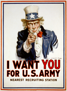
I believe this is one of the most famous posters of all time. Everyone has seen this image and there have been countless parodies of it as well. It was created during WWI as propaganda to recruit soldiers for the American Army. Uncle Sam is depicted pointing at and staring into the eyes of the viewer, drawing them in. The use of an iconic figure (Uncle Sam) and the choice of the red, white and blue colors make it very patriotic. Uncle Sam personifies the United States and is a man associated with the qualities of fairness, reliability, honesty, and who is devoted to his country. The “YOU” is the most prominent word. It is larger than the rest and a different color, which again draws the viewer in. I believe this poster connects to the viewer in a very personal way (especially emotionally). This poster was so overwhelmingly successful that it was later used in WWII.
Category Archives: Uncategorized
Wordmarks
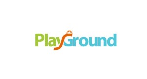
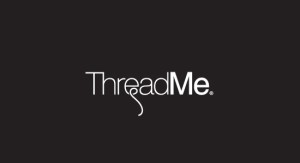
I love both of these designs because they relays to me that wordmarks can be playful. For example, the first wordmark uses the letters y and g in its name to create a slide looking effect, as well as use different colors making it colorful and fun. The second wordmark may not have color, in fact it has no color, but what drew me into the design was the playful design on the letter e in its name. Something so simple can be so effective.
Chocolate, chocolate and more chocolate
Hershey’s. Arguably the worlds most famous chocolate. The wordmark does much to make this chocolaty experience memoriable. Reminding much of something out of Charlie and the Chocolate Factory, this typeface is a pillar of originality and strength. The letters themselves are squared and all in capitals while also being given the effect that they are mounted (or lifting off the page) with the black line on one side and the reflecting light on the opposite side. They are equally spaced and in general very uniformed and neat.The color looks like a molten silver which springs from the wrapper as it contrasts with the deep creamy brown that is of course the color of the product inside. Hershey’s, founded in 1894 has made no changes to it’s wordmark, rather it just rotates around how it is colored and mounted. The longevity of this wordmark creates a memorable experience for all that enjoy its products as the customer recognizes it as more than a delicious treat, but also a company that has lasted the test of time.
Having been born and raised in New Zealand, I have found that this wordmark is much more common over that side of the world than it is in America. Unlike Hershey’s, the Cadbury brand is a lot more playful and colorful to look at. Combining the colors of purple and white, the wordmark gives the product a luxurious feel with purple being the color of royalty. While the Hershey typeface is square, straight and perfectly aligned, the word ‘Cadbury’ is artfully scrolled over the purple sphere with all letters linked and just the ‘C’ being in upper case. The typography itself is white but is also mounted on a softer purple than that of the background. I think that the typography and the background sphere give the idea of a creamy and delicious product. The way the purple has swirls rather than just being a flat color swatch makes it look like a molten mixture spiraling into itself. Overall this wordmark enhances its product with the use of color and the effortless floating letters all of which combine to entice a customer into buying the product.
Subway and Flickr
I chose the Subway wordmark for its amazing design. All the letters are upper capital, and connect tightly. These letter may be used Helvetica, which is one of the world’s most widely used typefaces. White, yellow, and green serve as the symbolic color of Subway, and the white and yellow color combination of its wordmark reveals its object—to provide healthy and fresh food for people. The most creative things are “S” and “Y” with the little arrows, relating the meaning of subway.
Flickr is a website that people can upload and share their photograph. The wordmark of Flickr utilizes all lower capital that looks friendly. The blue and pink color combination looks bright and interesting, which can easily attract people’s attention. It uses pink color to make “r” stand out, which stands for “-er”.
I think the common point of Subway and Flickr is the utilization of color. Both of them are good at finding the best color combinations to demonstrate their brands.
The new and the old
Okay, so let’s talk about wordmarks. I am taking the approach of looking at the new and the classic. There are two minds to design in my opinion. There is the classic that gives the audience a sense of nostalgia. You know, like when we talk about America and we think of a woman with rolled hair putting an apple-pie on the windowsill. Then there are the new designs that give you the feeling of…Well I guess branding would be the best way to describe it. We look at “5” gum and we think of cool, sleek and even cold metal for the most part. That brings me to my first choice, the PS3 logo.
The reason I like this wordmark is because it’s both new and nostalgic in the same design. No I am not saying nostalgic like PS1, I mean true nostalgia. Think back in the days of IBM. We look at that old logo with the lines, and the line-printers, (and if you’re old enough) you think of the perforations in the paper. I don’t know about you, but I drove my mom crazy when I would throw those around the house.
Though back then, we looked at technology as a big box. It took up space, it was considered something powerful and should be revered. Smack one of your knucklehead kids if they even looked at it the wrong way.
Oh, so that just my childhood….awkward.
Though I digress. Computers and technology became so much more over the years. We stopped revering the technology, in the sense of, we didn’t buy giant furniture to house our huge floor-model televisions. Technology started adapting to us. That’s the sense that I get from the PS3 logo. The way the lines contour, they are saying that technology is sleek and flexible.
Like what audience?
Like humans.
Now I say this as I hate video games and don’t even own a PS3, but its a cool logo. Now let’s talk about real classics.
Oh Newsweek, let your print format rest in peace. I spoke about the nostalgia of certain things, and what it makes you feel just by looking at it. When I see Newsweek, I think, “Now this is NEWS. They mean business.” There is the old english script, which looks as if a scribe got high off the fumes and just went with it. But this Newsweek logo says something different. News has become efficient. Quick, clarity, and straight to the point. You get that by the block text, that the organization doesn’t have time for games. You get what you read. The news of the week. Though to me honestly; it says professionalism. Something that at times can be lost by our very creative (but sometimes overzealous) designers.
Less is more… Well thanks for reading.
TWL
Coca-Cola and Geico
Coca-Cola has a simple, easy to read, and distinct script typeface. Coke has been around for more than 100-years, and while their wordmark isn’t the most creative, it’s instantly identifiable with their brand. It’s important to note that Coke primarily uses a red and white color scheme, but because they have such a distinct typeface, it wouldn’t matter if they used black and blue or purple and pink.
Geico uses the Eurostile bold extended font. The designer made a font that would stand out on most layouts with bold capital letters. While the wordmark is nice and works well on a letterhead or a blank white background, it’s not that memorable. When people think of GEICO, they’re probably going to first think about the Gecko. It also appears that GEICO and Nokia share the same font.
Wordmark.
Star Wars is one of the most iconic and recognizable “perfect” word marks. It is a custom made typeface which was based on a Helvetica Italic font. The sleek lines and flowing script give it a futuristic appearance. The yellow colored lettering stands against the black (galaxy) background giving it depth and a sense of unknown. The combination of the elongated “S” and the “T” as well as the “R” and the “S” add a distinct and memorable quality to this word mark.
Lego has a very fun and playful word mark with bright colors and a relaxed typeface which appeals to children. The word mark has close or tight kerning which correlates with the actual stacking of the Lego blocks. The Lego word mark has evolved over time to its present day simplistic, digital friendly design. http://lego.wikia.com/wiki/LEGO_logo
Ebay and Jeep Wordmarks
The typeface of the Ebay logo, Univers 53 Extended, is an example of san serif. I think this is an effective wordmark because the mix of different warm colors not only capture the viewers eye but come off as fun too. Ebay is like its own community, attracting members from all over the world to sell items, so the mixture of colors is effective. I like how all of hte letters are lowercase, too, because it makes the font more playful. The letters are also simple and easy to read, with little to no space between them, making the tracking even. The kerning between letters is also very minimal, showing how close people from all over the world are and how one is able to order a product from Australia, with this online trading superstore.
The Jeep word mark uses the sans serif typeface similar to Helvetica Bold. Jeep is a brand of cars that have been around for years and are known to be rugged sport utility vehicles. The army green font color works with the brand, reminding me of the outdoors and manly doings like hunting. It is a very simple font and uses even tracking space and kerning.The bold face reminds me of strength because these cars are built tough.
Please do not put your wordmarks in two separate posts
Do not put your wordmarks in two separate posts. Do it like what they did here.

