Category Archives: Uncategorized
website design.
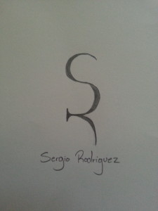
Sergio Rodriguez Logo
using photos in web design
Gestalt Principles in Web Design
Gestalt is a German term describing a design’s wholeness. When we look at a design and say, “This design works!” what we are describing is the overall Gestalt quality. How this is so is defined by this Gestalt term: A design’s unity is more than the simple addition of its parts. Very simply it means that each part of a design is affected by what surrounds it, and that we can affect the cumulative perception by manipulating the interaction of the individual parts.
Logo
Eunice Kim logo
I like to keep things simple. For me, simple = clever = intelligent = universal = effective = powerful. So I wanted to convey the impression that I am of these personalities. The reason why I used lighter color for the “KIM” is to emphasize me as a person “Eunice” more rather than what people may assume by just looking at the last name.
Dominique Pineiro Logo
I was going for a clean, and easy to read look. I want people to get the impression that I’m a creative energetic self-starter. I didn’t want to put my initials side-by-side, so I decided to make an implied shape inside the “D.” I chose red not only because it’s an eye-catching color, but because the red, white, and black all create an appealing design.
[This is just a sketch.]
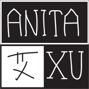
Black and white is my favorite color combination, which suggests simpleness, classics and a bit seriousness, as my major journalism requests.
Coming from China, I’m always looking for a way to showcase my bilingual writing skill, which I found could be perfectly revealed in this logo — I put both my English name (Anita Xu) and my Chinese first name (bottom left) here. Also, black and white indicates the Chinese philosophy of “yin and yang,” something that powerfully controls the balance of nature. Literally, “yin” could represent female and anything that’s slow and soft, while “yang” representing the opposite. With three quarters in black (“yin” being overwhelming in this case), this logo also corresponds to my gender.
I’m keeping looking for typefaces that will work well with the information I wanna transmit — probably something genuine, classic and a bit ancient.
Logo
These are my two ideas for a logo for myself. I used the bottom one as my word mark/initial mark on the resume, too. I think it could work well on a business card too. I had trouble incorporating both letters in my name because I have awkward letters that don’t work together too well, but I figured it out! My favorite color is lime green, so that’s why I created my initials using it. Also, I think the middle, between the s and r, you almost forms a letter b, which is my middle initial.

