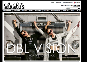
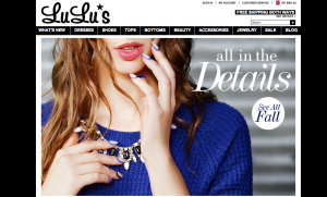
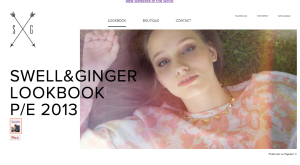
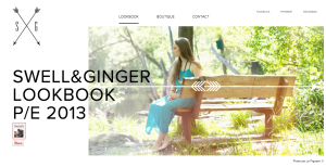
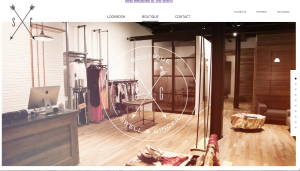
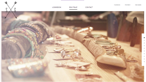
- figure and ground: The company’s products stand out very clearly from the background. By making the background black and white the color of the products really pop out at the viewer.
- proximity and alignment: Black and white are the only two colors used for the website’s typefaces. The majority of the site is in San Serif however the name of the site and some of the titles use different typefaces to draw attention to certain words.
- continuation: All of the different product categories are listed on one line below the title. Any other pertinent information is in a line on the top right and all the social media is in a line on the bottom left corner.
- visual hierarchy: Lulu’s website does a good job at this. Any words that are in white and on a black background are links and will connect you to a different page. The home page goes through a slide show of different images, the type paired with a image is significantly bigger than the type on the rest of the site. This draws your attention to the middle of the page and to the collections they are trying to sell.
Author Archives: Kathryn Grant
Website
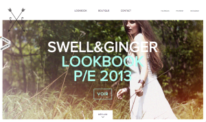
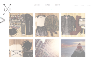
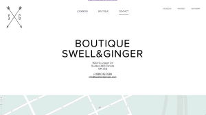
I really love the whole look of this website. Since the company Swell and Ginger is a boutique that sells women’s clothing and accessories, the website appeals to women. The light colors and simple typeface make the website appear very clean and pretty. The use of white space also adds to the page feeling very clean. I also really like that each page has lots of pictures and that they are all taken in the same light and edited the same way. The design of the website is very consistent and it is a great marketing tool for the company’s logo to appear on every page. I think the fact that the social media is all the way to the right and in a smaller font size separates the information very well.
Adobe Illustrator
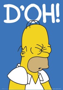
This image was most likely done in Adobe Illustrator using primarily the pen, paint bucket, and text tool. The designer most likely used the shape tool to draw a rectangle for the background and then filled the shape in with blue using the color tool. The the designer probably used the text tool to write D’OH! in white. Having completed the backdrop the designer then probably used the pen tool to draw the outline of Homer and used the color tool to fill in the different sections of his face and upper body. The pen tool was also most likely used to create the details within the outline like his hair, eyes, shirt, etc. This image is simple yet conveys emotion very well and is a great representation of Homer Simpson.
Typography Design
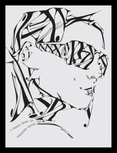
I find this typographic image particularly interesting because it creates an image using primarily three letters: X,Y, and K and one typeface to compose the image. I think the Serif typeface the designer chose really adds a elegant and fashion feel to the design. In order to create this image, the designer used an array of sizes for the letters, stretched the letters, and flipped them. I find the small x on the women’s check particularly interesting. At first I thought it was a mistake, but then I realized the designer used it as a beauty mark. Another interesting aspect of the design is that the girl has no distinct ears, yet because of the placing of the letters it does not detract from the design. The one thing I did not understand was why the designer chose to have a Y coming off the women’s chin because the chin is already defined without it.
Resume
POSTER CRITIQUE
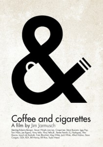
Out of all the different posters I looked through this is the one that stood out to me the most, both visually and conceptively.
The simplicity and cleverness of the poster is what makes it stand out. By visually representing both coffee and cigarettes in the & symbol, the poster conveys the essence of the film to the general audience, which according to IMDb is a “series of vignettes that all have coffee and cigarettes in common”.
I think the designer had two reasons for picking black and white for the color of the poster. One is that Coffee and Cigarettes is shot in black and white, so by choosing those colors he or she stayed true and inline with the film’s visuals. Another reason for reason is that the white resembles the color white walls will eventually turn if someone is constantly smoking near them.
The title Coffee and Cigarettes is perfectly matched up with the visual elements. The coffee cup is aligned with the word coffee, the & symbol with the word and, and the word cigarettes with the visual cigarette created by the large typography. The visual is clean and to the point. I would not change anything with this poster. The design makes it clear that it is a poster for a film. It also engrains the title of the film into the viewers mind while illustrating an important theme in the film at the same time.
WORDMARKS
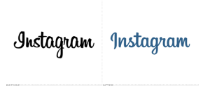
Instagram ditched their old stock font wordmark for a more refined custom-drawn one. The new wordmark stays true to Instragram’s brand but looks cleaner and less choppy. The original typeface was script, but did not connect throughout the name. The new wordmark encourages the eye to flow effortlessly through the name. The old typeface “Billabong” gave the brand a retro feel, which carries over into the new wordmark so that the brand’s personality is not lost. The old I in Instagram could be confused for a G, but the new one is clearly an I without loosing character. Using blue also enhances the brands wordmark because it is easier on the eye and also can change appearances using Instragram’s different filters. The old wordmark looked the same in each filter, which did not represent the company’s concept of representing the same image in different ways.
The Disney wordmark represents The Walt Disney Company perfectly. The typeface gives the wordmark a whimsical feel and the choice to mix both upper case and lower case letters makes it feel fun and friendly. Making the D the longest and widest letter draws your eye to the start of the wordmark first. The I’s dot gives it a playful feeling and resembles Walt Disney’s real signature I. The curve of the S brings your eye in the direction of the N, which is tilted in the opposite direction of the following E, again reestablishing the companies playful feel. The Y at the end ties into the signature feeling of the entire wordmark making it feel personal. The thickness, lettercase, whitespace, and color all add to the feel of childhood and imagination, which is what Disney is all about.

