Apple Blog 4

Apple


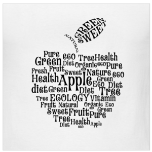
I really like the typography, arrangement and spacing on this t-shirt design. I like the way that the words make the shape of an apple. The word apple is the biggest in size and stands out the most, which makes sense because all the other words describe aspects of apples. The typography works really well on this design because the curly letters add to the element of the curved outside lines of the apple. Overall, the typography is fun and the arrangement of words is clever.

Week 4 Blog Post

typography-cocktail01

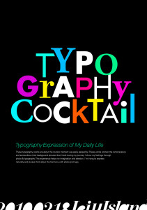
This design really stands out. Use of different typefaces and colors adds tremendous playful elements to it, making viewers link the playful design to the cocktail event unconsciously, which I believe is very very smart. Also, the designer chooses different sizes for each letter, making it even more lively. It’s fun to look at such design, as it spurs your imagination.

Typography -Blog 4

Screen Shot 2013-09-18 at 4.29.50 PM

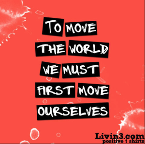
I really like this poster. The colors drive one to get inspiration and move, with the red background. The typography is very playful and almost looks hand drawn to emphasize people have power and can change the world. The typeface is of the novelty variety and is very successful with the message it is trying to convey.

Week 4 Blog: Typography Design post


As is shown here, you can do some pretty cools things just by arranging and adjusting words and letters. Find a design that primarily relies on typography. It can be anything, a poster, a booklet, or a magazine page. And find out what sorts of typographic elements make it stand out.

The deadline for blog post is September 18, Friday by 11:59 P.M.

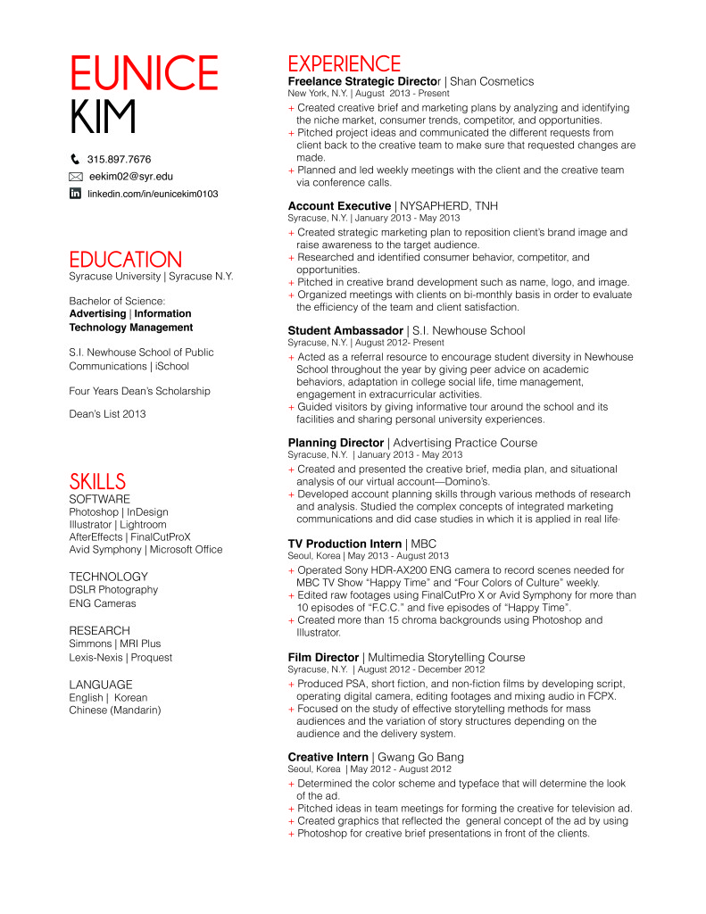
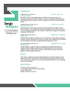
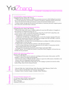
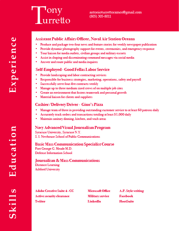
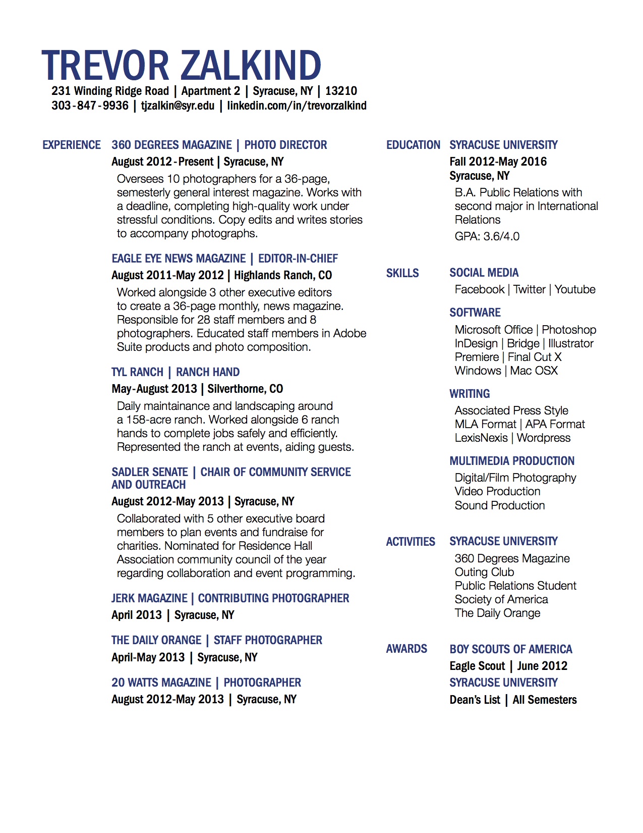
The deadline for resume post is September 18, Friday by 11:59 P.M. You don’t need to put your rationale in it.

This week you need to make two comments on two of your classmates’ resume design. The deadline is Sunday by 11:59 P.M.