

Monthly Archives: October 2013
website design.
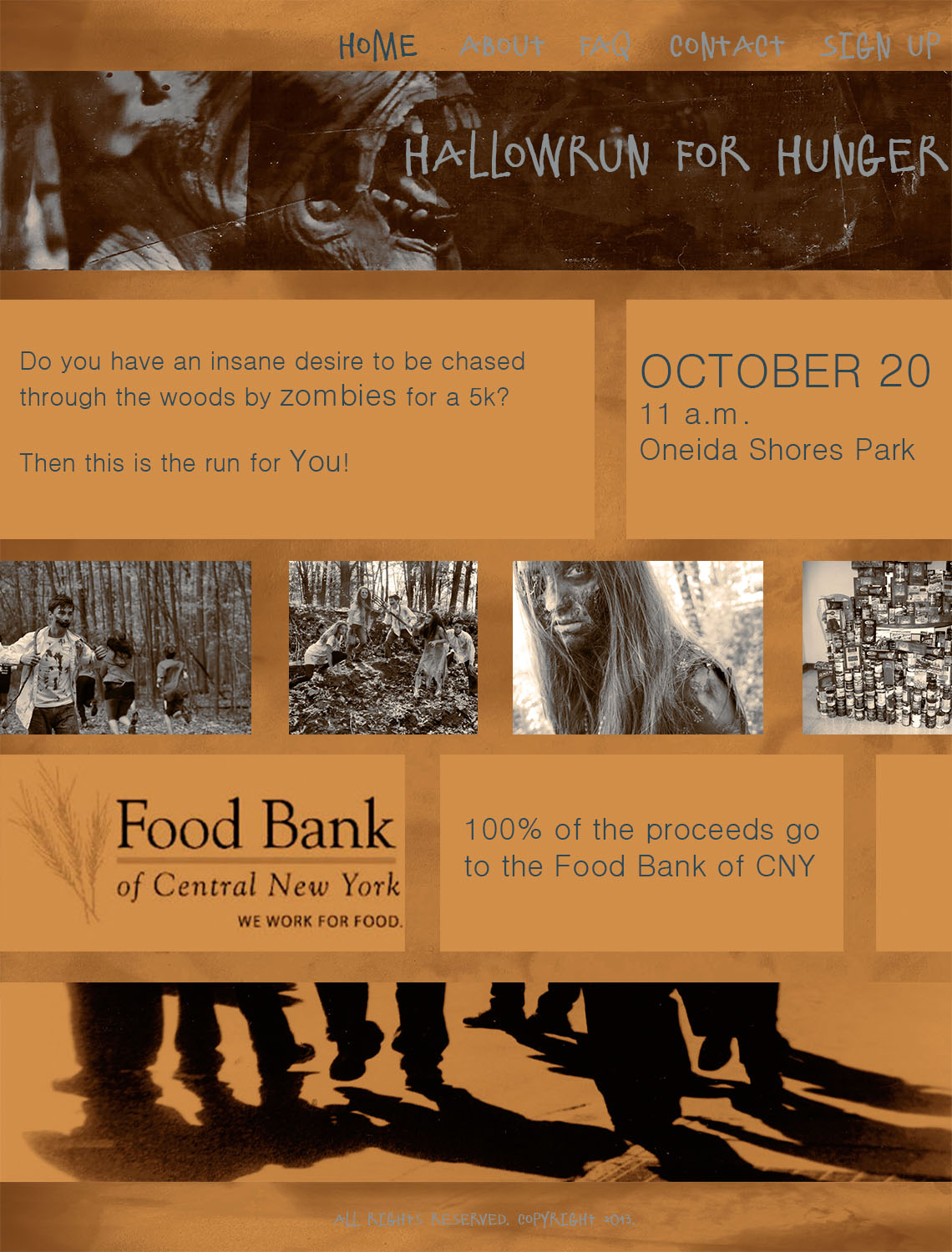

Sergio Rodriguez Logo
![]()
This is my personal logo drawn out. the R was supposed to be a reflection of the S but as i was drawing it i saw the R and decided to keep it like that. i really like how simple the design is and how it flows. hope you all like it too!
using photos in web design

I love how the bikes in the photo compliment the idea of this coffee shop, as well as the type and design used in this website. it works really well all together along with the colors.
Gestalt Principles in Web Design
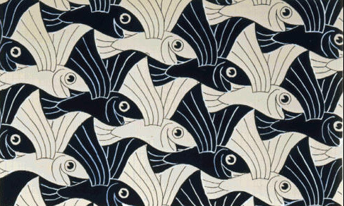
Gestalt is a German term describing a design’s wholeness. When we look at a design and say, “This design works!” what we are describing is the overall Gestalt quality. How this is so is defined by this Gestalt term: A design’s unity is more than the simple addition of its parts. Very simply it means that each part of a design is affected by what surrounds it, and that we can affect the cumulative perception by manipulating the interaction of the individual parts.
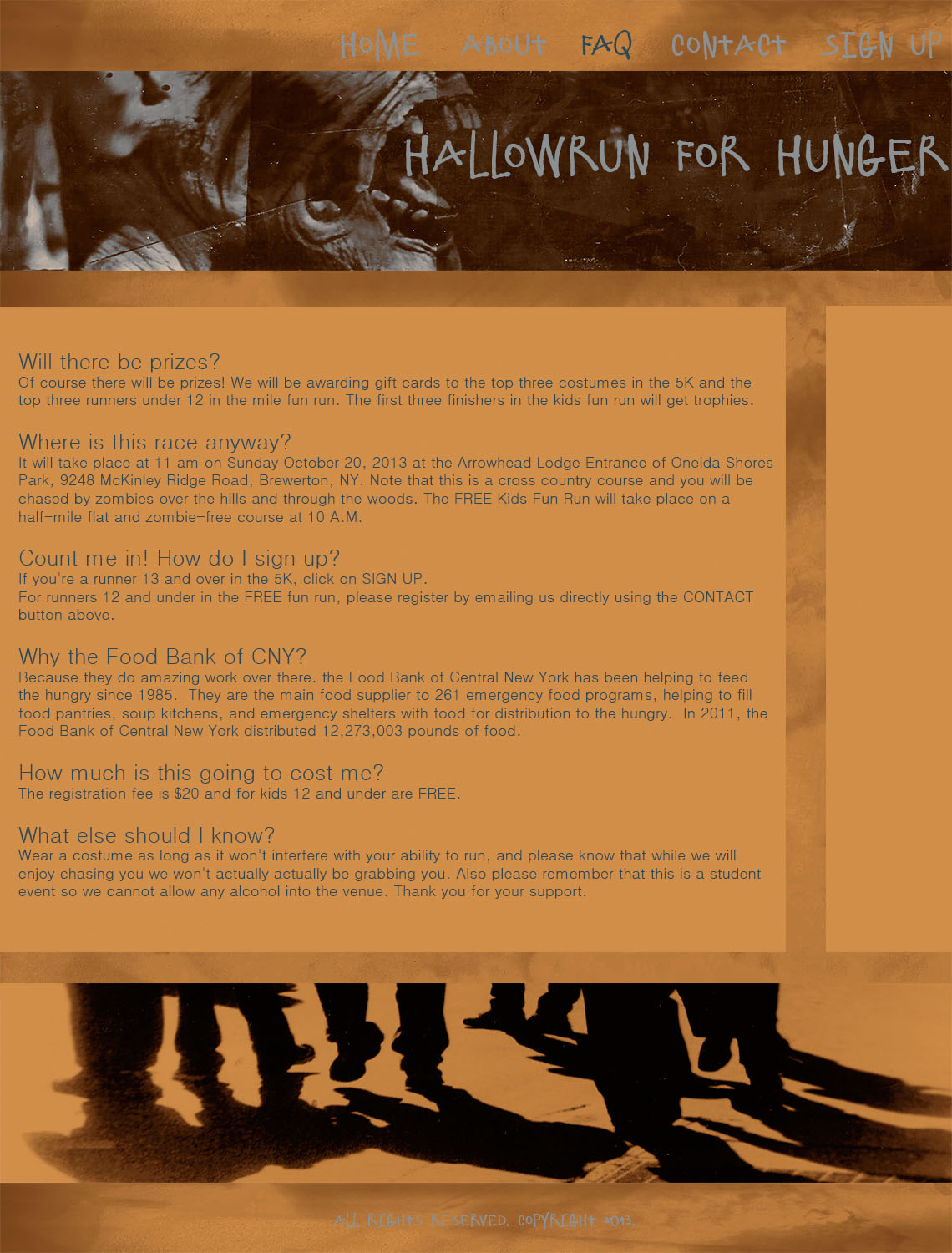
Logo
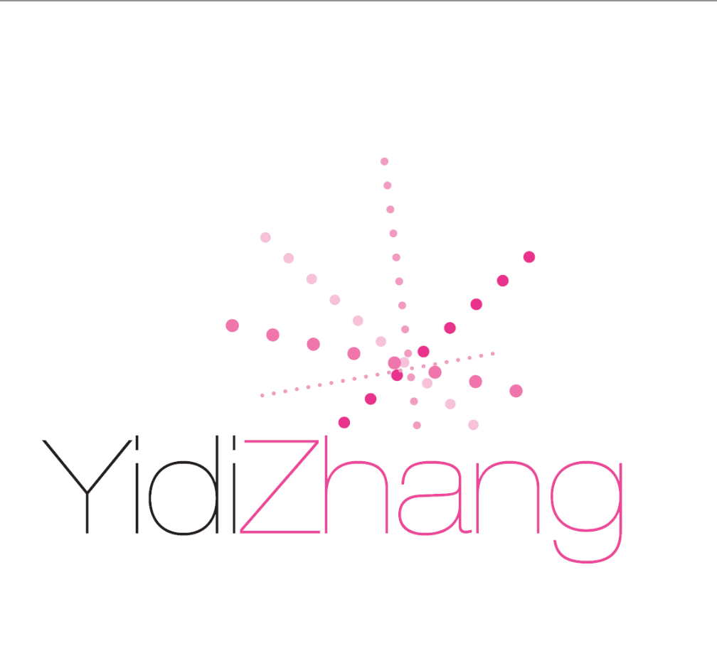
I designed the logo in InDesign. The words are my wordmark in the resume. I like the different pt dots lines because they shows inspiring, creative and energetic characteristics. Pink is my favorite color, so I used it for my last name and dots line.I was inspired by the logo of Sparkpr Firm.
Turretto logo
I used the symmetrical and closure gestalt principles to put this logo together. The two capital T’s are the same with one flipped upside down so the logo looks the same ride-side-up and up-side-down. The two letter are slanted to create an effect of an unfinished/open-ended equilateral.
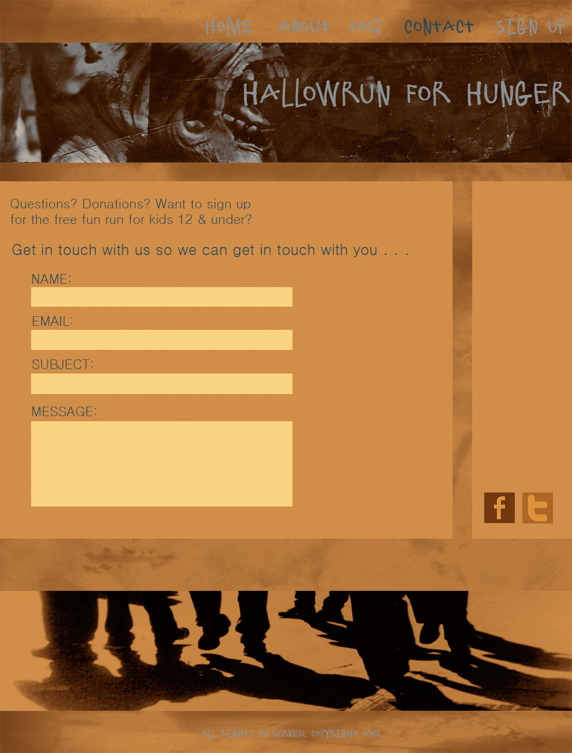
![]()
Eunice Kim logo
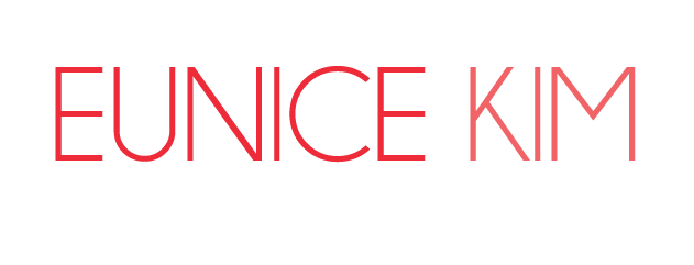
I like to keep things simple. For me, simple = clever = intelligent = universal = effective = powerful. So I wanted to convey the impression that I am of these personalities. The reason why I used lighter color for the “KIM” is to emphasize me as a person “Eunice” more rather than what people may assume by just looking at the last name.
Trevor Zalkind Logo
![]() For my logo (created haphazardly in Photoshop), I used my initials and the text creatively to form one object. My full name, Trevor John Zalkind, is represented. Through decreasing the type of the “J,” I deemphasized the initial, while maintaining a closeness between the “T” and the “Z.” I used ITC Franklin Gothic Bold Condensed for the typeface, which is a very masculine and defined typeface. The color, a dark blue, is also relatively masculine and contrasts greatly with the white background of the page. The only similarities with my initials was the bar at the meanline, so I made sure to make that the combining factor of the logo. Instead of being three separate letters, the logo now combines my three initials into a single entity.
For my logo (created haphazardly in Photoshop), I used my initials and the text creatively to form one object. My full name, Trevor John Zalkind, is represented. Through decreasing the type of the “J,” I deemphasized the initial, while maintaining a closeness between the “T” and the “Z.” I used ITC Franklin Gothic Bold Condensed for the typeface, which is a very masculine and defined typeface. The color, a dark blue, is also relatively masculine and contrasts greatly with the white background of the page. The only similarities with my initials was the bar at the meanline, so I made sure to make that the combining factor of the logo. Instead of being three separate letters, the logo now combines my three initials into a single entity.
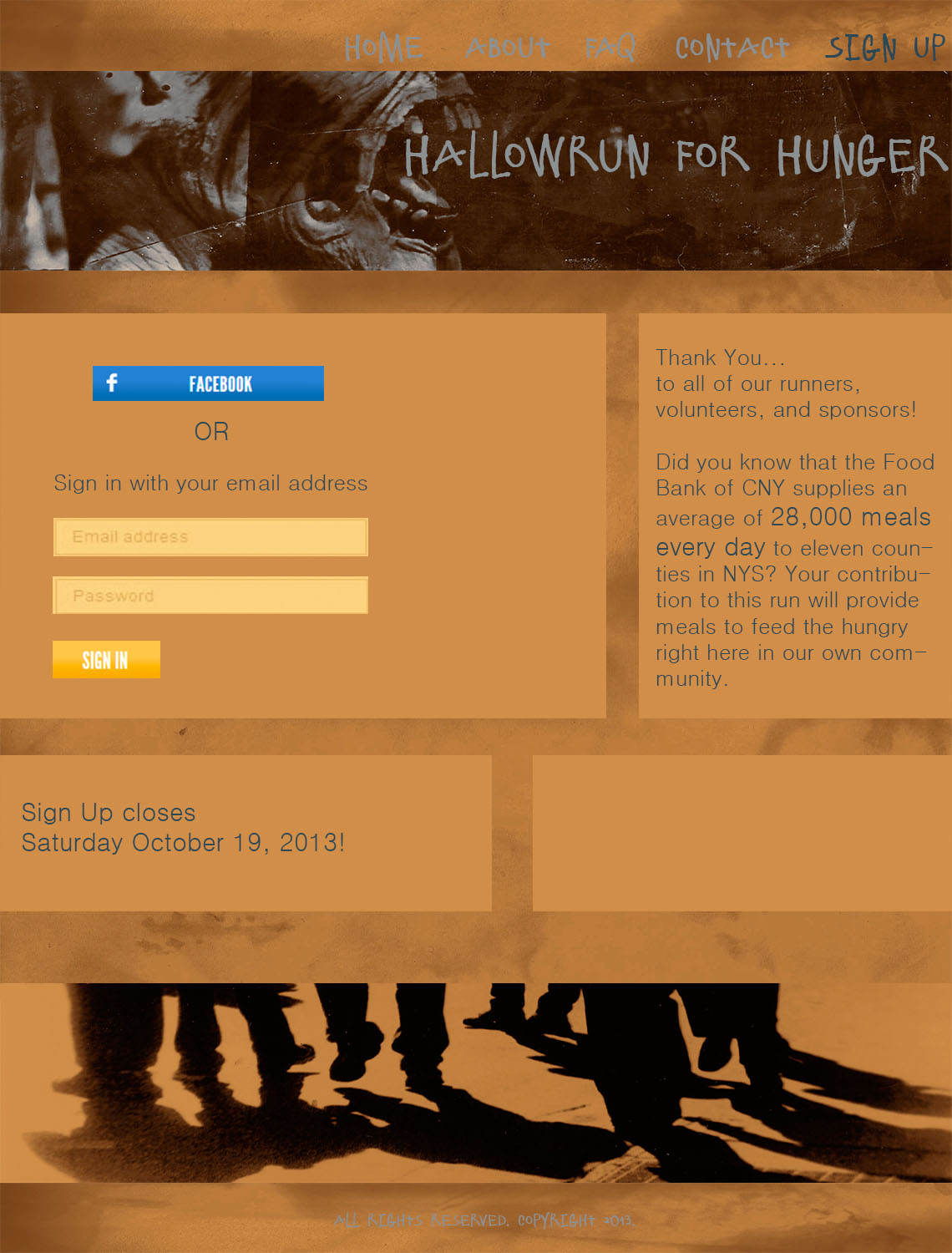
Dominique Pineiro Logo
![]()
I was going for a clean, and easy to read look. I want people to get the impression that I’m a creative energetic self-starter. I didn’t want to put my initials side-by-side, so I decided to make an implied shape inside the “D.” I chose red not only because it’s an eye-catching color, but because the red, white, and black all create an appealing design.