Monthly Archives: October 2013
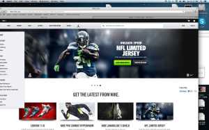
As a photographer I am really into Nike’s designs. They love dark gradients, and that really sells if for me, because Nike shoes are so colorful. The visuals that you will always see in Nike is that when they design they keep the same pallet. like lime green shoes, with a link bar with the same effect.
Website – Gestalt Design “Uggs”
No website needs to be more visually appealing and attractive than a website trying to sell an object/item to its viewers.Websites that are the home base for selling clothes and shoes need to be universally simple to use while portraying their products as expertly as possible.
The Australian shoe/boot/slipper manufacturer Ugg’s has progessviely become more and more popular on an international scale. Products are shipped worldwide so the website that advertises its goods may send the viewer a message of quality and luxury – two characteristics that this company is known for.
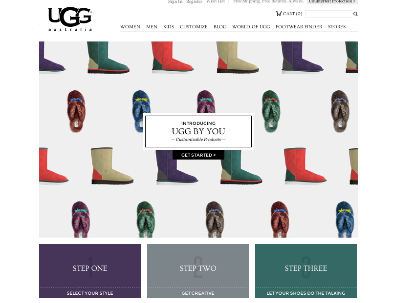
Figure and ground: The Ugg website does a great job of using white space. Products are used in appealing photography, however, when shopping for an individual piece, it stands alone. The foreground is not interrupted by a busy background. It is clean, simply and visually appealing.
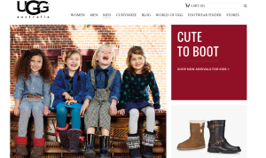 Proximity and alignment: The website does a great job on continuity throughout its pages. All typefaces are the same apart from the companies iconic logo which stands tall and strong on the top left hand corner of every page. Colors are explosive and appealing, but they all stay within the ‘prime colors’ zone and mix very well. Colors are also in their block for, they are not patterned or textured, just simply and uniformed.
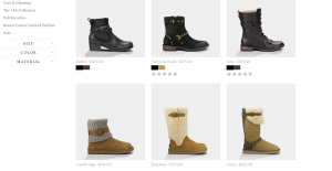 Lastly, visual heirachy is used in the display pictures that are feature points. There is quality photography throughout the site which features some of Uggs most popular products. The actual items for sale are separated by neat and easy to navigate boxs. Overall it is a great website.
The Whitney’s Website and Gestalt Principles
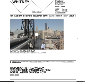
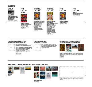
This website was newly published by the Whitney Museum of American Arts. I think it serves as a good example for other museums how to make pages readable and clear. It uses white color as a background and black color for most words, and the visuals are very colorful. Hence, it is such a great contrast that objects can easily stand out. We can see that it groups information well under the “EVENTS” column. Top is dates, middle is visuals and bottom is the name and other information. White space is between each event. Each group of information can be clearly consider as a unity and separate with each other. Regarding visual hierarchy, the website uses the same font but different colors, different sizes, bold or regular, and upper or lower cases. For example, it uses black color, bigger size and upper case for the dates in EVENT column, while uses smaller size and lower case for the events’ names. And it uses grey colors, for the least important information—the time.
Davroc Interiors
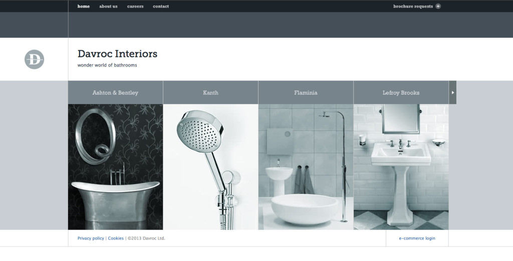
The Davroc Interiors website uses sever gestalt principles including a very narrow color palette of various shades of bluish gray to simplify the design and ensure that the photos all compliment each other. The site also uses generous whitespace throughout and a minimum of text in simple fonts to reiterate the minimalist design. Everything also uses a very clear alignment to keep order to the flow of the site.
Studio MPLS Gestalt Principles
Many of my favorite websites are often simplistic. This website, studiompls.com is no different. A good website also follows gestalt principles. Here are a few examples of gestalt found in this example:
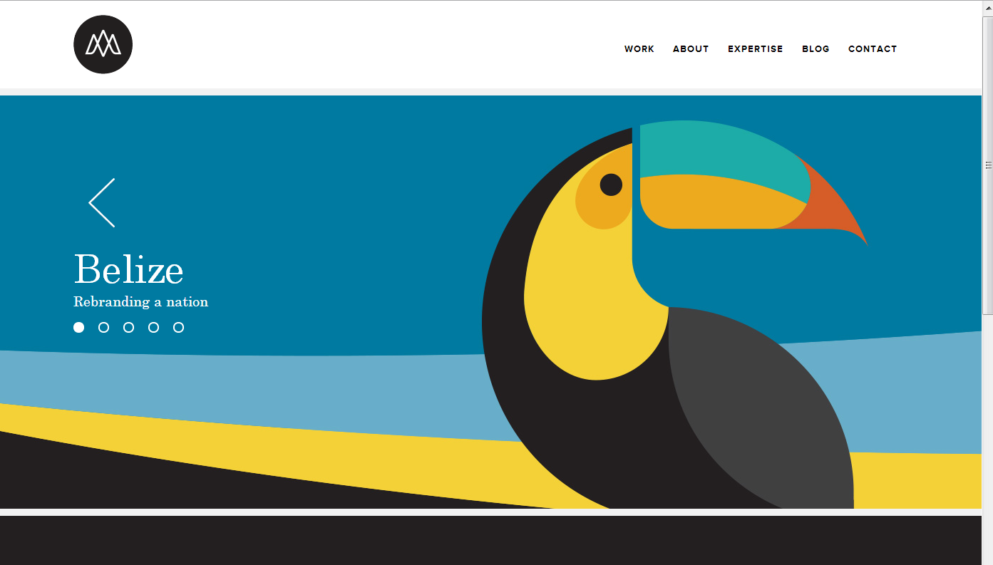
Similarity: This site has panels that change. The grouping of the multiple shapes into the form of the toucan creates a similar shape that distinguishes itself from the rest of the web page.
Closure: The toucan beak is not connected or closed off with the rest of the toucan, so the mind seeks closure and does so to assume the beak and body are one object.
Proximity: The formation of the section words in the top right are close together in proximity, allowing for the mind to group these concepts together.
Figure and Ground: The website easily differentiates the background with the figure because the background is white. Regardless, even with the toucan graphic, the toucan is easily distinguishable from the background because of the vertical vs horizontal contrast.
Bring History off the page
Law of Symmetry in Circlex Web
This website uses Gestalt’s Principle- Law of Symmetry. The main image of the web has a element of rotational symmetry because it has a central reference point (the hands) and rotates around the central point. Because of it, the web looks much more interesting, engaging, and attractive to the visitors.
Zalkind Poster
Rule of Three
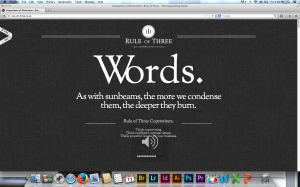
The Rule of Three website applies many gestalt principles. Most notably, visual hierarchy, figure and ground, and proximity and alignment.
The dark background and white letters allows the viewer to easily navigate the website’s text. The layout’s is very simple, and the word “Words,” is the most prominent figure on the screen, It’s also what the website sells. The website is very organized. Even though there’s only one type of font used, it’s used very effectively with grouping. All the areas with like information are equally separated, and the use of different sized fonts helps readability.

