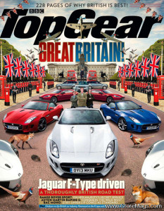
Top Gear is a magazine based on the BBC television show directed towards car enthusiasts. The title design/typography comes from the show. This issue highlights Britain, so they pulled the colors of the cars from the British flag. In the iPad format, there is mush less type and the photograph is significantly cropped. They also changed the color of “Top Gear” from black to white in the iPad version so it would not have an overwhelming presence.
Category Archives: Uncategorized
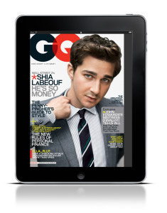
GQ iPad Cover
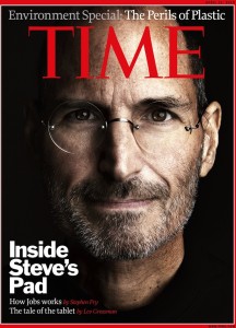
Time of Steve Jobs
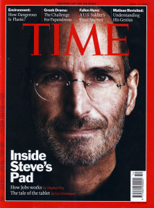
On the left side, it is an iPad cover of Time magazine with Steve Jobs. Steve Jobs’s eyes are look at us, strongly dragging our attentions. “Time” is on the top, covering half of Jobs’s forehead. The visual–his bright face works well with the black background.The feature story’s cover line is at the left bottom, white and bold. Two lines of deck are lower with smaller fonts. This design works well because of strong visual hierarchy.
Compared to the iPad cover, the print cover is a little bit different. It includes four other cover lines on the top, and a barcode. I like the iPad cover more because it looks more succinct
Ipad Magazine Cover
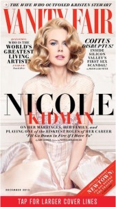
This is the cover of Vanity Fair Ipad version. The photo is smartly shot and chosen, where Nicole Kidman looks directly into readers’ eyes and connects with readers perfectly. Symmetry doesn’t always work well but in this design, it looks great — with the photo at the center dominating the cover, any asymmetry would break the balance; however, symmetry like we see in this design avoid such imbalance. The colors are kind of simple but the combination of red and black, for most of the time, if not always, is very effective and eye-catching. Also, with Nicole Kidman slightly leaning over, the line “Nicole” is made even more prominent — very smart design.
WIRED iPad Magazine
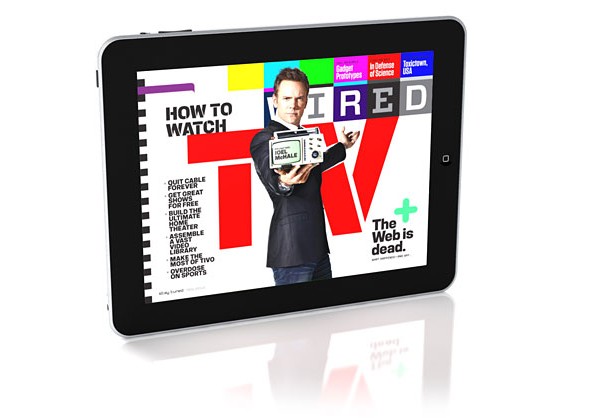
I chose WIRED magazine’s iPad cover. I could not find the vertical version of this photo. The reason I chose this layout is because of its cleverness of the horizontal iPad and layout. The theme of this feature is TV, and the immediate value of association that comes with it is horizontal, rectangular TV. I love how the headlines are unified into one typography that has style that reminds one of technology, IT, and innovation.
Ipad Magazine Cover
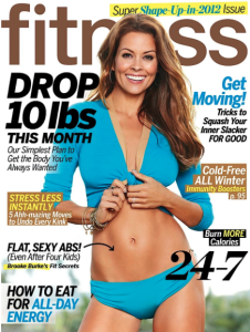
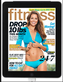
I could not find the horizontal image of this magazine on the iPad.
I like the iPad version better because the colors seem brighter. However, the layout of the images and words are identical in both versions. Even though the text seems clear and easier to read in the print version, I still prefer the iPad colors and overall appearance. The only thing I am not too fond of with this magazine is the multiple headlines all over the cover, I think they distract from the big image on the cover. And there are too many article titles to follow, overall just distracting the reader. Maybe for the iPad version the multiple headlines are safer because they hyperlink to the article but for the print magazine, I think they aren’t as valuable.
Sports Illustrated Headline and Deck
Headline: Boston Strongman
Deck: David Ortiz is brute October force, inarguably one of the greatest postseason sluggers ever, but there is a Tao of Papi that goes beyond the raw power and three rings. As a study in resilience and seizing big moments, his story is the story of Boston itself.

