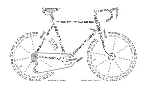
I really like this image of a bike built using typography because not only does the name of each part create that part of the picture, but also because of the way certain letters in key positions are styled to better fit the shape of the part it represents.
Typography.
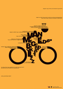
This poster cleverly uses typography to give the essence of motion. I like how it is a recognizable figure yet still abstract. It effectively uses the type’s size to create form, especially the very small type to invoke speed. The design is simple and has nice contrast against the yellow background.The giant “O’s” as wheels draw the viewers eyes in but do not distract from the whole image over all.
Week 4 Blog: Typography
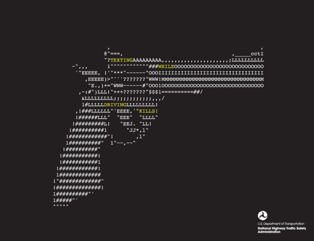
This design solely relies on typographic to create this image of a gun. The purpose of this graphic is for public service announcement, raising awareness for the danger of texting while driving. By creating a shape of a gun through face found in regular phone while texting, it allows viewers to create the realtionship between the gun (and its associated values such as violence) and texting in the car.
Starbucks Typography Poster
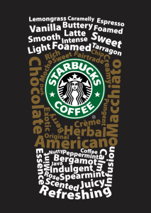
I really like this typography poster designed for Starbucks. It is a very smart design that the words are combined as a typical Starbucks’s coffee cup. The upper and lower words are white color, while the middle ones are brown color that implies the cup sleeve. The typeface of the words should be sans serif grotesque. Creatively, all the words are about coffee, like “Macchiato”, “Vanilla”, and “Foamed”. And the logo at the middle of the “cup” is bright and impressive, which gives people a clear idea that this is a Starbucks’s poster.
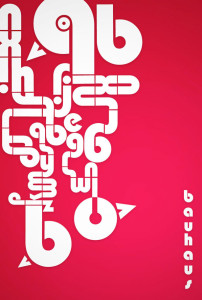
Bauhaus?
I’m not even sure what I’m looking at, but I love the way the letters are arranged. They create a maze like object and it leads you all around the image. I was drawn to this typography because of the use negative space. It’s heavy on one side, but I like the asymmetrical balance, it adds to the maze-like design. I think the color scheme is awful. I hate it. But other than the terrible colors I think this is a solid piece.
Week 4 Typography
I think this really demonstrates how typography can really drive home a message or theme. I think it’s really interesting how words alone from this image. The words are describing challenges faced in President Obama’s administration, and the image depicted shows the burden of leadership. I think this is a creative way to show how typography can be really powerful when different elements are combined.
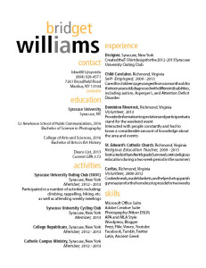
Resume.
Week 4 Blog Post
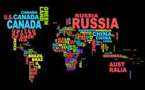 I enjoy typography that not only is visually appealing but also can display another message. In this case, instead of simply typing out a country name, the typographer arranges variations of the country’s name to form a visual map of the world. The double emphasis of the name and visual representation hammers home the concept of national borders and national identity.
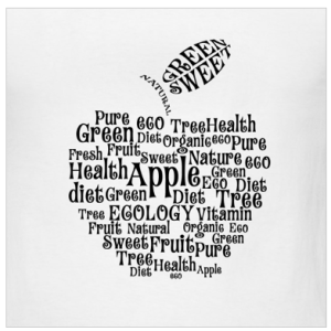
Apple Blog 4
I really like the typography, arrangement and spacing on this t-shirt design. I like the way that the words make the shape of an apple. The word apple is the biggest in size and stands out the most, which makes sense because all the other words describe aspects of apples. The typography works really well on this design because the curly letters add to the element of the curved outside lines of the apple. Overall, the typography is fun and the arrangement of words is clever.
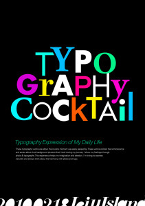
Week 4 Blog Post
This design really stands out. Use of different typefaces and colors adds tremendous playful elements to it, making viewers link the playful design to the cocktail event unconsciously, which I believe is very very smart. Also, the designer chooses different sizes for each letter, making it even more lively. It’s fun to look at such design, as it spurs your imagination.

