KONY 2012 Invisible Children Poster

Evernote Camera Roll 20130912 151656


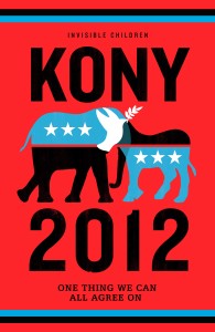
The colors, bold typeface, and the eye-catching image all work to make this poster successful. The use of complementary colors attracts the viewers to be engaged with the poster.  The designer chose the bold yet modern typeface to imply the importance and urgency of this issue. The boldness arouses confidence and sense of call to action to the viewers. Furthermore, the icon is very symbolic and engaging at the same time because the contour of elephant and donkey symbolizes the icons for the dominant American political parties Republican and Democratic. The crossing of these two icons in this poster implies that all parties must unify in this movement and work together for the same cause. It also shows the hierarchal importance of this issue, saying that this movement is in the higher hierarchy than the political differences of the parties, which emphasizes even higher importance of this topic. It definitely achieved its marketing goals because it was bold, attractive, clear, and distinct in its delivery. If anything could be improved in this poster, it may be to address more of the actual issue what we are dealing with. However, this itself is good enough to fulfill the purpose of their campaign .


Lemon Poster by Ethan Kleinberg

lemon volkswagen

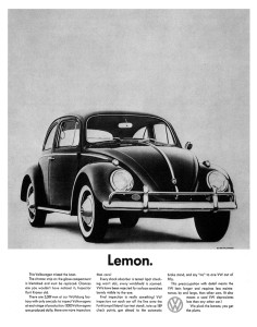
This famous 1960’s poster “Lemon” was apart of DDB’s “Think Small” campaign for Volkswagen. Not only was this poster revolutionary in many ways, but also it is visually and stylistically attractive. Before this, posters used to example the poster, sometimes having the text cover most of the poster. This has small print, but just one word stands out– “Lemon.” Additionally lemon, before this poster, used to mean a bad car; a mistake, a screw-up. When a consumer looked at this poster, you had to stop and think. Why would they call their own car bad? What does it mean? Besides the choice of text, the style is beautiful. White and black with a lot of white space. Just the beautiful car sitting there. So simple, yet elegant; exactly what DDB wanted to portray. At first it looks small and strange-looking, like a lemon, or a screw-up, but the simplicity is elegant and advantageous for an owner. It uses white space and color (or lack thereof) impeccably. It is one of the most important posters of all-time, it even was referred to on “Mad Men”, and it is personally an advertisement that I will always admire. About 75 years later and this still wants to make me want to buy that Volkswagen.

Poster of The Prestige

the_prestige_poster

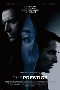
A mystery and thriller, The Prestige is one of my favorite movies. With a dark background featuring three main characters in the film, the poster highlights a creepy, mysterious and thrilling atmosphere the film is trying to sell. What impresses me is the women in the middle. Seeing from a distance, it’s hard to tell what the slim and cursive outline in the middle is: is it the woman’s hair, or smoke? Such illusion perfectly resonates with the mysterious tone of the film, and is further highlighted by the line “Are you watching closely?” I also like the all-cap texts on this poster, which make it consistent, serious and exciting.

SHARE – WWII Propaganda Poster

SHARE WWII Poster


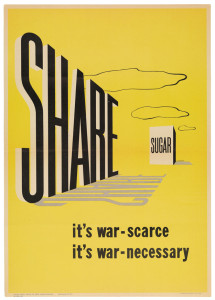
Ahh, World War II: An era of immense nationalistic sentiment. The American war machine needed its various sources of fuel, and the only way to obtain those resources was through the American people. But how do you get all of the mothers of the US to relinquish their sugar needed for scrumptious homemade apple pies? Through excellent use of the visual hierarchy in propaganda posters, of course.

The yellow background of the poster stands out, and brings the reader in from afar. Then, the eyes begin at the word “share” and follow the perspective towards sugar. Even the clouds help provide depth and guide the reader. The shear simplicity of the message and its portrayal in the poster is what makes it effective. It’s also important to note the distinct lack of “patriotic” colors and wording. The poster doesn’t ask for war resources out of patriotism, but rather the “common sense” of giving. There’s no distractions, and no bull. The government just wants some sugar. They’re just simply the neighbor next door.


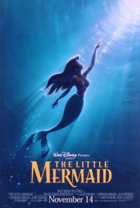
Part of your world

little_mermaid_ver1_xlg(Warning: Torrey Lee is talking in jest in most of this piece and depiction’s shouldn’t be taking as fact. Its just meant to be satarical to make you read everything. He actually loves Neil Carter, Ron Clements and John Musker. Except for the Princess and the Frog…You know what you did.)


Oh the days when Disney Princesses ruled the magic kingdom. I mean seriously, what do men get out of the deal? Aladdin was technically a Disney prince (after the whole street rat deal.), but who gets the thespian running around the parks to take photos, PRINCESS Jasmine… Where’s the justice? Lets get back on point before I get into a rant.

I love The Little Mermaid poster. Might it have been me as a seven-year old crushing on an animated hottie, or the future teenage me cheering on a rebelling aqua-human teenager.

This poster has all the elements to sell the idea. The wordmark used accents that cater to the water aspect of the movie. A majority of the movie, you are watching a pissed-off teen singing about living under the sea. Apparently the graphic designers of this poster wanted to showcase the feeling of someone yearning for a new world. Though her life is pretty fun, and she’s the favorite daughter of the sea-king, the artist depicted her in darkness (depression) looking for more.  Well done, senior graphics-guy.

Though really, he didn’t’ have much to work with in this piece filled with racism and misogyny.  Come on, we all know that Ron Clement and John Musker were sitting around saying;

Ron: “Dude, how I am supposed to make this chick depressed? The movie can’t progress.”

John: “Well you were the one that wanted her singing with that Jamaican crab.”

Ron: “Hey! He’s Caribbean! Besides, they’re a jovial people.”

John: “Alright, Alright. You just need to make her shut up for half of the movie.”

Ron: “I got it! A sea-witch steals her voice. What’s that fat lady’s name from Gimme a Break?”

John: “You mean Neil Carter?”

Ron: “Perfect, we’ll name her Ursula.”

John: [sighs] “I’ll prep the legal team.”

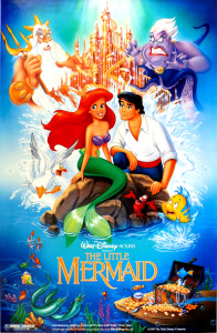
Though in all seriousness, I liked the poster because it’s simulated use of light. Back before those days, artist just drew a character in darker shade and assumed that would display a lack of sunlight.  The artist had to incorporate the coldness (color temperature) of the sea while showing Disney vibrance.  Then again, the artist get’s one for two in his designs…You’ve seen the other with the phallic castle right?  Yeah…look real close…
littlemermaid


Rosie The Riveter Poster


Screen Shot 2013-09-12 at 10.26.55 PM


This is a poster that has been around since 1943, but became more noticed in the ’80’s. It is an American wartime propaganda poster produced to emphasize feminism and women workers in World War II. Now, many people know the poster as “Rosie the Riveter”, named after a female worker in the war.

I like this poster because it draws the eye from one end to the other effectively. When you first glance at the poster, you see the woman’s arm which directs you to the caption at the top of the poster. The colors are bold and allow the words to remain visible. I think the slab serif font style is successful in this case because it is easy and clear to read at a quick first glance.

The words in the poster “We Can Do It”, are supported by the woman displaying her muscles because she’s showing the public that woman are just as capable as men and “can do it too.” Also, the yellow background is so bright and strong, emphasizing the strength of the woman. I don’t believe there are improvements to be made here, I think it’s a very successful, well cherished poster.

The Checkerboard Criminal

TBC

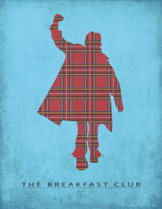
One of my favorite movies is The Breakfast Club, and this poster captures one of the prominent characters in an effective way, and also includes the logo of the movie, as well as the title. The contrasting colors of the blue and the checkerboard red pushes the classic pose of Judd Nelson to the forward, as the deep red is a warm color, against the cool blue background. The iconic fist pump during the ending scene of TBC to “Don’t You Forget About Me” is one of the most well known endings in cinematic history, so this poster effectively captures the entire theme of the movie – creating new friendships from different people that you never thought you could. Bender is the glue that keeps the club together, so it is only right to have him front and center. The checkerboard is his shirt, one of the other symbols of the movie. Overall, beautiful representation of the movie in a minimalist way.

Keep Calm and Carry On Poster

Keep Calm and Carry On

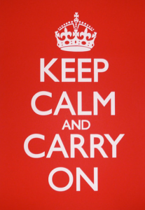
Originally, this poster was intended to increase British morale before the Second World War. Now, this poster has become even more famous. I see this poster almost everywhere, and I believe that it has a powerful message. It tells its’ viewer to not worry about what is going on, but to remain calm, and to keep moving along. Not only is its’ message very strong, but it is designed very well. The Gill Sans typography that is used remains the same throughout the entire poster. It is white, bold, and stands out very clearly in front of the bright, red background. The typography, color, and design are very clear and keep the message short and simple. I don’t believe anything should be changed to this poster to improve its effectiveness.


Poster.

i_want_you_for_u_s__army_rst__n_by_adamcuerden-d32aw9u

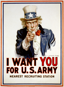
I believe this is one of the most famous posters of all time. Everyone has seen this image and there have been countless parodies of it as well. It was created during WWI as propaganda to recruit soldiers for the American Army. Uncle Sam is depicted pointing at and staring into the eyes of the viewer, drawing them in. The use of an iconic figure (Uncle Sam) and the choice of the red, white and blue colors make it very patriotic. Uncle Sam personifies the United States and is a man associated with the qualities of fairness, reliability, honesty, and who is devoted to his country. The “YOU” is the most prominent word. It is larger than the rest and a different color, which again draws the viewer in. I believe this poster connects to the viewer in a very personal way (especially emotionally). This poster was so overwhelmingly successful that it was later used in WWII.

Sushi/Plastic Pollution Poster

sushi_ad


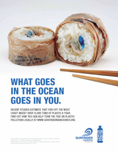
The major message this poster tries to convey is that polluting the ocean with garbage should be prevented because fish eat that garbage and we eat fish. I believe the designer decided to use this sans-serif typography because it is easy to read on a poster-sized paper, and the message is straight to the point. I also believe the designer used the color blue for the typeface to represent the blue of the ocean. The visual choices made were very clever. The picture is two pieces of sushi with a pair of chopsticks like it is ready to be eaten. The issue with these pieces of sushi is that the outside is wrapped in plastic, and the inside, where the raw fish is usually placed, contains more plastic remnants. The words connect very intimately with the graphic image because the words say that we eat fish and if fish ate plastic pollution we are essentially eating plastic. The picture shows exactly what the words are saying by showing plastic on and in the sushi pieces where food from the ocean usually is in sushi pieces. The poster met marketing goals by grabbing the attention of readers with an interesting visual, while having a bold, easy to read, and straight to the point message. It makes for a clever yet easy to comprehend poster. There is always room for possible improvements. I think that maybe the words could have been written on a path of a wave to drive home the ocean message even further. Additionally, one of the chopsticks could have pointed down toward the text to encourage the reader’s eye to read the message. Lastly, the logos in the bottom right could be smaller because the size they are now is a little distracting from the overall message.