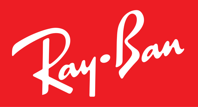
Wordmark one for week two assignment.
I really like the Ray Ban wordmark because it has always been associated with ‘cool’. The wordmark, as most of you know I’m sure, is always neatly and subtly placed in the corner of all their products. I always thought that was neat because it distinguishes their product from similar ones. I like the bold color that draws you in, but I also like the the way they present themselves elsewhere using only the signature font. It’s unmistakable.
Wordmark two for week two assignment.
This wordmark is a classic. The font is unique but familiar and bold. I think the wordmark matches appropriately with the products it represents because of the bold color and sleek appearance. Unlike Ray Ban, Ferrari uses a block/slab serif that I find appealing because it’s bold and uncompromising. When I see Ferrari and Ray Ban wordmarks I think of classic and uncompromising brands that don’t aspire to be trend setters. These wordmarks and the associated products set the standard of what we know to be cool.