Simple is more

Screen Shot 2013-10-04 at 9.53.08 PM


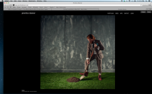
So I am doing my favorite site, Prentice Danner. Danner is a photographer and as you can tell by the website he likes things to be simple clean and not distracting.  Sure I love website with lots of elements and creativity, but when it comes to the mind of this photographer, I want to be consumed by his work and not the other things. The navigation is simple and too the point.  I promise to be colorful again next week.

website.

3 2

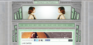
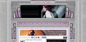
Florence + the Machine has a very aesthetically pleasing website. I like the 20’s/art deco style of the web design. It correlates with Florence’s actual fashion style. The website includes very dramatic and quality photographs of her. The colors of the windows and the photos at the header change while you are viewing the page. It is very clear and easy to navigate. I believe that many artists and bands have really nice and quality websites and Florence + the Machine is no exception. http://www.florenceandthemachine.net/index


100 McDonald’s Moments

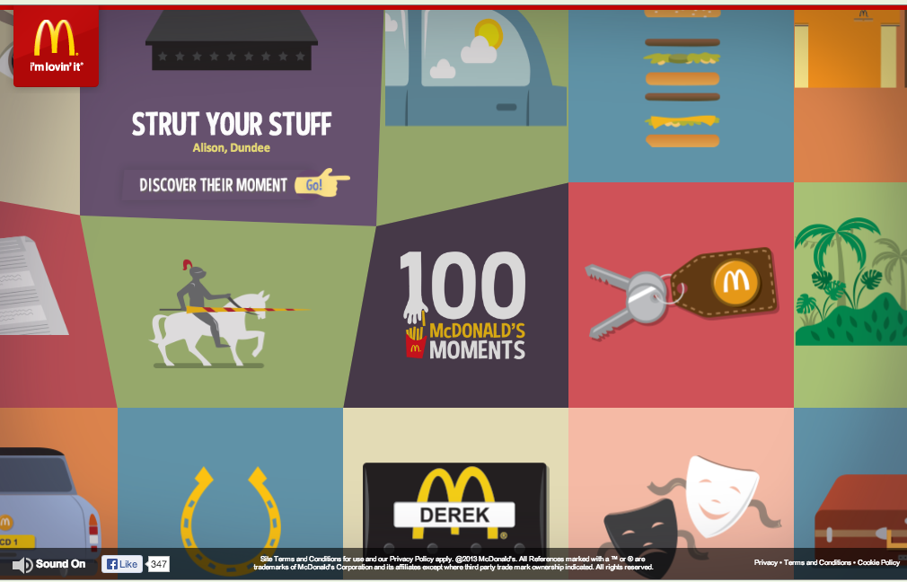
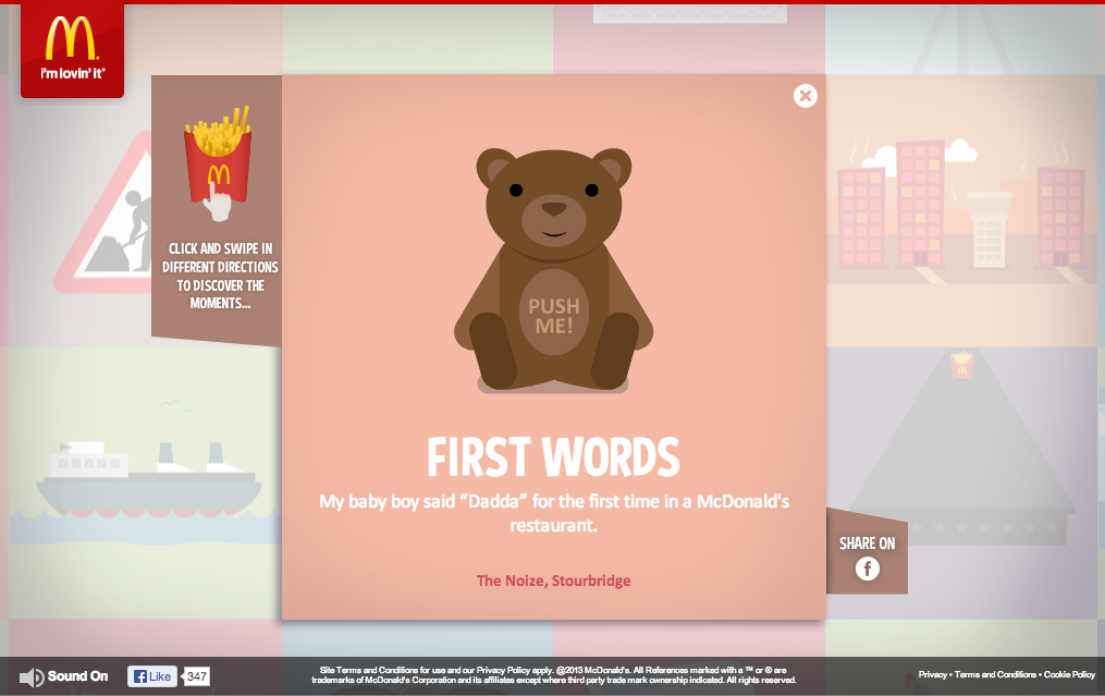
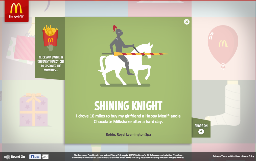
Screen Shot 2013-10-04 at 6.30.37 PMScreen Shot 2013-10-04 at 6.31.30 PM Screen Shot 2013-10-04 at 6.31.14 PMI chose 100 McDonald’s Moments as my favorite website because of its effectiveness in engaging the audience, showing brand personality, and and also enhancing brand image.

McDonald’s did a fantastic job of creating a web site that is purely created by engagements of its consumers. With the valuable anecdotes that consumers have sent, it raises the credibility and authenticity of their message to a whole new level.

Their use of color, gif motion, grid format, and typography are all fun, colorful, and original and it conveys the personality of McDonald’s excellently.


Brewery Ommegang – Simple – Beautiful

Brewery Omegang

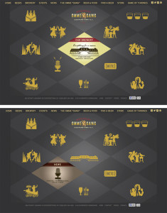
The website for Brewery Ommegang is simple and clean, using the same plaid motif they decorate bottles with, but in two shades of gray to allow other content to stand out in the bold yellow they chose for text and icons. When the mouse is rolled over any of the icons, the diamond containing that icon switches to a colored graphic with more information. Icons are silhouettes of designs used on bottles for each variety of beer they make along with complementary icons to represent the brewery, news, events etc.

America’s Navy

Americas Navy

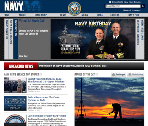
I like the visual hierarchy of this page. The arrangement of items leads you across the page from left to right, up and down in a very pleasing way. I also like the grouping of like items. It keeps everything on the page very neat and organized.

Website

Screen Shot 2013-10-03 at 6.26.54 PM


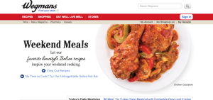
A Wegmans employee, I love this website because it is so easily navigable and is visually appealing. The white background with the red banner (a warm and visually eye catching color), makes this site simple yet attractive. The red banner pops but allows the bar to be visible where all information you’d need to find can be sourced by clicking on the links. Also, as you scroll down the page (not seen here), there are pictures different areas of the store you can click on and social media links, as well. I also like that the front image (of the chicken, here) constantly changes to different meal images, keeping it interesting and appealing. This is a great website.

A Booming Web Design

Screen Shot 2013-10-02 at 9.42.00 PM


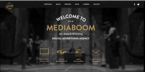
I really love this website design. The darkness of the background contrasts excellently with the white and gold colors used for the type. I also really like the way the overhead lights in the background frame the type on the page. It looks as though the lighting comes from the tabs at the top and then as it shines down and widens its scope of light, the type on the rest of the page fills up that lightened space. I also approve of the way the picture is blurred in the background; it allows the viewers eye to be focused on the clear type of the page.

I find the visual hierarchy on this website design to be very effective. My eye naturally focuses first on the largest size type of the most important word, “mediaboom.”The san-serif typeface is easily readable, and layout of the type is playful and interesting. The links with the visuals at the bottom of the page do a great job of capturing my attention. The visuals allude to the information that will be described on the different pages, and they are neatly organized at the bottom of the page. Overall, I feel this website design is organized and visually appealing.

Niko’s Greek Taverna Website Design

Screen Shot 2013-10-02 at 9.24.21 PM

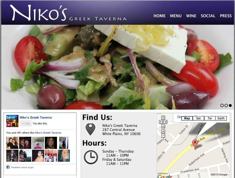
I absolutely love this website design. It’s clean, appetizing and easy to navigate. The name of the restaurant, Niko’s Greek Taverna, is right there in the top corner. Then, on the navigation bar, there lists home, menu, wine, social and press. These are all links that customers want to have access to before dining at the restaurant. Next, there is a picture flow; the screenshot is stuck on the salad photo, but there are other photos of a fish dish and people happily dining. In addition, on the home page there is a Facebook section, which allows people to “Like” the page right there and even see how many other people “Liked” the page as well. Furthermore, there is the restaurant address and hours of operation, which is super important because it is a common reason why people go to website pages in the first place. Lastly, it does not show on the screenshot here, but there are links to Niko’s Greek Taverna’s Facebook, Twitter and RSS pages.

http://www.nikostaverna.com/


Web Design

SIA Aperitivos

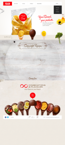
I personally like this web design very much. I think it is a good example of how Gestalt principle (similarity, continuation, proximity, closure and figure/ground) is applied.

For example, through the use of “containers” all in spoon shapes throughout the website, the designer nicely introduces similarities that make the website look very organized. The background color is clean, which makes objects in the foreground stand out. The website also uses very effective visual elements, especially the image of chips whose reflections add huge dimension to it and make it pop out.

I also like the typeface the designer has chosen, which looks really neat, clean and relaxing.