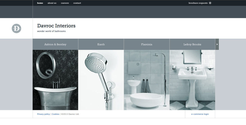
The Davroc Interiors website uses sever gestalt principles including a very narrow color palette of various shades of bluish gray to simplify the design and ensure that the photos all compliment each other. The site also uses generous whitespace throughout and a minimum of text in simple fonts to reiterate the minimalist design. Everything also uses a very clear alignment to keep order to the flow of the site.
Studio MPLS Gestalt Principles
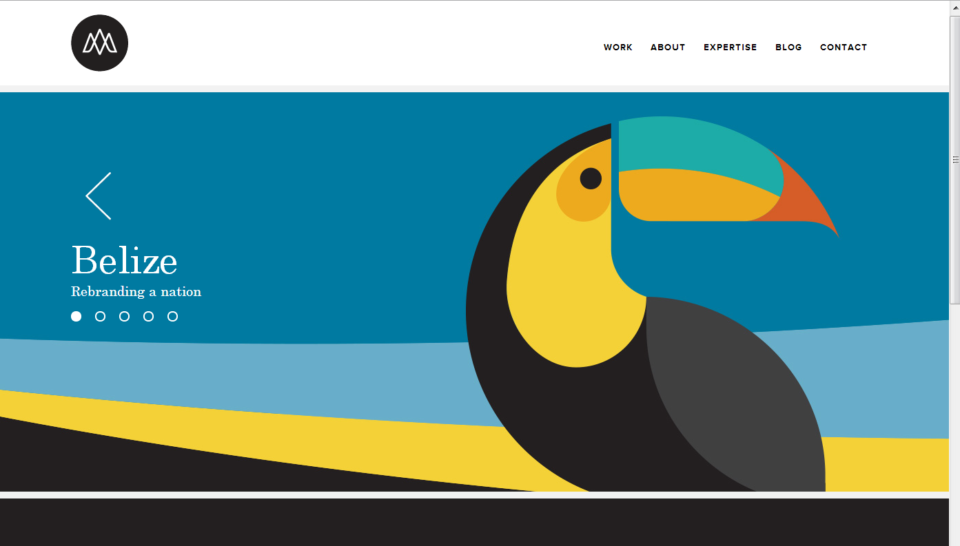
Many of my favorite websites are often simplistic. This website, studiompls.com is no different. A good website also follows gestalt principles. Here are a few examples of gestalt found in this example:
Similarity: This site has panels that change. The grouping of the multiple shapes into the form of the toucan creates a similar shape that distinguishes itself from the rest of the web page.
Closure: The toucan beak is not connected or closed off with the rest of the toucan, so the mind seeks closure and does so to assume the beak and body are one object.
Proximity: The formation of the section words in the top right are close together in proximity, allowing for the mind to group these concepts together.
Figure and Ground: The website easily differentiates the background with the figure because the background is white. Regardless, even with the toucan graphic, the toucan is easily distinguishable from the background because of the vertical vs horizontal contrast.
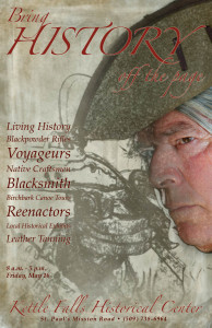
Bring History off the page
Law of Symmetry in Circlex Web
This website uses Gestalt’s Principle- Law of Symmetry. The main image of the web has a element of rotational symmetry because it has a central reference point (the hands) and rotates around the central point. Because of it, the web looks much more interesting, engaging, and attractive to the visitors.
Zalkind Poster
Rule of Three
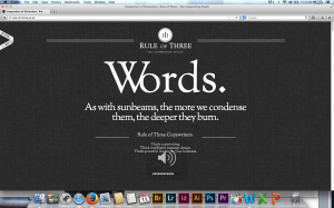
The Rule of Three website applies many gestalt principles. Most notably, visual hierarchy, figure and ground, and proximity and alignment.
The dark background and white letters allows the viewer to easily navigate the website’s text. The layout’s is very simple, and the word “Words,” is the most prominent figure on the screen, It’s also what the website sells. The website is very organized. Even though there’s only one type of font used, it’s used very effectively with grouping. All the areas with like information are equally separated, and the use of different sized fonts helps readability.
Poster
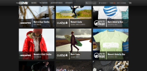
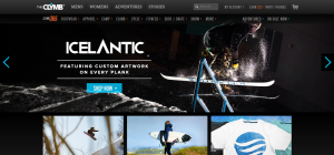
The Clymb is a discount outdoor clothing/gear website. Their business is all web based so it is very important they have an easy and accessible website design.
- figure and ground: The Clymb uses a dark background which allows the viewer to see the products clearly.
- proximity and alignment: The site uses two types of fonts, and the dark and light grey as well as the light blue colors throughout the website which creates unity.
- continuation: The site is very linear and organized. They decided to create square blocks to place the information and products they are selling in.
- visual hierarchy: Their layout is simple which is necessary for the site to place emphasis on the products they are selling. Most everything is uniform in size and color because each thing they are selling is equally important. The Clymb logo is large at the top of the page and the categories begin to decrease in size as you go to another sub category.

