EAT PI Poster
GoPro Website
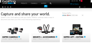
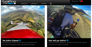
I love the GoPro website for its visual design. Go Pro is a universally renowned sporting and extreme activity camera. It takes incredible photos and videos the most dangerous and intense activities in the world while in some of the most extreme surroundings.
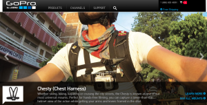
With all this in mind the web designers knew that they had to make a website as appealing as the product. This website is absolutely filled with photos and videos on every page. Instead of reading all the things you can do with the Go Pro, they show you with a video example.
All the products have been expertly photographed and are on a very visual display. Text is at a minimum and is very simple and readable whenever it is used. Social media is everywhere and the chance to win some of this companies amazing products is always shown.
This website will make anyone, myself included want to buy a GoPro!
Fashion PR Confidential
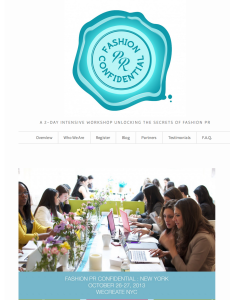
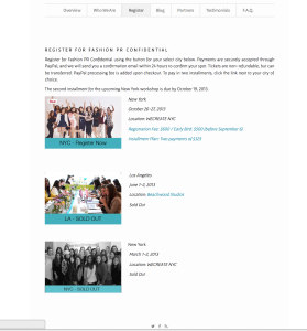
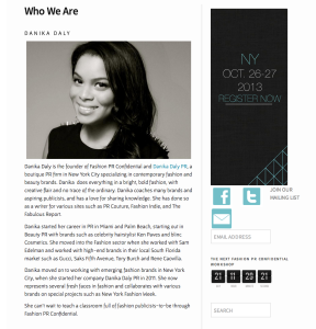
This is a website for promoting a 2-day crash course in Fashion PR in NYC. This is a event website that is similar to our projects, so it is valuable for us to study. I really like this website, because it look bright, simple and stylish. And it is very easy to navigate. Its logo, which is on the top of the home page, is very impressive and can catch people’s attention once they open this website. I think one of the reasons make this website so attractive is that it makes a good use of white color, which occupies most of the space. Also, the color of the logo and the theme color are almost the same. All in all, this website can be a very good example for promoting an event.
SRCOM – Website Design
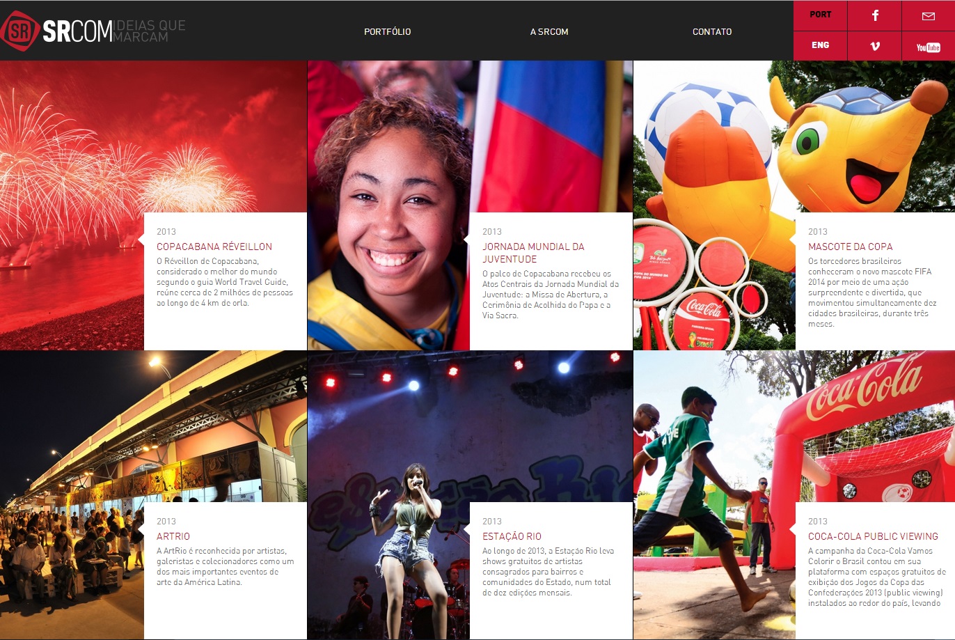
This website proves that web design is a universal language for communication. Despite being in Portuguese, even an English speaker can understand the importance of layout. Boxes may seem initially unappealing in regards to web design, but they can also be the most effective. In separating the text and emphasizing the important parts of the pictures, the web design has a successful visual hierarchy. The eye prefers visuals over text, and managing the layout greatly improves the viewer’s willingness to read the text.
Simple is more
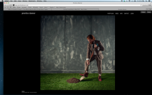
So I am doing my favorite site, Prentice Danner. Danner is a photographer and as you can tell by the website he likes things to be simple clean and not distracting. Sure I love website with lots of elements and creativity, but when it comes to the mind of this photographer, I want to be consumed by his work and not the other things. The navigation is simple and too the point. I promise to be colorful again next week.
website.
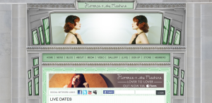
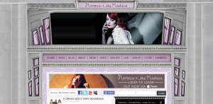
Florence + the Machine has a very aesthetically pleasing website. I like the 20’s/art deco style of the web design. It correlates with Florence’s actual fashion style. The website includes very dramatic and quality photographs of her. The colors of the windows and the photos at the header change while you are viewing the page. It is very clear and easy to navigate. I believe that many artists and bands have really nice and quality websites and Florence + the Machine is no exception. http://www.florenceandthemachine.net/index
Website design
100 McDonald’s Moments
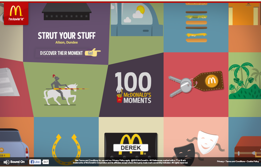
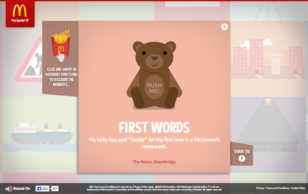
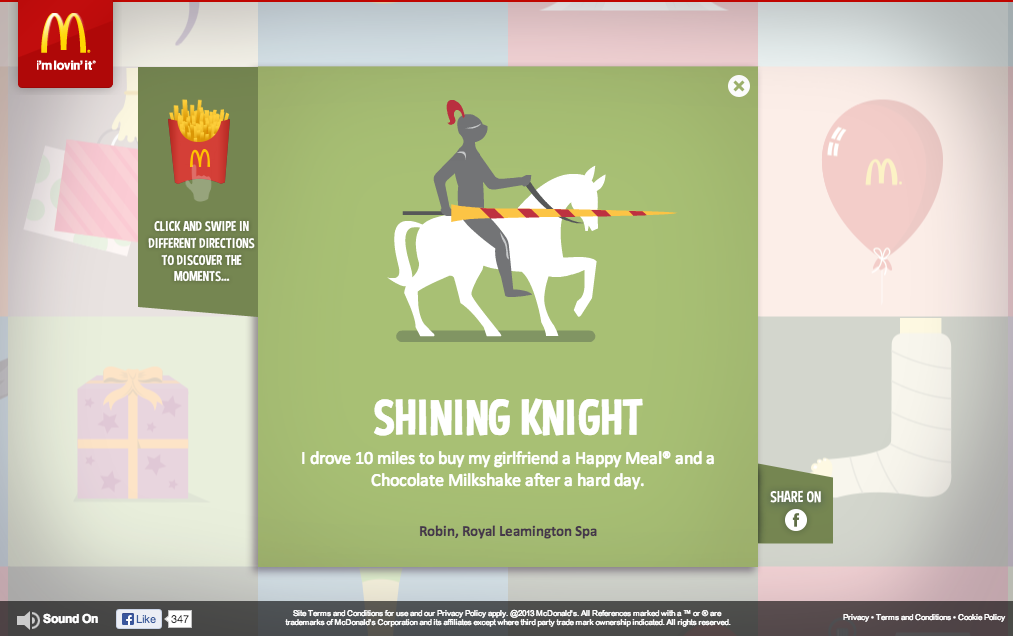 I chose 100 McDonald’s Moments as my favorite website because of its effectiveness in engaging the audience, showing brand personality, and and also enhancing brand image.
McDonald’s did a fantastic job of creating a web site that is purely created by engagements of its consumers. With the valuable anecdotes that consumers have sent, it raises the credibility and authenticity of their message to a whole new level.
Their use of color, gif motion, grid format, and typography are all fun, colorful, and original and it conveys the personality of McDonald’s excellently.

