iPad Magazine Cover

cosmo_cover102e610c1ee41a3a_diannaagron_cosmopolitan_sept2011


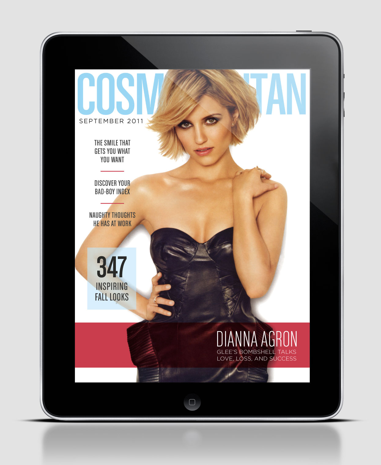
As you can see the digital and print cover for this particular issue are completely different. Although the color scheme stays consistent, where the color is placed is different as well as the picture itself. Another difference is the amount of white space from cover to cover. For the digital design 6 stories were picked to spotlight, whereas the print version has 8. On the digital version the only type that is in bold is the title of the magazine, but on the print version the majority of type is bold. I also thought it was interesting to see the difference in where the type was placed. The print version surrounded the picture with type, whereas the digital version clustered it all to the left except for the story that goes with the cover picture, which is located at the bottom left and highlighted. Although this example is of the same issue the design is so different it almost appears to be a different magazine. Do you think this is good or bad?

Wired iPad Design

wired-for-ipadwired


I couldn’t find the horizontal layout for this Wired cover that features Will Ferrell. But I did find the print version, which, as you can see, is identical except for the newsstand barcode. The consistent white-silver color scheme is very effective in this photo illustration since silver represents technology and the future. Ferrell’s headphones point upwards, directing the eye to the WIRED nameplate. Since sans serif is considered more modern than serif typefaces, the elongated font also fits well with the cover story. This issue has more cover lines than you would normally see on an iPad issue, so it surprises me that they kept all of them between the print and digital versions.

Headline&Deck

From TIME Magazine 10/28/13

Headline: The United States of Texas

Deck: The Lone Star State is America’s future

I think the headline and the deck do their job very well. In combination with the artwork on the cover I am very interested as to why Texas is apparently America’s future.

Headline

I loved this headline and deck; it’s very captivating, and makes me want to read the article. It does a great job of catching the attention of the intended audience and follows the personality of the magazine.

Screen shot 2013-11-08 at 11.29.37 PM

HEADLINE AND DECK

Screen shot 2013-11-08 at 9.33.14 PM


This headline and deck are in Cosmopolitans beauty section. I think both the header and the deck draw the reader in by relating specifically to the reader. The two compliment each other and the deck makes me want to read the rest of the article by giving specific examples that are relatable.

Headline and Deck

HEADLINE: EMINEM’S CHILDHOOD HOME CAUGHT ON FIRE

DECK: Last night, Eminem’s boyhood home in Detroit was damaged by fire. The two-story…

I can appreciate the urgency behind the headline in the post; its simple, direct and catches the viewers attention, as well as their emotion with the term “childhood home.” The deck further does a good job of getting the reader to transition from the title to the story.

Headline

Screen Shot 2013-11-08 at 3.22.25 PM

This headline and deck work very well together. The headline is creative and draws the reader in because it is unusual and is targeted to a specific audience. It is not broad, it is not confusing, it is clear and is successful in pulling in its designated audience.

The deck: “This hyper-tailored shopping list has something for everyone you know, including your very sophisticated chicken” works great with the headline and the fun language is consistent throughout.


Hed and Dek

No Alpha Males Allowed

Peace-loving South American monkeys and the U.S. scientist who champions their future encourage us to rethink our aggressive nature.

(From Smithsonian Magazine, September 2013)

Headline/deck

From Saveur Magazine, November 2013

Headline: Miss American Pie

Deck: How one cook embraced the glory of America’s iconic dessert

I think the headline and the deck are effective because the headline clearly describes what the article is about – pie (Saveur is a food magazine) – while being witty.

The deck is effective because it is an extremely short, clear connector between the heading and the actual body text.