Headline and Deck

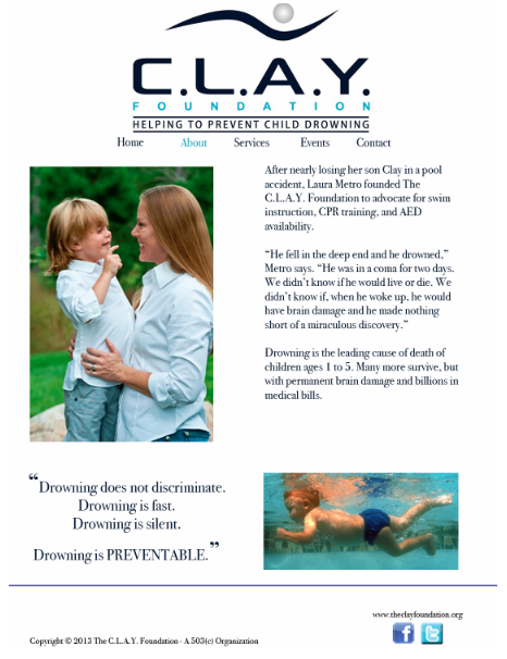
Are We All On Crack? How Rob Ford Keeps His Job

A morbid fascination with the urban drug somehow casts the transgressive Toronto mayor as a cultural adventurer.

This is an article that ran in Newsweek. While a lot of the attention grabbing-ness of this story does have to do with the content of the article, the headline was written in a way that grabs a reader. “Are we all on crack?” is not something that you would expect to read when flipping through the pages of Newsweek. By also referring to the drug as “crack” it sounds more casual and friendly. When reading this a person doesn’t think that they are going to be reading a very formal, scientific sounding article. They will be reading something casual, funny and engaging.

Magazine Headline/Deck

Headline: Good Golly Miss Miley!

Deck: Pop music’s wildest child  knows what you think about her – and she totally doesn’t care

(From a Rolling Stone article about Miley Cyrus published October 2013)

Magazine Spread

Screen Shot 2013-11-01 at 9.28.17 PM

I think this magazine spread is very creative and eye-appealing. Although the feature runs on two pages, the elements work together to create a sense of unity. For example, Taylor Swift runs through the gutter of the spread, connecting both pages together. The image of Taylor also separates the elements in the page. The headline and deck are on her left, while the actual story is on her right. This method ensures that the two elements don’t mix together. The headline design itself is very creative as well. It takes up lots of space and commands reader attention, though doesn’t overpower the photo. The color scheme of the word “love” ties in with Taylor’s dress nicely, and the stacked and overlapped letters create a graphic, artsy feel. The silhouetted photo of Taylor keeps the page simply with its size and lack of background, and her draped hand leads the eye to the headline. Finally, the small elements of the page (like the author’s name placed within the “e” and the red dropcap at the start of the article) make the page look complete against the white background.


NYT Magazine: “Stephen King’s Family Business

King1 King2

Over the summer the New York Times Magazine published a feature story of The legendary family of authors headed by Stephen King.  The spread was very simple but the color scheme was dark and the pictures old and eerie in a similar fashion to his writing style.  The article gave timeline info on King’s career and the progression of his family.  The pictures are intriguing because they show a very interesting family.  They are the main guiding points of the article and most of it is consumed by the text.

Magazine Spread Design

Screen Shot 2013-11-01 at 1.27.05 PM


  • Principle 2 (Continuation): The hed and dek leads the eye upward toward the visual, then to the text.
  • Principle 3 (Closure): I think this spread most heavily uses the Gestalt principle of closure. Although the visual is a collage of random face parts of different people, our eyes are able to close the gaps between the pieces and understand that it’s a complete face. The text container also fills the face, even though it’s completely different from the rest of the objects.
  • Principle 5 (Figure/Ground Relationship): Our eyes move through the page in a left to right motion.