Logo

logo


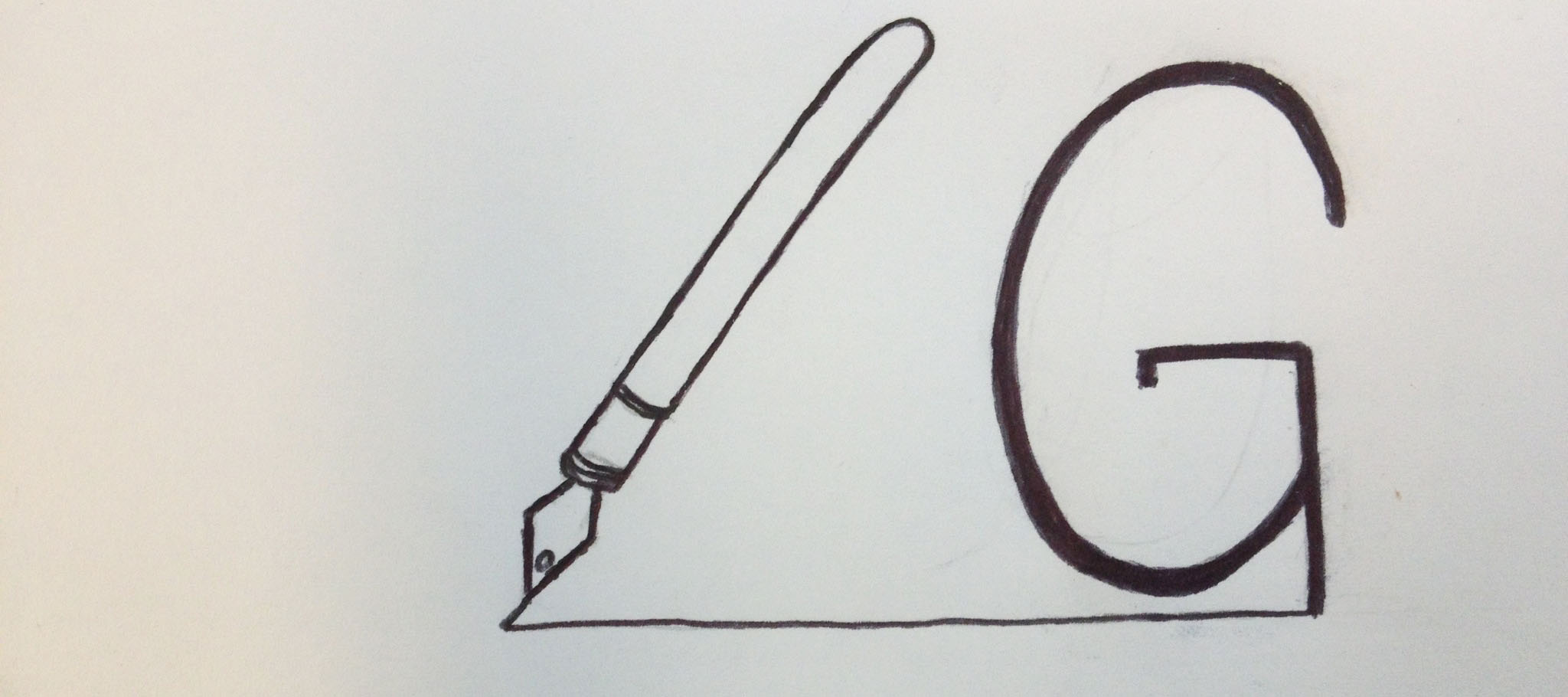
When thinking about my logo, I wanted to incorporate my area of study somehow: magazine journalism. My initials are “LG,” so I drew a fountain pen with a line drawn to appear as the “L.” I connected the line to the bottom of the “G,” so it looks like it was just drawn as well. I would obviously place this near my wordmark on my resume or a business card, so readers would understand it’s my initials. As for my identity, I wanted to portray that I think of writing stories as a craft. I hoped that choosing a fountain pen instead of a modern one will show this.

Logo

logoFor my logo, I wanted to make my name look cohesive, because it’s a good way to draw the reader in and get the whole picture. I liked the use of my full first name, because that is more important to me. I then connected the last letter of my first name with my single initial of my last name to have the eye read from first to last name. I like this simple font because it was easy to manipulate, however, I may explore more diverse fonts for the future.

Personal Logo

Personal Logo

My first thought when I was sketching out different ideas was wanting to do something with the “rah” since it was in both my first and last name. I added the color to my first name and made my last name thinner so it might help differentiate between the two. I used the same font and color as my resume because I assumed people I may be giving my resume to, I’ll also be giving a business card to, so it would be beneficial to have every piece of my paper identity coherent.

Personal Logo 2


For this second idea, I wanted to incorporate something with the S and G in my names being similar curves and shapes. I think this one might be a little difficult to comprehend, and it might be because of the font. I think because the font is slightly unusual, it might get in the way of understanding it. However, on a business card with other information, it might make more sense. At first I had the G in the same maroon color as the first logo, but decided to change it so it would have more a contrast with the black S on top of it.

Blog Assignment: upload your own logo

On Wednesday’s class, professor Taylor asked you to design your own logo. So for this week’s blog, you need upload a photo of your logo sketch. Below the sketch, describe briefly your thinking process behind the design and how you are going to implement this new identity.

You can upload multiple sketches if you have different ideas. If you want to directly design it in Illustrator/PS/Indesign, feel free to do so. Just remember to upload a jpeg/png of your final image.

Sketch Post due on Saturday 11:59 PM (Not Friday)

Comments due on Sunday 11:59 PM.