Monthly Archives: October 2013
Resume 1B
Website Photography
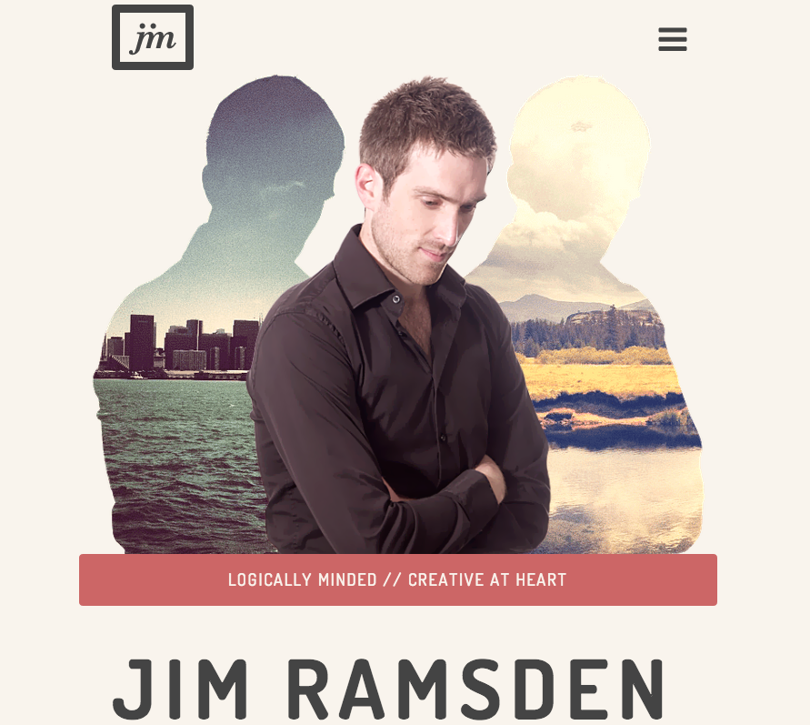
This screenshot is from a portfolio website of Jim Ramsden. His home page features this picture of himself, and then the silhouette of his picture with imposed pictures in the background. It works well as his home page picture. 1. His tagline is “logically minded, creative at heart.” Instead of just telling his audience this, he shows it through his picture and creatively adding the pictures in his silhouettes. 2. He positioned himself well with his eyes leading the audience down to his name. 3. It is clean cut and professional so any possible employers looking at his portfolio would be more apt to look further into this experience and talent. 4. The two images that he chose to fill his silhouettes seem to juxtapose east coast and west coast which gives a hint into his career, interests and personalities.
Website Photography
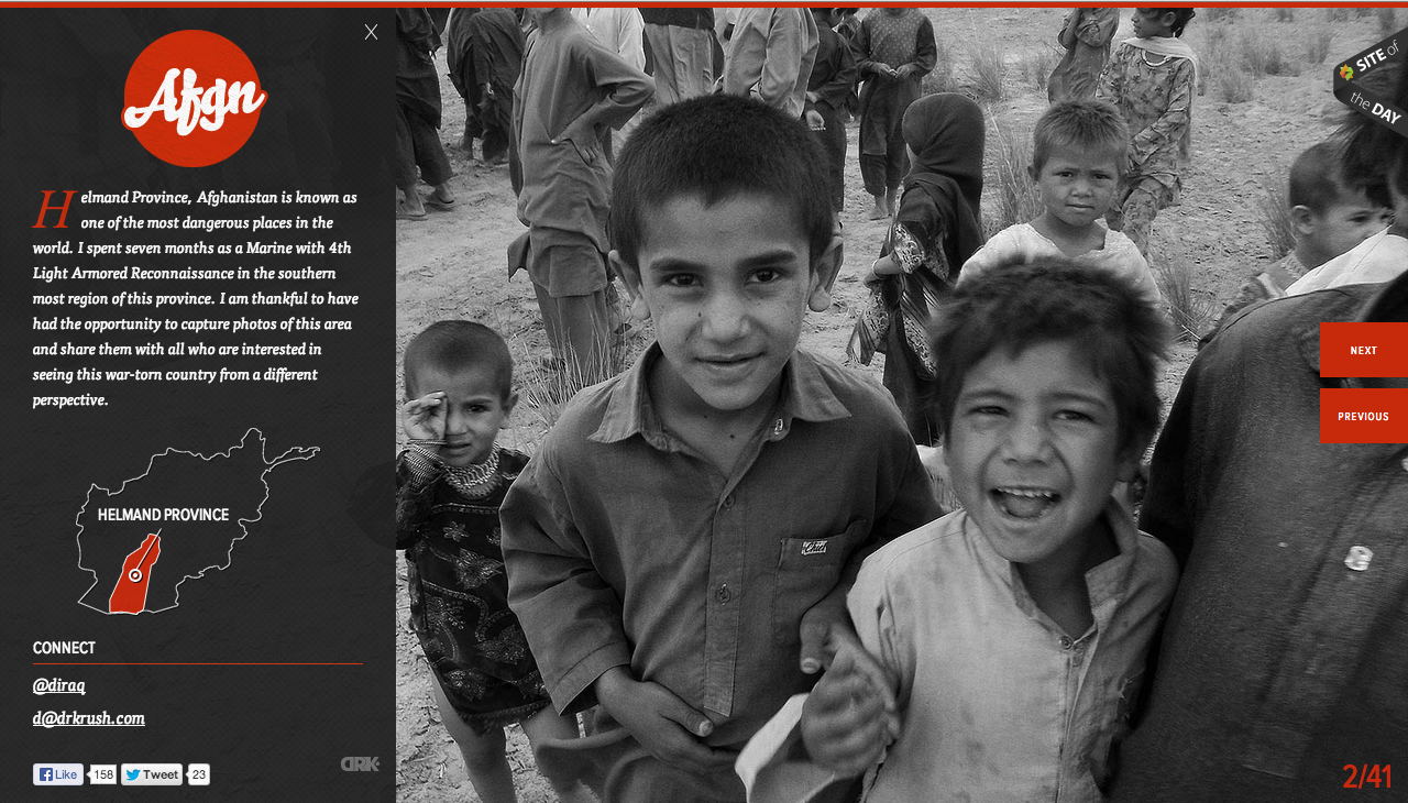
This website is designed to teach people the dangers of living in the featured province in Afghanistan. The website features only black and white pictures that are the full size of the page. I think this is powerful because the image dominates the page and there is no captions/thumbnails/frames/other text to detract from them. The black and white also limits the amount of things the eye needs to look at. A person’s eye isn’t darting around the pictures looking at all the different colors, instead they can settle in and focus on the closeups of the children’s faces. Also, this website uses just pictures to teach people and convey a message. Aside from the one paragraph of text that is set over the image on the left, there is nothing else besides this.
Resume 1B
Website Photography
 I chose spalding as a representation of a website with good photography because there home page caught my attention with all of the differnet pictures that it displayed. The photograph above is one in a set of images that rotate on the home page. I took a screen shot of this image in particular because I feel like it grabs the viewers attention from the start. The concrast between the man’s body and the background gives the image an over all feeling of accomplishment. It makes it seem as if the man is workign really hard to achieve some aspect of physical fitness. The light highlights his athletic features which is what spalding is about. The photograph effectively communicates to the viewers that Spalding is an athletic company, and targets viewers who are into physical fitness or sports. I feel like the designer chose this image because it is general enough to make the viewer understand the object of the website, but not so specific that the viewer may think the website is for a specific sport. The picture adds depth to the website’s overall design by giving it a casual/determined tone which is what the target audience is looking for.
Website and Photography
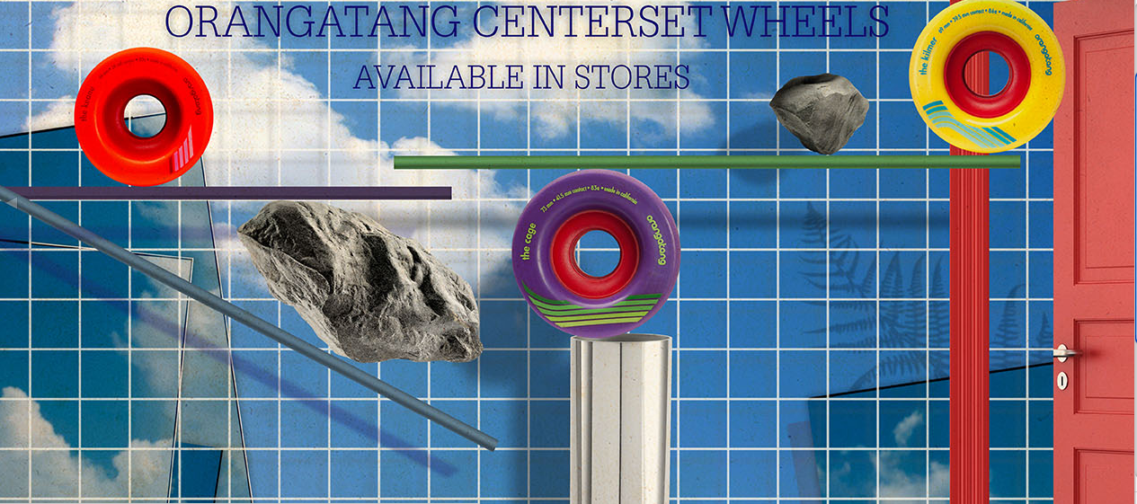
This website for a long board skateboard company advertises a new set of wheel. The photo used is the sky background with clouds along with rocks in the page. This photo effectively communicates because longboarding is a very outdoor activity and the background captures that nicely. The wheels are what directly contact the ground or outside when your out skateboarding so its a good connection to make with nature and the sense of being outdoors. The target audience of this website is definitely the adventurous type that enjoy going out and seeing nice scenic views while out skating around. My guess as to why the creator included rocks its to also key in to the nature aspect of skating itself but also the durability of these new wheels they are advertising.
Blogging Assignment: using photos in web design
 This week, you need to post a screenshot of a website and explain how photos were used as a visual element to effectively communicate with the viewers, or add depth into the overall design. What’s the target audience of the website? Why did the designer choose this particular image? What’s the relationship between the photos and other contents? Read this excellent article before you get started.
- Deadline for this blog post: Friday 11:59 pm.
- Please also upload a JPEG of your new resume by Friday at 11:59 p.m.
- Deadline for two comments on your classmates’ web design blog post : Sunday 11:59 p.m.
- Those students who are doing floating redo for the poster project, please upload a JPEG of your poster by Sunday at 11:59pm.
Lincoln Website
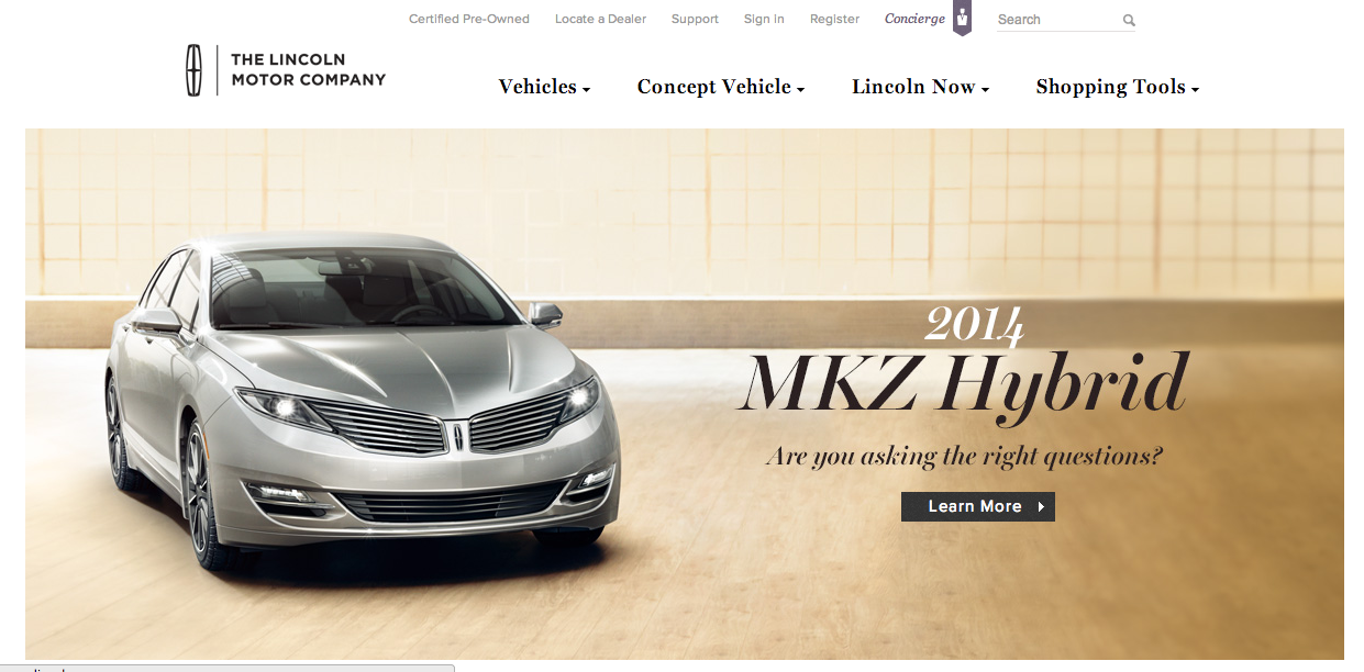
As a brand, Lincoln is known for class, prestige, and luxury. Their website perfectly reflects this image through various techniques. In terms of figure and ground, the picture is set against a white background, and the color scheme of the picture allows the juxtaposition of the picture on the background to be less harsh. Furthermore, the black headers are clearly visible.
In terms of proximity and alignment, the Lincoln all-caps font and logo are present for a wordmark effect, and the font used on the site maintains the image of elegance. The new car within the picture is clearly the newest, best design, and the italicized and bold font help show that it exemplifies the brand while still displaying an aggressive feeling as it bursts into the car market.
In terms of continuation, the website flows very smoothly. This is due to the color scheme, the way the fonts work together, and how those two things are complemented by the picture that was chosen for the new car model.
For visual heirarchy, navigation links are present all along the top of the page. Following the “Z” formation, the reader’s eye hits the left-aligned text within the picture at the middle of the page. Although it was cut out in the screenshot for the post, the bottom of the page has further navigational links that deal with incentive plans, contacting employees, and personalized shopping.
Poster