Final post

Though I did a floating redo on the ipad project, I posted my ipad design before thanksgiving break and here is the link to it: https://gra217.expressions.syr.edu/s5g1/?p=1514

Before this class, I am unfamiliar with the graphic design software such as indesign and illustrator. This class enable me to have some basic ideas about these softwares. Besides, it also help me understand some basic concept of graphic design. I really like doing the ipad design on illustrator. The interactivity is great.

Final Post

GRA217 has taught me so many valuable skills. Even though I am not a graphics major, knowing how to use the Adobe programs is a skill that I think I will use in school and also in my job. In one of the classes Professor Taylor said we will never look at type the same and she was right. Whenever I see a logo, poster, anything design oriented I now actually stop and critique it in my head. I am really grateful for this class because I feel like I learned skills that will be very valuable in my career.

iPad Magazine jpegs

GRANT GRANT2 GRANT3GRANT5GRANT4 GRANT6


One thing I learned from this project was how to make something interactive on InDesign. When I was first learning how to make a hyperlink and button I thought it was complicated, but now I feel like I could easily do it on another project.

Final Blog Post

Before taking this course, I knew a little about InDesign and Photoshop but nothing about Illustrator. Now I feel pretty confidant about using all three programs. I learned that creating a visually appealing design isn’t easy; designers have to think about color, typefaces, visuals, making sure the page is navigable and not overly crowded, etc. I never realized the importance of white space before, and I used to fill almost every inch of the pages I designed with content. Now I know that simpler is always better. Also, I learned how about all of the different typefaces available, and which ones are suitable for different occasions. For example, I know now that modern serif typefaces are used for fashion publications, and script typefaces are not effective for headlines. I will use what I learned in GRA217 through the rest of my school and professional careers.

What I have learned

Throughout this semester, I have struggled with almost everything Adobe has to offer.  Finally, I can say that I feel confident in myself in using Photoshop, InDesign and Illustrator.  Every TA was always there to help me learn and Professor Taylor’s daily office hours were a life saver.  Essentially, what I have learned this semester is to appreciate all of the designs and advertisements I see in the world because they all most likely took days and even months to create an idea and then execute it properly.

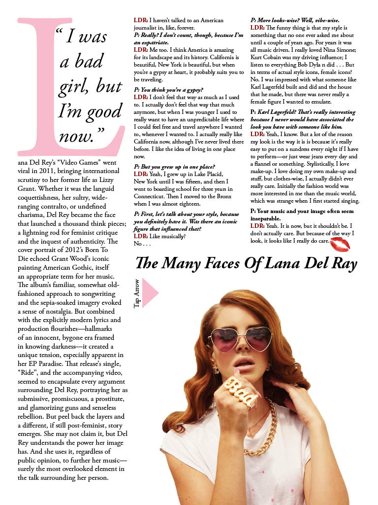
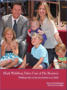
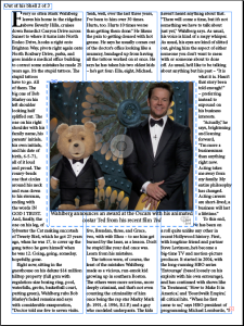
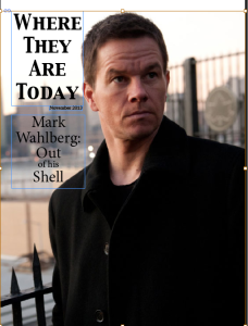
Magazine

Screen Shot 2013-12-04 at 1.59.26 PM Screen Shot 2013-12-04 at 1.59.35 PM Screen Shot 2013-12-04 at 1.59.14 PM

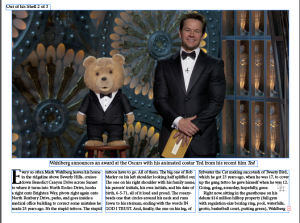
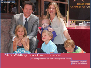
This is the vertical orientation of my magazine about Mark Wahlberg

Screen Shot 2013-12-04 at 1.59.57 PM Screen Shot 2013-12-04 at 1.59.00 PM Screen Shot 2013-12-04 at 1.58.42 PM


This is the horizontal orientation of my magazine and my final version.

The interactivity on both my pages is a slide show on the third page picture.


Last post

The biggest thing I learned this semester was to take advantage of white space. I didn’t realize how much impact a simple, minimal design could have. Going into this class my thoughts were to add and embellish and use effects and colors and repeat images. While yes, these effects might really add to a piece, they’re only going to add to something if they’re used in moderation. Under-designing can in fact be better than over-designing. Before, I may have thought that once I finished a design that I should look it over and think, what else can I add? Now, when making this evaluation, my thought will definitely be, what can I take out?

Final Reflection

Last semester when I scheduled for GRA 216, I was definitely a little nervous. The only program that I really had any sort of grasp on was InDesign and I wasn’t sure if I would be able to dedicate the time that was necessary to finish the projects. Now that the course is done and all of the projects are turned in, I feel much more comfortable using the different Adobe Suite programs. There were so many details about graphic design that I learned. Terminology, color associations, typeface uses and plenty more. The most valuable tool that I learned that I’ll be leaving the semester with is definitely learning the interactivity for the iPad design. That’s a huge plus when it comes to resume building and impressing future bosses. It was also helpful to have my work critiqued by someone who really knew graphic design, and not just a friend telling me if it looked good or not. I have definitely learned a lot and I am sure I’ll be able to use the lessons I learned when I’m making posters in the future.

Concluding Thoughts

Coming into the class I did not have more than an elementary knowledge of graphic design and the softwares involved. After learning about the powerful ways in which the principles of design affect all aspects of life, I now recognize the value and worth in being able to manipulate public perception through the use of design tools and techniques. Prior to this class, I did not analyze and understand graphic design in the same way that I do now as I now am able to make the best use out of design principles and tools such as kerning and leading. Also, I now blame this class for how I will never be able to look at text the same way–now type is more than type. Now I find myself looking at typefaces and am able to recognize whether it is a serif, sans-serif, or another possible typeface. Counters, kerning, x-heights, margins, the rule of thirds, complimentary and analogous colors–forever stuck in my head thanks to this class!