Monthly Archives: October 2013
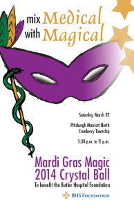
Mardi Gras Magic Poster
Blog Assignment: Gestalt Principles in Web Design
Gestalt is a psychology term describing how people tend to organize visual elements into groups or “unified wholes” based on certain principles.
Some of the gestalt principles include:
- figure and ground: establish significant differences between the object and its background, making the object stand out from its surroundings.
- proximity and alignment: use the same font, color, or alignment to create unity.
- continuation: elements were positioned on a line or a curve to indicate continuation or connectedness.
- visual hierarchy: use size, shape or color variation to tell viewers which part are important, and which part are supplemental.
This week for the blog, you need to choose a website and talk about how the designer of that website applied those gestalt principles. Deadline is Friday at midnight.
To learn more about gestalt principles and web design, read here.
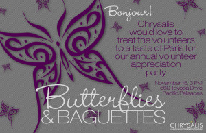
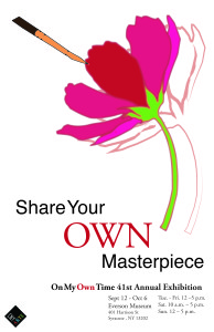
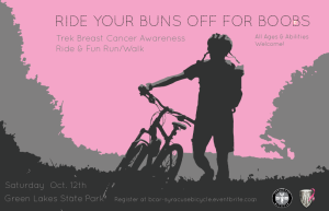
In addition to this blogging assignment, you need to upload a jpeg of your poster and comment on two other persons’ poster posts. Deadline is Sunday 11:49 PM.
Poster
poster.
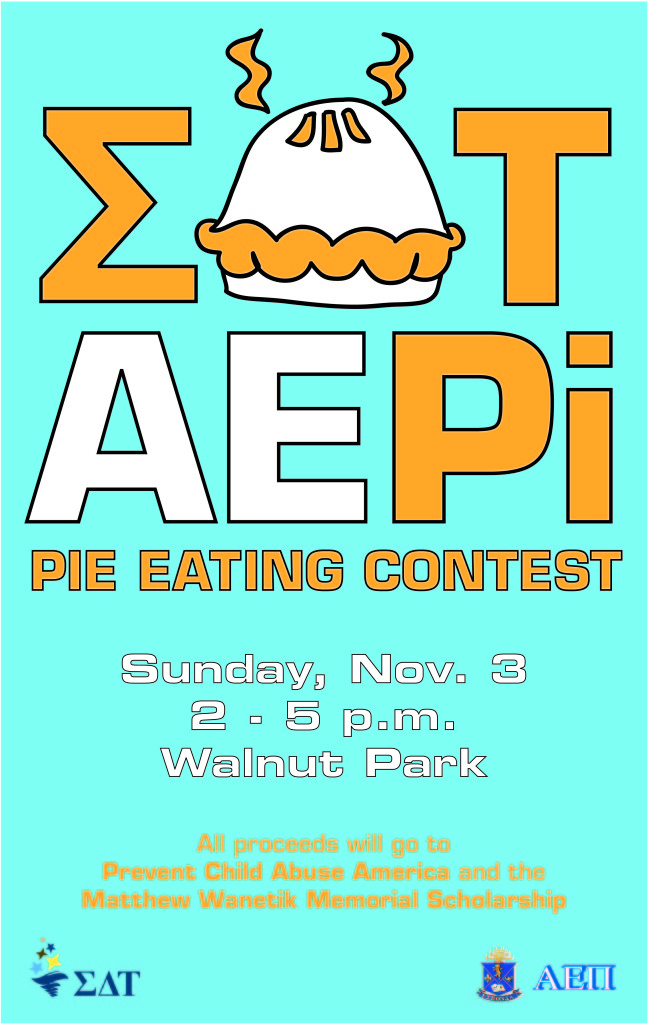
EAT PI Poster
GoPro Website
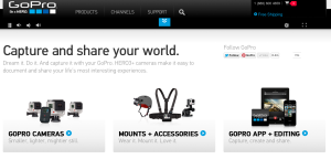
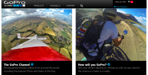
I love the GoPro website for its visual design. Go Pro is a universally renowned sporting and extreme activity camera. It takes incredible photos and videos the most dangerous and intense activities in the world while in some of the most extreme surroundings.
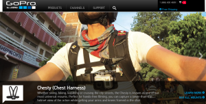
With all this in mind the web designers knew that they had to make a website as appealing as the product. This website is absolutely filled with photos and videos on every page. Instead of reading all the things you can do with the Go Pro, they show you with a video example.
All the products have been expertly photographed and are on a very visual display. Text is at a minimum and is very simple and readable whenever it is used. Social media is everywhere and the chance to win some of this companies amazing products is always shown.
This website will make anyone, myself included want to buy a GoPro!
Fashion PR Confidential
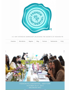
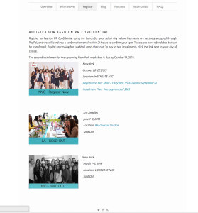
This is a website for promoting a 2-day crash course in Fashion PR in NYC. This is a event website that is similar to our projects, so it is valuable for us to study. I really like this website, because it look bright, simple and stylish. And it is very easy to navigate. Its logo, which is on the top of the home page, is very impressive and can catch people’s attention once they open this website. I think one of the reasons make this website so attractive is that it makes a good use of white color, which occupies most of the space. Also, the color of the logo and the theme color are almost the same. All in all, this website can be a very good example for promoting an event.
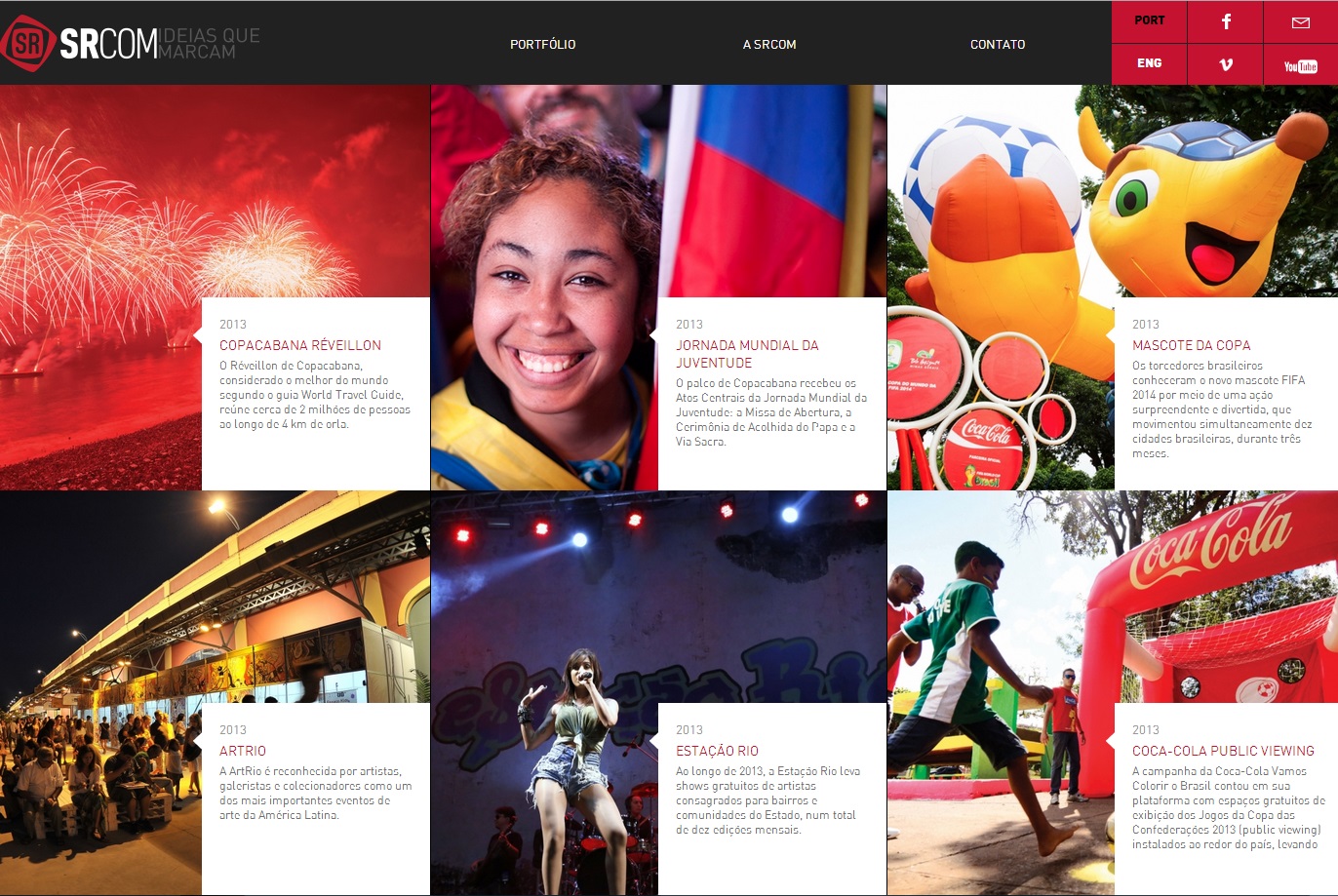
SRCOM – Website Design
This website proves that web design is a universal language for communication. Despite being in Portuguese, even an English speaker can understand the importance of layout. Boxes may seem initially unappealing in regards to web design, but they can also be the most effective. In separating the text and emphasizing the important parts of the pictures, the web design has a successful visual hierarchy. The eye prefers visuals over text, and managing the layout greatly improves the viewer’s willingness to read the text.

